Selling Landing Principles
A selling landing page is a key element of an advertising campaign that affects the conversion of users into a client (buyer). If the purpose of the ad is to attract the attention of the user, then the task of an effective landing is to keep the user on the page and convince him to complete the target action. There are many recommendations on how to create a selling landing page, but there is no universal recipe. Depending on the product being advertised, there are various approaches for creating a selling landing page.
In general, the landing page consists of the following elements:
1. The design of the ad and the design of the landing should match.
If a user clicks on an ad, he expects to see some continuation of the ad in question. Therefore, the color scheme, style of presentation of the text, and the general style should coincide, if we talk about banner or teaser advertising. On the other hand, overly decorated bright landing pages do not bring a good envelope. We can say that the rule “the simpler the better” applies to landings. The smaller the large print, the images, the intriguing headlines, but the more specific information about what the product is and what benefits the user will receive, the more effective the landing page will be. Red color is also not recommended for use.
To connect a “flashy” ad with a less restrained landing page, you can use the same top of the teaser and landing page. This bunch is effective for teaser advertising.
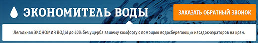
2. The title and subtitle of the landing page contain information about what the product, service presented on the page is.
Returning to the previous paragraph that the design of the ad and the landing page should match, the heading and subheading, in turn, should logically continue the heading of the advertisement or repeat the main message if it is a draw or a promotion.
Heading / Subheading Options:

3. Image The
image (s) on the landing page has a tremendous effect and is the main element of the selling landing page.
What images should I use?
The option of advertising a particular product is the easiest. In this case, it is enough to place a photo of the product or the person who uses this product.
A good option is to show the effect of using the product - a photo before and a photo after.
For advertising an intangible object, there are several approaches:
4. Description
The purpose of the description is to explain to the user what he will receive by purchasing the product.
Components of the description may be:
Arguments - this is a direct description of the benefits that the user will receive when purchasing a product, and not a listing of product characteristics or company achievements.
Answers to questions should dispel the user's doubts. This can be real reviews and comments of industry experts.
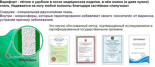
As for information that enhances trust, the loyalty of users is facilitated by certification marks, contact details, information about the company. What information to place on the landing page is curled directly from the target action.
For example, the user must leave contact details for feedback. In this case, the landing page should contain information about the company, contact details and the cost of the incoming call.
Another example, products subject to licensing, drugs for weight loss, etc. In this case, it is appropriate to post information that the product is certified and approved by the Ministry of Health.
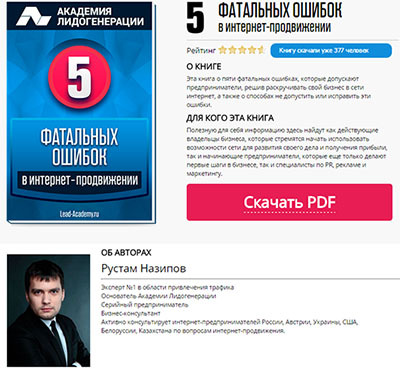
If the advertisement concerns an information product, for example, an e-book or a course, then it is advisable to place detailed information about the authors.
For the advertising of goods - information on delivery, guarantees, contact phone number.
Information about promotions and discounts encourages the user to perform the target action. Limited offers, the last day of the discount, etc. stimulates the user to complete the targeted action immediately.

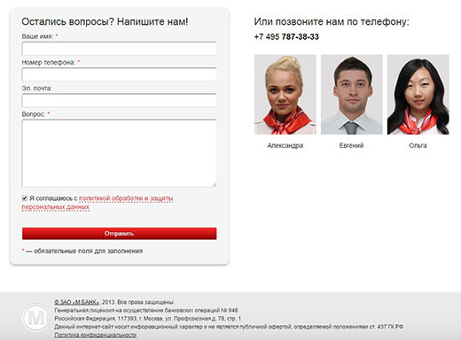
5. A call to action should be as accurate and clear as possible.
A call to action is the last argument. If the user has already reached the landing page, then the main task is to prevent him from leaving the page. The title, image and description, providing information in a logical sequence, lead the user to the Call to action button.
Always start from the end. Formulate the target action and remove unnecessary information that is not related to the target action. Excess information on the landing page only reduces conversion.
Where should the call to action button be located?
Ideally, up to the “fold line” so that the user does not have to scroll down. If the landing page contains a lot of information and the CTA does not fit at the top of the page, then you can place the CTA after each block of information or make a dynamic CTA that will appear when the user reads about ⅔ of the text.
The implementation of the target action should be as simple as possible for the user. The ideal option is in 1 click, for example, click to call, click to download, click to request a quote. If the user needs to fill in the registration fields, then the number of completed fields should be minimized. Registration using a social network account greatly simplifies the life of the user, and accordingly increases the conversion.
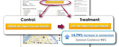
The text on the call to action button deserves special attention. Correct text increases conversions by an average of 30%.
Examples of testing various options STA .


In conclusion, it should be added that only through split testing can a high conversion be achieved. By sequentially testing each element, it is possible to determine which combination of heading, subheading, description, image, and CTA makes a landing page selling.
Do not forget to analyze and correctly identify the problems of your target audience. If there is an opportunity to interview users who have left their contact details but have not made a purchase, be sure to use this opportunity, perhaps the reason is that the support phone is not striking.
In general, the landing page consists of the following elements:
- Header / Descriptor
- Picture
- Description
- Call to action
- Strengthening the call to action (promotions, coupons, discounts, limited offers)
Rules for creating a selling landing page
1. The design of the ad and the design of the landing should match.
If a user clicks on an ad, he expects to see some continuation of the ad in question. Therefore, the color scheme, style of presentation of the text, and the general style should coincide, if we talk about banner or teaser advertising. On the other hand, overly decorated bright landing pages do not bring a good envelope. We can say that the rule “the simpler the better” applies to landings. The smaller the large print, the images, the intriguing headlines, but the more specific information about what the product is and what benefits the user will receive, the more effective the landing page will be. Red color is also not recommended for use.
To connect a “flashy” ad with a less restrained landing page, you can use the same top of the teaser and landing page. This bunch is effective for teaser advertising.
2. The title and subtitle of the landing page contain information about what the product, service presented on the page is.
Returning to the previous paragraph that the design of the ad and the landing page should match, the heading and subheading, in turn, should logically continue the heading of the advertisement or repeat the main message if it is a draw or a promotion.
Heading / Subheading Options:
- a problem / question that worries the target audience;
- specific benefits with numbers (lose 8 kg, save 50%, buy cheaper, etc.);
- name of the proposed product;
- unique selling proposition.
3. Image The
image (s) on the landing page has a tremendous effect and is the main element of the selling landing page.
What images should I use?
The option of advertising a particular product is the easiest. In this case, it is enough to place a photo of the product or the person who uses this product.
A good option is to show the effect of using the product - a photo before and a photo after.
For advertising an intangible object, there are several approaches:
- The image evokes associations with the benefit / benefit that the product will bring, for example, insurance services - security, banking services - financial stability, educational services - a successful career, etc.
- Photos of smiling people. As practice shows, photographs of smiling people, positive emotions allow the user to better perceive information and contribute to the completion of the target action.
4. Description
The purpose of the description is to explain to the user what he will receive by purchasing the product.
Components of the description may be:
- arguments
- answers on questions;
- confidence-building information;
- promotions, discounts, etc.
Arguments - this is a direct description of the benefits that the user will receive when purchasing a product, and not a listing of product characteristics or company achievements.
Answers to questions should dispel the user's doubts. This can be real reviews and comments of industry experts.
As for information that enhances trust, the loyalty of users is facilitated by certification marks, contact details, information about the company. What information to place on the landing page is curled directly from the target action.
For example, the user must leave contact details for feedback. In this case, the landing page should contain information about the company, contact details and the cost of the incoming call.
Another example, products subject to licensing, drugs for weight loss, etc. In this case, it is appropriate to post information that the product is certified and approved by the Ministry of Health.
If the advertisement concerns an information product, for example, an e-book or a course, then it is advisable to place detailed information about the authors.
For the advertising of goods - information on delivery, guarantees, contact phone number.
Information about promotions and discounts encourages the user to perform the target action. Limited offers, the last day of the discount, etc. stimulates the user to complete the targeted action immediately.
5. A call to action should be as accurate and clear as possible.
A call to action is the last argument. If the user has already reached the landing page, then the main task is to prevent him from leaving the page. The title, image and description, providing information in a logical sequence, lead the user to the Call to action button.
Always start from the end. Formulate the target action and remove unnecessary information that is not related to the target action. Excess information on the landing page only reduces conversion.
Where should the call to action button be located?
Ideally, up to the “fold line” so that the user does not have to scroll down. If the landing page contains a lot of information and the CTA does not fit at the top of the page, then you can place the CTA after each block of information or make a dynamic CTA that will appear when the user reads about ⅔ of the text.
The implementation of the target action should be as simple as possible for the user. The ideal option is in 1 click, for example, click to call, click to download, click to request a quote. If the user needs to fill in the registration fields, then the number of completed fields should be minimized. Registration using a social network account greatly simplifies the life of the user, and accordingly increases the conversion.
The text on the call to action button deserves special attention. Correct text increases conversions by an average of 30%.
Examples of testing various options STA .
In conclusion, it should be added that only through split testing can a high conversion be achieved. By sequentially testing each element, it is possible to determine which combination of heading, subheading, description, image, and CTA makes a landing page selling.
Do not forget to analyze and correctly identify the problems of your target audience. If there is an opportunity to interview users who have left their contact details but have not made a purchase, be sure to use this opportunity, perhaps the reason is that the support phone is not striking.