 February 15, 2016 at 12:32
How to create an animated flask using CSS
Today I want to talk about how I created an animated flask using only CSS3. The result can be seen here . Well, what is interesting? Then let's get started!
We study the problem
A bulb consists of many versatile shapes, but CSS is limited and does not allow us to create these kinds of elements. What will we do? We implement them using triangles and rectangles.
- Pseudo-elements: Before and: After
- Position, top, right, bottom, left, z-index
- Border, width and height
The implementation of the base of the flask
The base has a triangular shape, so we will make it using a triangle. To do this, I will create the following markup:
I use the main element with the flask class, which will house the base with the flask__bottom class. In it we added a blank for the future triangle. Next, I stylize the markup:
body {
  background-color: #292548;
}
.flask {
  height: 405px;
  width: 368px;
  position: absolute;
  bottom: 0;
}
.flask__bottom {
  position: absolute;
  bottom: 0;
}
.flask__triangle {
  width: 368px;
  height: 250px;
  overflow: hidden;
  position: relative;
  background-color: #fff;
}
I fixed the base at the bottom of the bulb using the properties position: absolute and bottom: 0. Next I set it to a width of 368 pixels and a height of 250 pixels. As a result, we have a rectangle.

Now the fun begins! How do we make a triangle ?! For this, I will use the pseudo-elements before and after. Using them, we will create rectangular triangles and place them on top of the white rectangle from the left and right edges, respectively. Thus, hiding part of its area.

But first, we need to make right triangles. To do this, I will add the following CSS code:
.flask__triangle::before,
.flask__triangle::after {
  content: "";
  width: 0;
  height: 0;
  border-top: 250px solid #292548;
  position: absolute;
  top: 0;
  z-index: 100;
}
.flask__triangle::before {
  border-right: 152px solid transparent;
  left: 0;
}
.flask__triangle::after {
  border-left: 152px solid transparent;
  right: 0;
}
The basic technique for creating CSS triangles is to use the border property. But first you need to set the width and height of the elements to 0, for the correct calculation of the size of the triangles.
Further for them I set the border-top property equal to 250 pixels and color # 292548 (background color). Next, for the left triangle, I specify the border-left property with a value of 152 pixels. I will do the same for the right triangle, only instead of border-left I will write border-right.
Then I place them on the edges of the rectangle using the left and right properties. And we got a triangle!

Create base elements
Now we will move on to the implementation of the foundation elements. To do this, add the following markup:
And I style it with the following code:
.flask__bottom-one {
  width: 0;
  height: 0;
  border-bottom: 55px solid #3a2481;
  border-left: 32px solid transparent;
  border-right: 42px solid transparent;
  position: absolute;
  bottom: 0;
  z-index: 4;
}
.flask__bottom-two {
  width: 0;
  height: 0;
  border-bottom: 165px solid #4266c0;
  border-left: 93px solid transparent;
  border-right: 200px solid transparent;
  position: absolute;
  bottom: 0;
  left: 0;
  z-index: 2;
}
.flask__bottom-five {
  width: 100%;
  height: 75px;
  background-color: #4248c0;
  position: absolute;
  bottom: 18px;
  left: 50px;
  z-index: 3;
  transform: rotate(24deg);
  transform-origin: left top;
}
.flask__bottom-six {
  width: 100%;
  height: 170px;
  background-color: #37acdd;
  position: absolute;
  right: 0;
  bottom: 0;
  z-index: 1;
}
.flask__bottom-seven {
  width: 100%;
  height: 218px;
  background-color: #1493c8;
  position: absolute;
  right: -95px;
  bottom: 24px;
  z-index: 3;
  transform: rotate(24deg);
  transform-origin: right top;
}
.flask__bottom-eight {
  width: 100%;
  height: 50px;
  background-color: #5c30ae;
  position: absolute;
  right: -95px;
  bottom: 218px;
  z-index: 3;
  transform: rotate(-12deg);
  transform-origin: left top;
}
An important step in creating elements is to preserve the triangular shape of the base. When positioning its parts, they will go beyond the triangle, so I added an overflow property with a value of hidden for their parent.
Next, we need to create 6 elements and, using the transform properties (with the value rotate) and transform-origin, arrange them as we need. In our case, transformation is needed in order to rotate the elements, and transform-origin - to indicate the point around which we will rotate the elements. Also, using absolute positioning, we place the elements in their places. As a result, we get:

Create the neck and its elements
To create a neck we need to create a rectangle with a size of 62 pixels by 152 pixels and place all 4 elements inside. To do this, I will add the following markup:
And css:
.flask__throat {
width: 64px;
height: 155px;
overflow: hidden;
position: absolute;
top: 0;
left: 152px;
}
.flask__throat-one {
width: 150px;
height: 50px;
background-color: #5c30ae;
position: absolute;
top: 110px;
right: -26px;
z-index: 3;
transform: rotate(24deg);
transform-origin: right top;
}
.flask__throat-two {
width: 150px;
height: 60px;
background-color: #37acdd;
position: absolute;
top: 35px;
right: -35px;
z-index: 3;
transform: rotate(20deg);
transform-origin: right top;
}
.flask__throat-three {
width: 100%;
height: 50px;
background-color: #5c30ae;
position: absolute;
bottom: 0;
right: 0;
z-index: 3;
}
.flask__throat-four {
width: 150px;
height: 20px;
background-color: #6c49ac;
position: absolute;
top: 100px;
right: -45px;
z-index: 3;
transform: rotate(20deg);
transform-origin: right top;
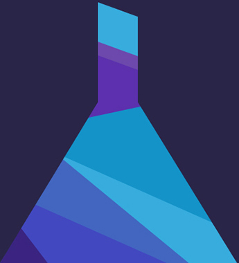
}The principle of arrangement of the elements is exactly the same as that of the base elements. So this task should not cause you any more difficulties! The result is a finished flask!
Bubble animation
We will load the flask and after a while bubbles will appear from it. They will be of different sizes and colors. The frequency of occurrence will be different.
To implement the bubbles, we will use modern CSS features, namely the border-radius property. Using this property, you can round the corners of an element. Now we will create 3 multi-colored bubbles of the same size, one slightly larger and one larger. To do this, we need to add the following markup:
And add css:
.circle {
  border-radius: 50%;
  border: 1px solid #fff;
  position: absolute;
  top: 30px;
  left: 48%;
}
.circle_small {
    width: 20px;
    height: 20px;
}
.circle_middle {
    width: 45px;
    height: 45px;
    margin-left: 2px;
    left: 42%;
}
.circle_little {
    width: 5px;
    height: 5px;
    margin-left: 4px;
}
.circle_little-white {
  background-color: #fff;
}
.little_circle_purpure {
  background-color: #6c49ac;
  border: 1px solid #6c49ac;
}
.circle_little-blue {
  background-color: #117fba;
  border: 1px solid #117fba;
}
Следующим шагом будет создание сценария анимации, используя свойство @ keyframes. Сам сценарий будет следующим. При загрузке страницы пузырьки имеют начальные координаты 20 пикселей по оси Y. При запуске анимации пузырьки начинают двигаться по оси Y от начальной координаты до -200px. Параллельно движению по оси Y пузырьки будут постепенно удаляться от пользоваться. Для этого мы используем свойство transform. Также, при движении пузырьков они плавно исчезают с помощью свойства opacity.
The script is created, now we need to specify it in the circle class. To do this, use the animation-name property and specify the script name - circle. Next, for each bubble, set the delay using animation-delay, and thus they will appear at different times. The final step is to set the animation-iteration-count parameter to repeat the animation script endlessly.
.circle {
  animation-name: circle;
  animation-duration: 5s;
  animation-iteration-count: infinite;
  animation-delay: 0s;
}
.circle_little-white {
  animation-duration: 4200ms;
}
.circle_little-purpure {
  animation-duration: 4200ms;
  animation-delay: 200ms;
}
.circle_little-blue {
  animation-duration: 4200ms;
  animation-delay: 600ms;
}
@keyframes circle {
  0% {
    transform: translateZ(0px) translateY(20px) scale(1);
    opacity: 1;
  }
  85% {
    opacity: 0;
  }
  100% {
    transform: translateZ(0px) translateY(-200px) scale(0);
    opacity: 0;
  }
}
Flask animation
To animate the bulb, I created my own script for each element:
@keyframes animation_bg_element1 {
  0% {
    border-bottom-color: #3a2481;
  }
  25% {
    border-bottom-color: #242781;
  }
  50% {
    border-bottom-color: #244081;
  }
  75% {
    border-bottom-color: #242781;
  }
}
@keyframes animation_bg_element2 {
  0% {
    border-bottom-color: #4266c0;
  }
  25% {
    border-bottom-color: #4287c0;
  }
  50% {
    border-bottom-color: #42a8c0;
  }
  75% {
    border-bottom-color: #4287c0;
  }
}
@keyframes animation_bg_element3 {
  0% {
    background-color: #4248c0;
  }
  25% {
    background-color: #4269c0;
  }
  50% {
    background-color: #428ac0;
  }
  75% {
    background-color: #4269c0;
  }
}
@keyframes animation_bg_element4 {
  0% {
    background-color: #37acdd;
  }
  25% {
    background-color: #37d8dd;
  }
  50% {
    background-color: #37ddb5;
  }
  75% {
    background-color: #37d8dd;
  }
}
@keyframes animation_bg_element5 {
  0% {
    background-color: #1493c8;
  }
  25% {
    background-color: #14c2c8;
  }
  50% {
    background-color: #14c89d;
  }
  75% {
    background-color: #14c2c8;
  }
}
@keyframes animation_bg_element6 {
  0% {
    background-color: #5c30ae;
  }
  25% {
    background-color: #3a30ae;
  }
  50% {
    background-color: #3048ae;
  }
  75% {
    background-color: #3a30ae;
  }
}
@keyframes animation_bg_element7 {
  0% {
    background-color: #6c49ac;
  }
  25% {
    background-color: #5249ac;
  }
  50% {
    background-color: #495aac;
  }
  75% {
    background-color: #5249ac;
  }
}
Now I will add an animation call in each class:
.flask__throat-one,
.flask__throat-two,
.flask__throat-three,
.flask__throat-four {
  animation-duration: 5s;
  animation-iteration-count: infinite;
  animation-delay: 0s;
}
.flask__throat-one,
.flask__throat-three {
  animation-name: animation_bg_element6;
}
.flask__throat-two {
  animation-name: animation_bg_element5;
}
.flask__throat-four {
  animation-name: animation_bg_element7;
}
.flask__bottom-one,
.flask__bottom-two,
.flask__bottom-five,
.flask__bottom-six,
.flask__bottom-seven,
.flask__bottom-eight {
  animation-duration: 5s;
  animation-iteration-count: infinite;
  animation-delay: 0s;
}
.flask__bottom-one {
  animation-name: animation_bg_element1;
}
.flask__bottom-two {
  animation-name: animation_bg_element2;
}
.flask__bottom-five {
  animation-name: animation_bg_element3;
}
flask__bottom-six {
  animation-name: animation_bg_element4;
}
.flask__bottom-seven {
  animation-name: animation_bg_element5;
}
.flask__bottom-eight {
  animation-name: animation_bg_element6;
}
Conclusion
In this article, I showed you the modern features of CSS. I hope that you will have an interest in this, and you will be able to create spectacular works. Thanks!