About one Data Science task
Hi, Habr!
As promised, I continue to publish articles in which I describe my experience after undergoing training in Data Science from the guys from MLClass.ru (by the way, who has not had time yet - I recommend registering ). This time, using the example of the Digit Recognizer task, we will study the effect of the size of the training sample on the quality of the machine learning algorithm. This is one of the very first and main questions that arise when building a predictive model.
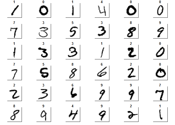
In the process of working on data analysis, there are situations when the sample size available for research is an obstacle. I met such an example when I participated in the Digit Recognizer competition held on the Kaggle website . As the object of the competition, the base of images of manually written numbers was chosen - The MNIST database of handwritten digits . Images were centered and reduced to the same size. As a training sample, a sample consisting of 42,000 such numbers is proposed. Each digit is laid out in a line of 784 signs, the value in each is its brightness.
To get started, load the full training sample into R
Now, to get an idea of the data provided, we will depict the numbers in the form familiar to the human eye.
Further, we could proceed to the construction of various models, the choice of parameters, etc. But, let's look at the data. 42,000 objects and 784 attributes. When I tried to build more complex models, such as Random Forest or Support Vector Machine, I got an error about the lack of memory, and training even on a small part of the full sample is already far from a minute. One way to deal with this is to use a significantly more powerful machine for computing, or to create clusters from several computers. But in this paper, I decided to investigate how the use of part of all the data provided for training affects the quality of the model.
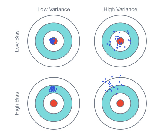
As a research tool, I use the Learning Curve or the training curve, which is a graph consisting of the dependence of the average error of the model on the data used for training and the dependence of the average error on the test data. In theory, there are two main options that will be obtained when constructing this graph.
The first option is when the model is under-trained or has a high bias . The main sign of this situation is a high average error for both training data and test data. In this case, attracting additional data will not improve the quality of the model. The second option is when the model is retrained or has great variability ( High variance) Visually, it can be determined by the presence of a large gap between the test and training curves and a low training error. Here, on the contrary, more data can lead to an improvement in the test error and, consequently, to an improvement in the model.
We divide the sample into training and test in a ratio of 60/40
If you look at the images of the numbers above, you can see that, because Since they are centered, there is a lot of space around the edges on which the number itself never happens. That is, in the data this feature will be expressed in features that have a constant value for all objects. Firstly, such signs do not carry any information for the model and, secondly, for many models, with the exception of tree-based models, they can lead to learning errors. Therefore, you can remove these characteristics from the data.
There were 532 of 784 such signs . To check how this significant change affected the quality of the models, we will train a simple CART model (which should not be adversely affected by the presence of constant signs) on the data before and after the change. The average percent error on test data is given as an estimate.
Because changes affected a hundredth of a percent, then you can use data with deleted features in the future
Finally, we construct the learning curve itself. A simple CART model was applied without changing the default parameters. To obtain statistically significant results, each assessment was carried out on each value of the sample size five times.
Averaging was performed using the GAM model
What do we see?
If to summarize, then the CART model is clearly under-trained, i.e. has a constant high bias. An increase in the sample for training will not lead to an improvement in the quality of prediction on test data. In order to improve the results of this model, it is necessary to improve the model itself, for example, by introducing additional significant features.
Now, let's evaluate the Random Forest model. Again, the model was applied “as is”, no parameters were changed. The initial sample size has been changed to 100 because a model cannot be built if there are significantly more features than objects.

Here we see a different situation.
I believe that this graph shows a possible third option, i.e. there is no retraining, because there is no gap between the curves, but there is no obvious under-education. I would say that with an increase in the sample, there will be a gradual decrease in the test and training errors until they reach the limit of the intrinsic model and the improvement stops. In this case, the schedule will be similar to uneducated. Therefore, I think that increasing the size of the sample should lead, albeit to a small, but improvement in the quality of the model and, accordingly, it makes sense.
Before you start researching the third model - Support Vector Machine , you need to once again process the data. We will carry out their standardization, as this is necessary for the "convergence" of the algorithm.
Now let's build a chart.
I think that this is just the second option from the theory, i.e. the model is retrained or has high variability. Based on this conclusion, we can confidently say that increasing the size of the training sample will lead to a significant improvement in the quality of the model.
This work showed that the Learning Curve is a good tool in the arsenal of a data researcher both to evaluate the models used and to assess the need to increase the selection of data used.
Next time I’ll talk about applying the principal component analysis (PCA) to this task.
Keep in touch!)
As promised, I continue to publish articles in which I describe my experience after undergoing training in Data Science from the guys from MLClass.ru (by the way, who has not had time yet - I recommend registering ). This time, using the example of the Digit Recognizer task, we will study the effect of the size of the training sample on the quality of the machine learning algorithm. This is one of the very first and main questions that arise when building a predictive model.
Introduction
In the process of working on data analysis, there are situations when the sample size available for research is an obstacle. I met such an example when I participated in the Digit Recognizer competition held on the Kaggle website . As the object of the competition, the base of images of manually written numbers was chosen - The MNIST database of handwritten digits . Images were centered and reduced to the same size. As a training sample, a sample consisting of 42,000 such numbers is proposed. Each digit is laid out in a line of 784 signs, the value in each is its brightness.
To get started, load the full training sample into R
library(readr)
require(magrittr)
require(dplyr)
require(caret)
data_train <- read_csv("train.csv")
Now, to get an idea of the data provided, we will depict the numbers in the form familiar to the human eye.
colors<-c('white','black')
cus_col<-colorRampPalette(colors=colors)
default_par <- par()
par(mfrow=c(6,6),pty='s',mar=c(1,1,1,1),xaxt='n',yaxt='n')
for(i in 1:36)
{
        z<-array(as.matrix(data_train)[i,-1],dim=c(28,28))
        z<-z[,28:1]
        image(1:28,1:28,z,main=data_train[i,1],col=cus_col(256))
}
par(default_par)
Further, we could proceed to the construction of various models, the choice of parameters, etc. But, let's look at the data. 42,000 objects and 784 attributes. When I tried to build more complex models, such as Random Forest or Support Vector Machine, I got an error about the lack of memory, and training even on a small part of the full sample is already far from a minute. One way to deal with this is to use a significantly more powerful machine for computing, or to create clusters from several computers. But in this paper, I decided to investigate how the use of part of all the data provided for training affects the quality of the model.
Learning Curve Theory
As a research tool, I use the Learning Curve or the training curve, which is a graph consisting of the dependence of the average error of the model on the data used for training and the dependence of the average error on the test data. In theory, there are two main options that will be obtained when constructing this graph.
The first option is when the model is under-trained or has a high bias . The main sign of this situation is a high average error for both training data and test data. In this case, attracting additional data will not improve the quality of the model. The second option is when the model is retrained or has great variability ( High variance) Visually, it can be determined by the presence of a large gap between the test and training curves and a low training error. Here, on the contrary, more data can lead to an improvement in the test error and, consequently, to an improvement in the model.
Data processing
We divide the sample into training and test in a ratio of 60/40
data_train$label <- as.factor(data_train$label)
set.seed(111)
split <- createDataPartition(data_train$label, p = 0.6, list = FALSE)
train <- slice(data_train, split)
test <- slice(data_train, -split)
If you look at the images of the numbers above, you can see that, because Since they are centered, there is a lot of space around the edges on which the number itself never happens. That is, in the data this feature will be expressed in features that have a constant value for all objects. Firstly, such signs do not carry any information for the model and, secondly, for many models, with the exception of tree-based models, they can lead to learning errors. Therefore, you can remove these characteristics from the data.
zero_var_col <- nearZeroVar(train, saveMetrics = T)
sum(zero_var_col$nzv)
## [1] 532
train_nzv <- train[, !zero_var_col$nzv]
test_nzv <- test[, !zero_var_col$nzv]
There were 532 of 784 such signs . To check how this significant change affected the quality of the models, we will train a simple CART model (which should not be adversely affected by the presence of constant signs) on the data before and after the change. The average percent error on test data is given as an estimate.
library(rpart)
model_tree <- rpart(label ~ ., data = train, method="class" )
predict_data_test <- predict(model_tree, newdata = test, type = "class")
sum(test$label != predict_data_test)/nrow(test)
## [1] 0.383507
model_tree_nzv <- rpart(label ~ ., data = train_nzv, method="class" )
predict_data_test_nzv <- predict(model_tree_nzv, newdata = test_nzv, type = "class")
sum(test_nzv$label != predict_data_test_nzv)/nrow(test_nzv)
## [1] 0.3838642
Because changes affected a hundredth of a percent, then you can use data with deleted features in the future
train <- train[, !zero_var_col$nzv]
test <- test[, !zero_var_col$nzv]
CART
Finally, we construct the learning curve itself. A simple CART model was applied without changing the default parameters. To obtain statistically significant results, each assessment was carried out on each value of the sample size five times.
learn_curve_data <- data.frame(integer(),
                               double(),
                               double())
for (n in 1:5 )
{
        for (i in seq(1, 2000, by = 200))
        {
                train_learn <- train[sample(nrow(train), size = i),]
                test_learn <- test[sample(nrow(test), size = i),]
                model_tree_learn <- rpart(label ~ ., data = train_learn, method="class" )
                predict_train_learn <- predict(model_tree_learn, type = "class")
                error_rate_train_rpart <- sum(train_learn$label != predict_train_learn)/i
                predict_test_learn <- predict(model_tree_learn, newdata = test_learn, type = "class")
                error_rate_test_rpart <- sum(test_learn$label != predict_test_learn)/i
                learn_curve_data <- rbind(learn_curve_data, c(i, error_rate_train_rpart, error_rate_test_rpart))
        }
}
Averaging was performed using the GAM model
colnames(learn_curve_data) <- c("Size", "Train_Error_Rate", "Test_Error_Rate")
library(reshape2)
library(ggplot2)
learn_curve_data_long <- melt(learn_curve_data, id = "Size")
ggplot(data=learn_curve_data_long, aes(x=Size, y=value, colour=variable)) +
        geom_point() + stat_smooth(method = "gam", formula = y ~ s(x), size = 1)
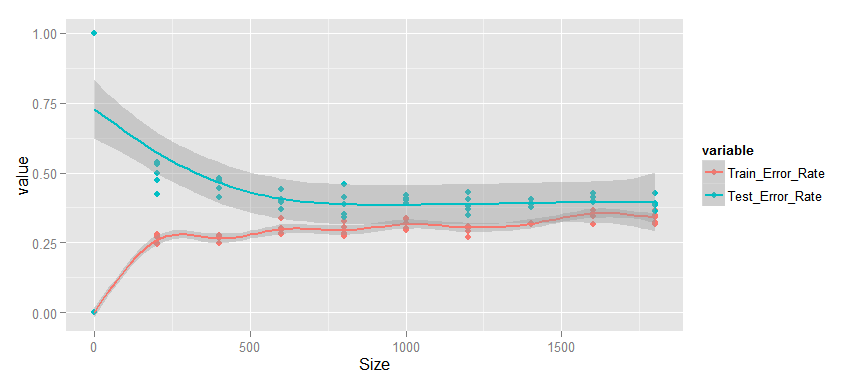
What do we see?
- The change in the average percentage of errors occurs monotonously, starting with 500 objects in the sample.
- The error for both training and test data is quite high.
- The gap between test and training data is small.
- Test error is not reduced.
If to summarize, then the CART model is clearly under-trained, i.e. has a constant high bias. An increase in the sample for training will not lead to an improvement in the quality of prediction on test data. In order to improve the results of this model, it is necessary to improve the model itself, for example, by introducing additional significant features.
Random forest
Now, let's evaluate the Random Forest model. Again, the model was applied “as is”, no parameters were changed. The initial sample size has been changed to 100 because a model cannot be built if there are significantly more features than objects.
library(randomForest)
learn_curve_data <- data.frame(integer(),
                               double(),
                               double())
for (n in 1:5 )
{
        for (i in seq(100, 5100, by = 1000))
        {
                train_learn <- train[sample(nrow(train), size = i),]
                test_learn <- test[sample(nrow(test), size = i),]
                model_learn <- randomForest(label ~ ., data = train_learn)
                predict_train_learn <- predict(model_learn)
                error_rate_train <- sum(train_learn$label != predict_train_learn)/i
                predict_test_learn <- predict(model_learn, newdata = test_learn)
                error_rate_test <- sum(test_learn$label != predict_test_learn)/i
                learn_curve_data <- rbind(learn_curve_data, c(i, error_rate_train, error_rate_test))
        }
}
colnames(learn_curve_data) <- c("Size", "Train_Error_Rate", "Test_Error_Rate")
learn_curve_data_long <- melt(learn_curve_data, id = "Size")
ggplot(data=learn_curve_data_long, aes(x=Size, y=value, colour=variable)) +
        geom_point() + stat_smooth()
Here we see a different situation.
- The change in the average error percentage also occurs monotonously.
- Test and training errors are small and continue to decrease.
- The gap between test and training data is small.
I believe that this graph shows a possible third option, i.e. there is no retraining, because there is no gap between the curves, but there is no obvious under-education. I would say that with an increase in the sample, there will be a gradual decrease in the test and training errors until they reach the limit of the intrinsic model and the improvement stops. In this case, the schedule will be similar to uneducated. Therefore, I think that increasing the size of the sample should lead, albeit to a small, but improvement in the quality of the model and, accordingly, it makes sense.
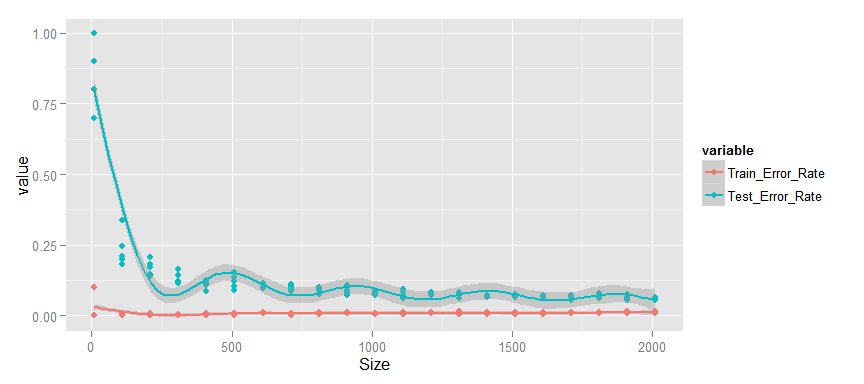
Support Vector Machine
Before you start researching the third model - Support Vector Machine , you need to once again process the data. We will carry out their standardization, as this is necessary for the "convergence" of the algorithm.
library("e1071")
scale_model <- preProcess(train[, -1], method = c("center", "scale"))
train_scale <- predict(scale_model, train[, -1])
train_scale <- cbind(train[, 1], train_scale)
test_scale <- predict(scale_model, test[, -1])
test_scale <- cbind(test[, 1], test_scale)
Now let's build a chart.
learn_curve_data <- data.frame(integer(),
                               double(),
                               double())
for (n in 1:5 )
{
        for (i in seq(10, 2010, by = 100))
        {
                train_learn <- train_scale[sample(nrow(train_scale), size = i),]
                test_learn <- test_scale[sample(nrow(test_scale), size = i),]
                model_learn <- svm(label ~ ., data = train_learn, kernel = "radial", scale = F)
                predict_train_learn <- predict(model_learn)
                error_rate_train <- sum(train_learn$label != predict_train_learn)/i
                predict_test_learn <- predict(model_learn, newdata = test_learn)
                error_rate_test <- sum(test_learn$label != predict_test_learn)/i
                learn_curve_data <- rbind(learn_curve_data, c(i, error_rate_train, error_rate_test))
        }
}
colnames(learn_curve_data) <- c("Size", "Train_Error_Rate", "Test_Error_Rate")
learn_curve_data_long <- melt(learn_curve_data, id = "Size")
ggplot(data=learn_curve_data_long, aes(x=Size, y=value, colour=variable)) +
        geom_point() + stat_smooth(method = "gam", formula = y ~ s(x), size = 1)
- Training error is very small.
- There is a significant gap between the test and training curve, which monotonously decreases.
- The test error is small enough and continues to decrease.
I think that this is just the second option from the theory, i.e. the model is retrained or has high variability. Based on this conclusion, we can confidently say that increasing the size of the training sample will lead to a significant improvement in the quality of the model.
conclusions
This work showed that the Learning Curve is a good tool in the arsenal of a data researcher both to evaluate the models used and to assess the need to increase the selection of data used.
Next time I’ll talk about applying the principal component analysis (PCA) to this task.
Keep in touch!)