How to declaratively describe a collapsing toolbar

I want to present a solution of how to describe CollapsingToolbar, with an emphasis on readability of the code. The article will not explain what it is and how to write your CoordinatorLayout.Behavior. If the reader is interested in understanding this, there are many articles, including on Habré . If you do not want to understand - nothing terrible: I tried to take out the writing of CollapsingToolbar so that you can abstract away from CoordinatorLayout.Behavior and OnOffsetChangedListener.
Terms
- Toolbar - a set of views that we want to display at the top of the screen (not android.widget.Toolbar).
- NestedScroll - any scrolling view that can be associated with AppBarLayout (RecyclerView, NestedScrollView).
Why did you need to write your decision
I looked at several approaches on the Internet, and almost all were built as follows:
- Sets a fixed height for AppBarLayout.
- It is written by CoordinatorLayout.Behavior, in which by some calculations (the cached height of the view is added from the bottom of another view and minus the margin multiplied by the scroll calculated here) change some twist.
- Others swap in OnOffsetChangedListener AppBarLayout.
Here is an example of Behavior with the described approach, 2.5k stars on Github.
Expectation
Reality: put on your oneplus
It is possible to correct the layout for this solution, but I am confused by something else. Some view can be managed through OnOffsetChangedListener, some through Behavior, something works out of the box. The developer, in order to understand the whole picture, will have to go over a variety of classes, and if for a new view you have to add behavior that depends on other Behaviors and on the view that changes in OnOffsetChangedListener, crutches and bugs can grow on level ground
Besides, in This example does not show how to be if additional elements are added to the toolbar that affect the height of this tulabar.
In the gif at the beginning of the article, you can see how TextView is hidden by clicking on the button - and NestedScroll is pulled higher so that empty space does not occur).
gif one more time
How to do it? The solutions that first come to mind are to write another CoordinatorLayout.Behavior for NestedScroll (keeping the logic of the base AppBarLayout.Behavior) or stick the toolbar into AppBarLayout and change it to OnOffsetChangedListener. I tried both solutions, and I got code tied to the implementation details, which would be quite difficult for someone else to figure out and could not be reused.
I would be glad if someone shares an example where such logic is implemented “purely”, but for now I will show my decision. The idea is to be able to declaratively describe in one place which views and how you should behave.
What does api look like
So, to create the CoordinatorLayout.Behavior you need:
- inherit BehaviorByRules;
- override the methods that return AppBarLayout, CollapsingToolbarLayout and the length of the scroll (the height of the AppBarLayout).
- override the setUpViews method - describe the rules, how the view will behave when the appBar changes.
TopInfoBehavior for the GIF toolbar at the beginning of the article will look like this (I will explain how it works later in the article):
Layout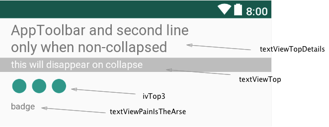
TopInfoBehavior.kt
classTopInfoBehavior(
        context: Context?,
        attrs: AttributeSet?
) : BehaviorByRules(context, attrs) {
    override fun calcAppbarHeight(child: View): Int = with(child) {
        return (height + pixels(R.dimen.toolbar_height)).toInt()
    }
    override fun View.provideAppbar(): AppBarLayout = ablAppbar
    override fun View.provideCollapsingToolbar(): CollapsingToolbarLayout
            = ctlToolbar
    override fun View.setUpViews(): List<RuledView> = listOf(
        RuledView(
                viewGroupTopDetails,
                BRuleYOffset(
                    min = pixels(R.dimen.zero),
                    max = pixels(R.dimen.toolbar_height)
                )
        ),
        RuledView(
                textViewTopDetails,
                BRuleAlpha(min = 0.6f, max = 1f)
                    .workInRange(from = appearedUntil, to = 1f),
                BRuleXOffset(
                    min = 0f, max = pixels(R.dimen.big_margin),
                    interpolator =
                    ReverseInterpolator(AccelerateInterpolator())
                ),
                BRuleYOffset(
                    min = pixels(R.dimen.zero), max = pixels(R.dimen.pad),
                    interpolator = ReverseInterpolator(LinearInterpolator())
                ),
                BRuleAppear(0.1f),
                BRuleScale(min = 0.8f, max = 1f)
        ),
        RuledView(
                textViewPainIsTheArse,
                BRuleAppear(isAppearedUntil = GONE_VIEW_THRESHOLD)
        ),
        RuledView(
                textViewCollapsedTop,
                BRuleAppear(0.1f, true)
        ),
        RuledView(
                textViewTop,
                BRuleAppear(isAppearedUntil = GONE_VIEW_THRESHOLD)
        ),
        buildRuleForIcon(ivTop, LinearInterpolator()),
        buildRuleForIcon(ivTop2, AccelerateInterpolator(0.7f)),
        buildRuleForIcon(ivTop3, AccelerateInterpolator())
    )
    private fun View.buildRuleForIcon(
            view: ImageView,
            interpolator: Interpolator
    ) = RuledView(
        view,
        BRuleYOffset(
                min = -(ivTop3.y - tvCollapsedTop.y),
                max = 0f,
                interpolator = DecelerateInterpolator(1.5f)
        ),
        BRuleXOffset(
                min = 0f,
                max = tvCollapsedTop.width.toFloat() + pixels(R.dimen.huge_margin),
                interpolator = ReverseInterpolator(interpolator)
        )
    )
    companion object {
        const val GONE_VIEW_THRESHOLD = 0.8f
    }
}
Xml layout (removed obvious attributes for readability)
<android.support.design.widget.CoordinatorLayout><android.support.design.widget.AppBarLayoutandroid:layout_height="wrap_content"><android.support.design.widget.CollapsingToolbarLayoutapp:layout_scrollFlags="scroll|exitUntilCollapsed"><android.support.v7.widget.Toolbarandroid:layout_height="@dimen/toolbar_height"app:layout_collapseMode="pin"/></android.support.design.widget.CollapsingToolbarLayout></android.support.design.widget.AppBarLayout><!--весь тулбар здесь--><RelativeLayoutandroid:translationZ="5dp"app:layout_behavior="TopInfoBehavior"/><android.support.v4.widget.NestedScrollViewapp:layout_behavior="@string/appbar_scrolling_view_behavior"></android.support.v4.widget.NestedScrollView><android.support.design.widget.FloatingActionButtonapp:layout_anchor="@id/nesteScroll"app:layout_anchorGravity="right"/></android.support.design.widget.CoordinatorLayout>How it works
The task is to write the rules:
interfaceBehaviorRule{
    /**
     * @param view to be changed
     * @param details view's data when first attached
     * @param ratio in range [0, 1]; 0 when toolbar is collapsed
     */funmanage(ratio: Float, details: InitialViewDetails, view: View)
}
Everything is clear here - a float value from 0 to 1 comes in, reflecting the percentage of ActionBar, and I get the view and its initial state. BaseBehaviorRule looks more interesting - a rule from which other basic rules are inherited.
abstractclassBaseBehaviorRule : BehaviorRule {abstractval interpolator: Interpolator
    abstractval min: Floatabstractval max: Floatfinaloverridefunmanage(
            ratio: Float,
            details: InitialViewDetails,
            view: View
    ) {
        val interpolation = interpolator.getInterpolation(ratio)
        val offset = normalize(
                oldValue = interpolation,
                newMin = min, newMax = max
        )
        perform(offset, details, view)
    }
    /**
     * @param offset normalized with range from [min] to [max] with [interpolator]
     */abstractfunperform(offset: Float, details: InitialViewDetails, view: View)
}
/**
 * Affine transform value form one range into another
 */funnormalize(
        oldValue: Float,
        newMin: Float, newMax: Float,
        oldMin: Float = 0f, oldMax: Float = 1f
): Float = newMin + ((oldValue - oldMin) * (newMax - newMin)) / (oldMax - oldMin)
For basic rules, the range of values (min, max) and interpolator is determined. This is enough to describe almost any behavior.
Suppose we want to set an alpha for our twist in the range 0.5 to 0.9. We also want the scroll to quickly become transparent at first, and then the rate of change will fall.
The rule will look like this:
BRuleAlpha(min = 0.5f, max = 0.9f, interpolator = DecelerateInterpolator())But the implementation of BRuleAlpha:
BRuleAlpha.kt
/**
 * [min], [max] — values in range [0, 1]
 */class BRuleAlpha(
        override val min: Float,
        override val max: Float,
        override val interpolator: Interpolator = LinearInterpolator()
) : BaseBehaviorRule() {
    override fun perform(offset: Float, details: InitialViewDetails, view: View) {
        view.alpha = offset
    }
}
And finally, the code BehaviorByRules. For those who wrote their Behavior, everything should be obvious (except that inside onMeasureChild, I’ll tell you about it below):
BehaviorByRules.kt
abstractclassBehaviorByRules(
        context: Context?,
        attrs: AttributeSet?
) : CoordinatorLayout.Behavior<View>(context, attrs) {
    privatevar views: List<RuledView> = emptyList()
    privatevar lastChildHeight = -1privatevar needToUpdateHeight: Boolean = trueoverridefunlayoutDependsOn(
            parent: CoordinatorLayout,
            child: View,
            dependency: View
    ): Boolean {
        return dependency is AppBarLayout
    }
    overridefunonDependentViewChanged(
            parent: CoordinatorLayout,
            child: View,
            dependency: View
    ): Boolean {
        if (views.isEmpty()) views = child.setUpViews()
        val progress = calcProgress(parent)
        views.forEach { performRules(offsetView = it, percent = progress) }
        tryToInitHeight(child, dependency, progress)
        returntrue
    }
    overridefunonMeasureChild(
            parent: CoordinatorLayout, child: View, parentWidthMeasureSpec: Int,
            widthUsed: Int, parentHeightMeasureSpec: Int, heightUsed: Int
    ): Boolean {
        val canUpdateHeight = canUpdateHeight(calcProgress(parent))
        if (canUpdateHeight) {
            parent.post {
                val newChildHeight = child.height
                if (newChildHeight != lastChildHeight) {
                    lastChildHeight = newChildHeight
                    setUpAppbarHeight(child, parent)
                }
            }
        } else {
            needToUpdateHeight = true
        }
        returnsuper.onMeasureChild(
                parent, child, parentWidthMeasureSpec,
                widthUsed, parentHeightMeasureSpec, heightUsed
        )
    }
    /**
     * If you use fitsSystemWindows=true in your coordinator layout,
     * you will have to include statusBar height in the appbarHeight
     */protectedabstractfuncalcAppbarHeight(child: View): Intprotectedabstractfun View.setUpViews(): List<RuledView>
    protectedabstractfun View.provideAppbar(): AppBarLayout
    protectedabstractfun View.provideCollapsingToolbar(): CollapsingToolbarLayout
    /**
     * You man not want to update height, if height depends on views, that are currently invisible
     */protectedopenfuncanUpdateHeight(progress: Float): Boolean = trueprivatefuncalcProgress(parent: CoordinatorLayout): Float {
        val appBar = parent.provideAppbar()
        val scrollRange = appBar.totalScrollRange.toFloat()
        val scrollY = Math.abs(appBar.y)
        val scroll = 1 - scrollY / scrollRange
        returnwhen {
            scroll.isNaN() -> 1felse -> scroll
        }
    }
    privatefunsetUpAppbarHeight(child: View, parent: ViewGroup) {
        parent.provideCollapsingToolbar().setHeight(calcAppbarHeight(child))
    }
    privatefuntryToInitHeight(child: View, dependency: View, scrollPercent: Float) {
        if (needToUpdateHeight && canUpdateHeight(scrollPercent)) {
            setUpAppbarHeight(child, dependency as ViewGroup)
            needToUpdateHeight = false
        }
    }
    privatefunperformRules(offsetView: RuledView, percent: Float) {
        val view = offsetView.view
        val details = offsetView.details
        offsetView.rules.forEach { rule ->
            rule.manage(percent, details, view)
        }
    }
}
So what's up with onMeasureChild?
This is needed to solve the problem I wrote about above: if some part of the toolbar disappears, NestedScroll should go higher. To make it higher, you need to reduce the height of CollapsingToolbarLayout.
There is another non-obvious method - canUpdateHeight. It is needed so that the heir can be allowed to set a rule when heights cannot be changed. For example, if the view on which the height depends is currently hidden. I'm not sure that this will cover all cases, but if anyone has any ideas on how to do better, please write down in the comments or in a personal note.
Rakes that can be stepped on when working with CollapsingToolbarLayout
- Changing the view should avoid onLayout. For example, you should not change the layoutParams or textSize inside the BehaviorRule, otherwise it will strongly promise performance.
- If you want to work with the toolbar through OnOffsetChangedListener, onLayout is even more dangerous - the onOffsetChanged method will be triggered endlessly.
- CoordinatorLayout.Behavior should not depend on the layout (layoutDependsOn), which can go into visibility GONE. When this view returns to View.VISIBLE, Behavior will not respond.
- If the toolbar is outside the AppBarLayout, then in order not to overlap the toolbar, you need to add the android attribute: translationZ = "5dp" to the parent ViewGroup of the toolbar.
Finally
We have a solution that allows you to quickly outline your CollapsingToolbarLayout with logic that will be relatively easy to read and modify. All rules and dependencies are formed within one class - CoordinatorLayout.Behavior. The code can be viewed on the githaba .