UX in e-Commerce: 3 positive and negative design trends
- Transfer
Translator's Note: Nielsen Normann Group is one of the leading research organizations in the field of UX and usability and produces very interesting reports on these topics. That is why we decided to transfer one of their latest research related primarily to UX in e-commerce. Enjoy reading!
Now ecommerce sites pay more attention to product descriptions and their photos, facilitate navigation in those places of the site that are devoted to issues of obtaining discounts and coupons - all this helps users to make purchases. However, some new problems were discovered, such as minimizing or hiding the product description and other details. The old problem remains - on a huge number of online store sites, it is impossible to understand whether the product has been added to the basket. Another of the new trends of mistakes is that the fashion for clogging the customer service area on such sites with unnecessary information came from somewhere. To begin, let's talk about positive trends and trends.
There are several reasons for this - the fact that the screens themselves and their resolutions are constantly increasing has also played a role, in addition, it comes to the realization that this has a positive effect on usability.
Images from grocery cards have become larger, so you can see the product in more detail. Everyone knows that on the website of an online store one picture can replace a thousand words, and a good picture can bring thousands of dollars. With the help of images, potential customers can find out about the product that is not indicated in its description - for example, whether small buns will fit in a particular toaster or if its holes are suitable only for standard slices of bread.
On the pages of product categories, images have also become larger, which helps the user to better navigate the assortment and buy exactly what you need.
With all this, it is important to point out two points. First, the pictures should not look like advertising banners, otherwise they will be ignored. Second, images from photo stocks can do more harm than good. When it comes to the use of large images, it is understood that these should be images of real goods (including an image of their actual use).
Note perev: In Russia, small online stores that do not have sufficient resources to create high-quality eCommerce content can connect to special b2b portalsuniting suppliers of goods and providing their quality descriptions and photos.
Product reviews can help potential buyers learn more about product quality and how best to use it. Reviews can dispel many doubts about the appropriateness of the purchase, because they are written from the point of view of the real person who wanted, bought and used this particular product. Therefore, the availability of reviews is necessary, but the effect of them can be further enhanced by adding a little additional information or combining data from several of them according to some criterion.
Many sites add additional important details to the reviews, such as information about the person who wrote the review (gender, age) or the specific parameter by which the product was priced like size or quality. In addition, often users can evaluate the quality of a review by rating it. Then the reviews can be summarized by combining the positive and negative in different categories, or even make quotes from the most popular reviews on the product description page.
Such additional information can help users better understand the pros and cons of products, take into account the opinions of different people. Details about the author of the review also provide an opportunity to compare the value of the recall with the user's own situation (it is unlikely that a young girl will listen strongly to the opinion of a conditional 50-year-old man), and combining reviews in case of a large number of them helps to better understand the general mood of customers and highlight the strong and weak side of the goods.
In the past, there was often a situation where it was very difficult for users to use codes and coupons to receive discounts on online store sites. Now, many began to think about improving the user experience in this direction. In particular, the automatic distribution of discounts to those site visitors who meet certain requirements is becoming more widespread. It also becomes easier to enter the code or coupon already received - some sites make it possible to do this a few steps before reaching the final payment page for the goods.

The approach, when in pursuit of increasing profits, online stores complicate the process of obtaining discounts for users, can lead to an increase in the number of dissatisfied customers, and therefore to a decrease in sales. And vice versa - if the discount can be used easily and without problems, then people may well want to spend even more money on the site in order, for example, to get the right to free delivery (it is logical to offer it after reaching a certain purchase amount).
We discussed positive trends in UX online stores, but not everything is so smooth, and there are also negative points. So what is bad in this area?
More and more online stores stop publishing product descriptions. The description is often placed in the area of the web page where the user is not so easy to get to, often such descriptions are separated from the images of the goods, hidden behind various links and compressed into small frames on the page. Perhaps here we are witnessing the impact of mobile design on the development of desktop sites, expressed in the desire to create concise content that is clearly visible on screens of various sizes.
On the other hand, the growth of images of goods, which we noted as a positive point above, cannot occur due to a decrease in the blocks with their description. This information answers important questions such as price, pros, warranty, materials and sizes of the product sold. Yes, a 1000-word description does not have to be the first thing that users see on a page, but it certainly should be easily accessible.
Product information on the site can be displayed in layers. If you need to save space, it should still be enough for a short description at the top of the page with a link to a more detailed description, which should be clear and understandable. In any case, users will look for detailed information about the product, so that you do not have the task of dumping all the data on them at once, but the most important issues must be addressed.
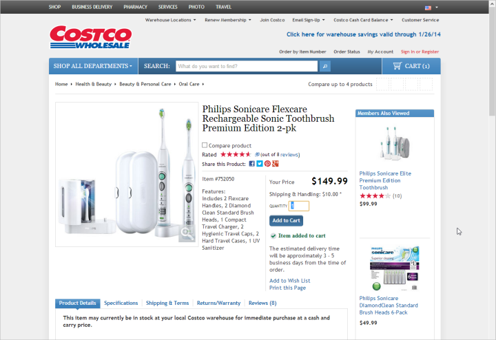
Users do not have to wonder if the item has been added to the cart. It is so obvious that the number of sites that cannot deal with this element is simply impressive.
This is the most important thing - users do not want to comb the page up and down to understand exactly whether they managed to put the product in the basket. This action should be carried out quickly, clearly and be clearly understood.
Feedback on adding goods to the basket can be implemented in many ways - from overlay to modal windows. What exactly does not work here is adding an extra line of text to the page or displaying a product counter next to the basket icon in the corner of the page. Most people simply will not notice these changes.
Uncertainty about the moment a product is added to the basket can lead to a variety of sad consequences. For example, a user can interrupt the purchase process and go check the basket to make sure that there is something to pay for. Someone can add goods to it twice, instead of one, and then, having discovered this, accuse the store of trying to cheat. This leads to loss of reputation and customers.
Here is an example of a failed solution:
Many eCommerce sites become easier and more understandable over time. This impression lasts right up to the moment when you go to the page containing the contact information - most of these pages are completely incomprehensible, confusing and overloaded with information.
If the user goes to the contact page, it means that he has already encountered some problem or wants to ask a question. What kind of message do you send to your users if all the pages related to receiving money from them are cleaned and licked to perfect condition, and those that are devoted to the issues of communicating with them are cloudy and incomprehensible?
Since online stores pay so much attention to the design of the main part of their sites, do not forget about the less important at first glance (but only at the first!) Pages with which users can ask you questions, get an exhaustive answer and buy something- sometime. If the design of the main site does not match the appearance of the contact page, this can confuse users and raise doubts about the adequacy of the information presented on the site.
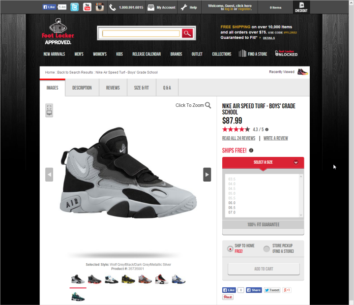
Here is a striking example of such a situation. The product pages on the FootLocker website are clear, understandable, there is a lot of free space, large pictures and well-read text.
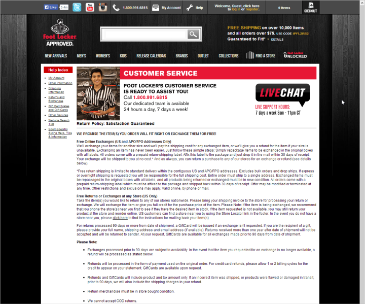
Everything is completely wrong on the contact page:
We have been studying the usability of e-commerce sites since 2000, and when preparing each new report, we clearly see that the recommendations formulated many years ago are also applicable in evaluating modern versions of online store sites. In general, it can be argued that, despite some improvements, eCommerce sites still have work to do - a lot of old problems still remain unresolved, in addition, some new ones are added to them.
Sammari : In a recent study, we found some improvements in UX online stores: product photos became larger, product reviews and descriptions became more informative, and discount systems were easier. On the other hand, even in the new design on many sites it’s hard to find product information, the sites themselves are not very “responsive” and cluttered with unnecessary elements.
Now ecommerce sites pay more attention to product descriptions and their photos, facilitate navigation in those places of the site that are devoted to issues of obtaining discounts and coupons - all this helps users to make purchases. However, some new problems were discovered, such as minimizing or hiding the product description and other details. The old problem remains - on a huge number of online store sites, it is impossible to understand whether the product has been added to the basket. Another of the new trends of mistakes is that the fashion for clogging the customer service area on such sites with unnecessary information came from somewhere. To begin, let's talk about positive trends and trends.
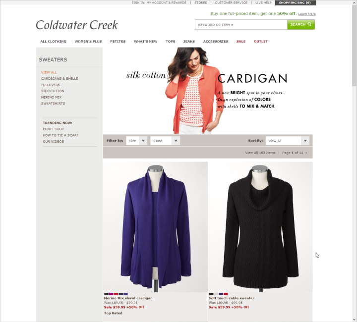
Larger product photos
There are several reasons for this - the fact that the screens themselves and their resolutions are constantly increasing has also played a role, in addition, it comes to the realization that this has a positive effect on usability.
Images from grocery cards have become larger, so you can see the product in more detail. Everyone knows that on the website of an online store one picture can replace a thousand words, and a good picture can bring thousands of dollars. With the help of images, potential customers can find out about the product that is not indicated in its description - for example, whether small buns will fit in a particular toaster or if its holes are suitable only for standard slices of bread.
On the pages of product categories, images have also become larger, which helps the user to better navigate the assortment and buy exactly what you need.
With all this, it is important to point out two points. First, the pictures should not look like advertising banners, otherwise they will be ignored. Second, images from photo stocks can do more harm than good. When it comes to the use of large images, it is understood that these should be images of real goods (including an image of their actual use).
Note perev: In Russia, small online stores that do not have sufficient resources to create high-quality eCommerce content can connect to special b2b portalsuniting suppliers of goods and providing their quality descriptions and photos.
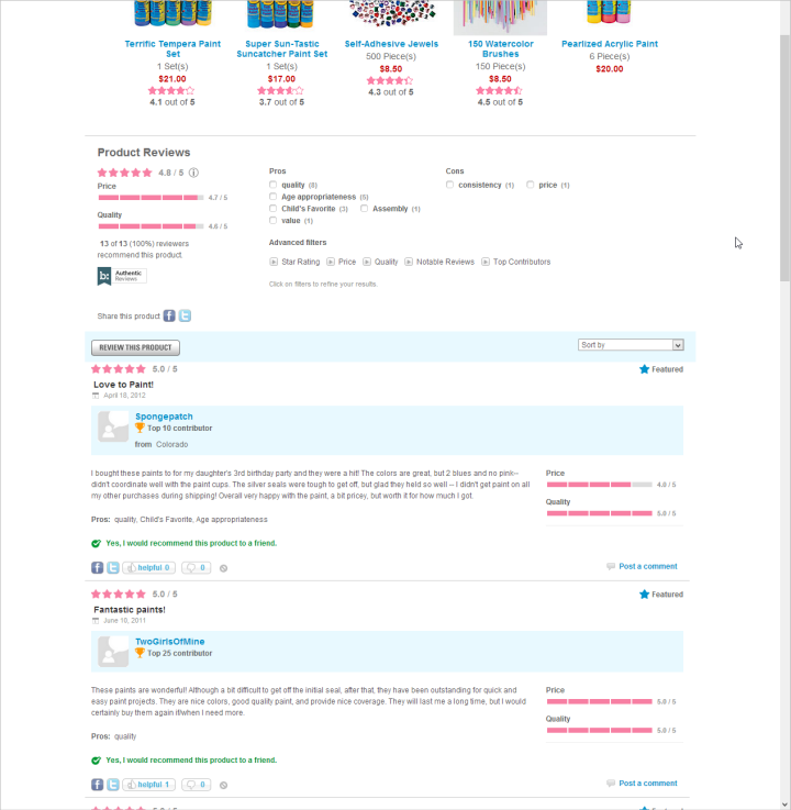
Better Reviews
Product reviews can help potential buyers learn more about product quality and how best to use it. Reviews can dispel many doubts about the appropriateness of the purchase, because they are written from the point of view of the real person who wanted, bought and used this particular product. Therefore, the availability of reviews is necessary, but the effect of them can be further enhanced by adding a little additional information or combining data from several of them according to some criterion.
Many sites add additional important details to the reviews, such as information about the person who wrote the review (gender, age) or the specific parameter by which the product was priced like size or quality. In addition, often users can evaluate the quality of a review by rating it. Then the reviews can be summarized by combining the positive and negative in different categories, or even make quotes from the most popular reviews on the product description page.
Such additional information can help users better understand the pros and cons of products, take into account the opinions of different people. Details about the author of the review also provide an opportunity to compare the value of the recall with the user's own situation (it is unlikely that a young girl will listen strongly to the opinion of a conditional 50-year-old man), and combining reviews in case of a large number of them helps to better understand the general mood of customers and highlight the strong and weak side of the goods.
Using coupons
In the past, there was often a situation where it was very difficult for users to use codes and coupons to receive discounts on online store sites. Now, many began to think about improving the user experience in this direction. In particular, the automatic distribution of discounts to those site visitors who meet certain requirements is becoming more widespread. It also becomes easier to enter the code or coupon already received - some sites make it possible to do this a few steps before reaching the final payment page for the goods.
The approach, when in pursuit of increasing profits, online stores complicate the process of obtaining discounts for users, can lead to an increase in the number of dissatisfied customers, and therefore to a decrease in sales. And vice versa - if the discount can be used easily and without problems, then people may well want to spend even more money on the site in order, for example, to get the right to free delivery (it is logical to offer it after reaching a certain purchase amount).
We discussed positive trends in UX online stores, but not everything is so smooth, and there are also negative points. So what is bad in this area?
Small and hidden product descriptions
More and more online stores stop publishing product descriptions. The description is often placed in the area of the web page where the user is not so easy to get to, often such descriptions are separated from the images of the goods, hidden behind various links and compressed into small frames on the page. Perhaps here we are witnessing the impact of mobile design on the development of desktop sites, expressed in the desire to create concise content that is clearly visible on screens of various sizes.
On the other hand, the growth of images of goods, which we noted as a positive point above, cannot occur due to a decrease in the blocks with their description. This information answers important questions such as price, pros, warranty, materials and sizes of the product sold. Yes, a 1000-word description does not have to be the first thing that users see on a page, but it certainly should be easily accessible.
Product information on the site can be displayed in layers. If you need to save space, it should still be enough for a short description at the top of the page with a link to a more detailed description, which should be clear and understandable. In any case, users will look for detailed information about the product, so that you do not have the task of dumping all the data on them at once, but the most important issues must be addressed.
Adding items to the cart
Users do not have to wonder if the item has been added to the cart. It is so obvious that the number of sites that cannot deal with this element is simply impressive.
This is the most important thing - users do not want to comb the page up and down to understand exactly whether they managed to put the product in the basket. This action should be carried out quickly, clearly and be clearly understood.
Feedback on adding goods to the basket can be implemented in many ways - from overlay to modal windows. What exactly does not work here is adding an extra line of text to the page or displaying a product counter next to the basket icon in the corner of the page. Most people simply will not notice these changes.
Uncertainty about the moment a product is added to the basket can lead to a variety of sad consequences. For example, a user can interrupt the purchase process and go check the basket to make sure that there is something to pay for. Someone can add goods to it twice, instead of one, and then, having discovered this, accuse the store of trying to cheat. This leads to loss of reputation and customers.
Here is an example of a failed solution:
Confusing contact details pages
Many eCommerce sites become easier and more understandable over time. This impression lasts right up to the moment when you go to the page containing the contact information - most of these pages are completely incomprehensible, confusing and overloaded with information.
If the user goes to the contact page, it means that he has already encountered some problem or wants to ask a question. What kind of message do you send to your users if all the pages related to receiving money from them are cleaned and licked to perfect condition, and those that are devoted to the issues of communicating with them are cloudy and incomprehensible?
Since online stores pay so much attention to the design of the main part of their sites, do not forget about the less important at first glance (but only at the first!) Pages with which users can ask you questions, get an exhaustive answer and buy something- sometime. If the design of the main site does not match the appearance of the contact page, this can confuse users and raise doubts about the adequacy of the information presented on the site.
Here is a striking example of such a situation. The product pages on the FootLocker website are clear, understandable, there is a lot of free space, large pictures and well-read text.
Everything is completely wrong on the contact page:
conclusions
We have been studying the usability of e-commerce sites since 2000, and when preparing each new report, we clearly see that the recommendations formulated many years ago are also applicable in evaluating modern versions of online store sites. In general, it can be argued that, despite some improvements, eCommerce sites still have work to do - a lot of old problems still remain unresolved, in addition, some new ones are added to them.