Tale of vintage icons. Riddle of 18 colors. Transparent and inverse colors
Few people now do not care about extra kilobytes or two. But there are such people, and just for such a person's zadrota , this note was written. )
In those single instances when I needed to write down the expressive icon (.ico) of the application and at the same time I had to save bytes, I used the following hack: I recorded the image in 16-color mode - but! - not in the usual fixed palette, but in adaptive.
What does this give? Icon 48x48, 1-bit transparency, 256 colors = 3774 bytes, it is also in 16 colors = 1662 bytes. Win - 2 kilobytes, with a slight drop in image quality.

Example. From left to right:
How it works? Oddly enough, the 16-color icon always carries a palette. That is, 99.9% of old icons carry exactly the same 64-byte color table (4 bytes per color). And yes, it turns out it can be reprogrammed.
Unfortunately, I am not familiar with the program that I can fully work with this kind of icons. Therefore, here’s a recipe for “defective” to concoct a similar icon: take IrfanView, load a picture into it: either a 16-color pre-prepared or reduce the number of colors right in it: menu - image - reduce color depth ... - 16 colors. Now: menu - save as ... - select the .ico format. Everything? No, not everything: Irfan View does not know how to work with transparency, it will have to be manually restored in another program. Microangelo Studio can download and edit such icons (alas, it does not allow creating a library from them, just like creating such icons from scratch). We load the icon into Microangelo and ... maybe we will immediately get a window with a warning about the “incorrect palette” - what this means in practice will be explained later. Using the “fill” and “pencil” tools we mark the transparent zones; we write down; is ready!
That was what I did before, ten years ago. Now, having carefully looked at the Microangelo palette, I have questions. What is this strange palette, 18 colors? How can you store 18 colors in a file? The number is not round, gentlemen programmers do not do that; it's just not convenient for them. )) It can be seen that there are 16 solid colors in the palette and two service colors: “transparent” and “inverse”. What kind of "inverse"? - if such a color occurs, it displays the negative of what lies under it; this is most often used in cursors; and the cursor — in fact and in terms of the file structure — is also an icon. But how are all these colors stored? If ordinary image points are packed in 4 bits (16 colors), then transparency can be stored only as a separate bitmask (1 bit for each image point). Okay, so where is the inversion stored? Another mask whether? Not economical, but possible ... Let's count.
Icon 48x48, 16 colors, 1 image. The file size is 1662 bytes. What's in it? I have little idea of the subtleties, but try to estimate. The main part, the image itself: 48 * 48/2 = 1152 bytes. Palette: 16 * 4 = 64 bytes. Transparency mask 48 * 48/8 = 288 bytes. Header .ico, officially = 6 bytes. Description of the frame (1 pc.) From the documentation = 16 bytes. Total: 1152 + 64 + 288 + 6 + 16 = 1526. Probably there is something else there, because the actual file size is larger - but this is not important; another thing is important, the remainder of the "dissimilar" is small: 136 bytes, and it clearly does not allow placing another bit mask of 288 bytes in size. So ... the inverse color is somehow embedded in the picture itself. Maybe now you can guess yourself how they did it?
And they did it, apparently, as follows: in the original Windows (it seems, starting from Win 95OSR2 fully, and in Win XP and newer already partially), in icons and cursors, strictly speaking, there was no real transparent color. If the alpha mask showed: the current point of the cursor / icon is “transparent” - the color under the cursor / icon was taken and XOR was (exclusive or); or maybe there was just a subtraction) - attention! - with the current point color taken from the icon palette.
What is the result? If it was the first color (black in a fixed palette), XOR did with the background “nothing” - the color became just transparent. If it was the last color (in the fixed palette - white) - the color changed completely, turned into a negative. This is the whole secret of how the “18 colors” were stored ... That is, once again: “transparent” = black (+) alpha mask, “inverse” = white (+) alpha mask. And now - let's talk about the "glitches".
The above-mentioned warning Microangelo says: “you do not have full white and black colors in the palette, working with transparency will be incorrect!”. Indeed, our adaptive palette can easily do without black or white colors. How, then, will work transparency? Oh, exactly as we expect: some color will be taken from the palette (for example, green), “open” (XOR) with a background, and we will get a beautiful purple color instead of transparency. )) Or another example - the place of the last color in the palette accidentally got black: and the “inversion” turned into normal full transparency.
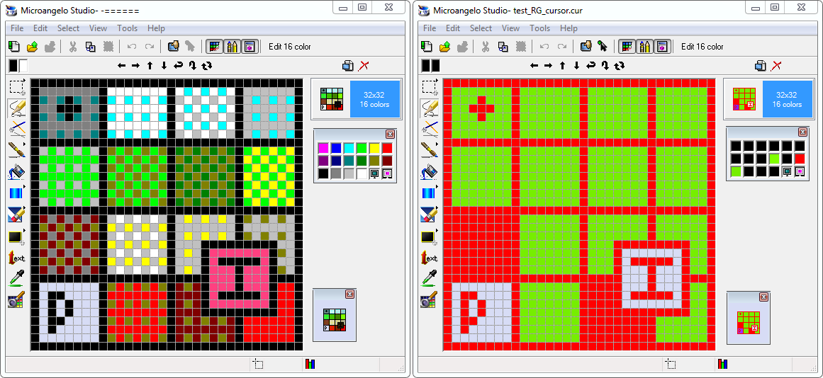
Example: on the left standard palette, reprogrammed on the right. On the left, transparency (P) and inversion (I) work as it should; on the right - obviously not.
However, we can observe all these charms of icons only in original Windows. Modern operating systems, such as Win 10, ignore the colors of the palette, and the “transparency” bitmask always works just like transparency in its pure form: there is no XOR, and there is no inversion, respectively. However, in the cursor display mechanism, there is still compatibility - a full-fledged good old economical scheme works there; "Warm, lamp", and ... very few people understand and need.
Example: different display of the same icons in Windows XP and in Windows 7.
In those single instances when I needed to write down the expressive icon (.ico) of the application and at the same time I had to save bytes, I used the following hack: I recorded the image in 16-color mode - but! - not in the usual fixed palette, but in adaptive.
What does this give? Icon 48x48, 1-bit transparency, 256 colors = 3774 bytes, it is also in 16 colors = 1662 bytes. Win - 2 kilobytes, with a slight drop in image quality.
Example. From left to right:
- 256-color original
- fixed standard 16-color palette (and here I picked up the hatching for a couple of minutes so that the image had any decent appearance)
- adaptive 16-color palette + hatching (dithering).
How it works? Oddly enough, the 16-color icon always carries a palette. That is, 99.9% of old icons carry exactly the same 64-byte color table (4 bytes per color). And yes, it turns out it can be reprogrammed.
Unfortunately, I am not familiar with the program that I can fully work with this kind of icons. Therefore, here’s a recipe for “defective” to concoct a similar icon: take IrfanView, load a picture into it: either a 16-color pre-prepared or reduce the number of colors right in it: menu - image - reduce color depth ... - 16 colors. Now: menu - save as ... - select the .ico format. Everything? No, not everything: Irfan View does not know how to work with transparency, it will have to be manually restored in another program. Microangelo Studio can download and edit such icons (alas, it does not allow creating a library from them, just like creating such icons from scratch). We load the icon into Microangelo and ... maybe we will immediately get a window with a warning about the “incorrect palette” - what this means in practice will be explained later. Using the “fill” and “pencil” tools we mark the transparent zones; we write down; is ready!
That was what I did before, ten years ago. Now, having carefully looked at the Microangelo palette, I have questions. What is this strange palette, 18 colors? How can you store 18 colors in a file? The number is not round, gentlemen programmers do not do that; it's just not convenient for them. )) It can be seen that there are 16 solid colors in the palette and two service colors: “transparent” and “inverse”. What kind of "inverse"? - if such a color occurs, it displays the negative of what lies under it; this is most often used in cursors; and the cursor — in fact and in terms of the file structure — is also an icon. But how are all these colors stored? If ordinary image points are packed in 4 bits (16 colors), then transparency can be stored only as a separate bitmask (1 bit for each image point). Okay, so where is the inversion stored? Another mask whether? Not economical, but possible ... Let's count.
Icon 48x48, 16 colors, 1 image. The file size is 1662 bytes. What's in it? I have little idea of the subtleties, but try to estimate. The main part, the image itself: 48 * 48/2 = 1152 bytes. Palette: 16 * 4 = 64 bytes. Transparency mask 48 * 48/8 = 288 bytes. Header .ico, officially = 6 bytes. Description of the frame (1 pc.) From the documentation = 16 bytes. Total: 1152 + 64 + 288 + 6 + 16 = 1526. Probably there is something else there, because the actual file size is larger - but this is not important; another thing is important, the remainder of the "dissimilar" is small: 136 bytes, and it clearly does not allow placing another bit mask of 288 bytes in size. So ... the inverse color is somehow embedded in the picture itself. Maybe now you can guess yourself how they did it?
And they did it, apparently, as follows: in the original Windows (it seems, starting from Win 95OSR2 fully, and in Win XP and newer already partially), in icons and cursors, strictly speaking, there was no real transparent color. If the alpha mask showed: the current point of the cursor / icon is “transparent” - the color under the cursor / icon was taken and XOR was (exclusive or); or maybe there was just a subtraction) - attention! - with the current point color taken from the icon palette.
What is the result? If it was the first color (black in a fixed palette), XOR did with the background “nothing” - the color became just transparent. If it was the last color (in the fixed palette - white) - the color changed completely, turned into a negative. This is the whole secret of how the “18 colors” were stored ... That is, once again: “transparent” = black (+) alpha mask, “inverse” = white (+) alpha mask. And now - let's talk about the "glitches".
The above-mentioned warning Microangelo says: “you do not have full white and black colors in the palette, working with transparency will be incorrect!”. Indeed, our adaptive palette can easily do without black or white colors. How, then, will work transparency? Oh, exactly as we expect: some color will be taken from the palette (for example, green), “open” (XOR) with a background, and we will get a beautiful purple color instead of transparency. )) Or another example - the place of the last color in the palette accidentally got black: and the “inversion” turned into normal full transparency.
Example: on the left standard palette, reprogrammed on the right. On the left, transparency (P) and inversion (I) work as it should; on the right - obviously not.
However, we can observe all these charms of icons only in original Windows. Modern operating systems, such as Win 10, ignore the colors of the palette, and the “transparency” bitmask always works just like transparency in its pure form: there is no XOR, and there is no inversion, respectively. However, in the cursor display mechanism, there is still compatibility - a full-fledged good old economical scheme works there; "Warm, lamp", and ... very few people understand and need.
Example: different display of the same icons in Windows XP and in Windows 7.