Overview of the railway tickets mobile application for the Android platform
We continue to disassemble applications from Google Play . We present to your attention the second review from a series of practical recommendations for improving the design, architecture and ergonomics of the Android application interface. Surveys prepared in conjunction with UsabilityLab .
The app “ Train tickets ” is still the first application on Google Play, with which you can buy train tickets. Through the application you can find a ticket, pay it with a credit card and immediately go through electronic registration.
Turning to reviews on Google Play, we see that users are not very happy with this application. Here is a review by Yuriy Turchin:
Next, we will talk about the key problems of the application and give recommendations on how to fix them.
One of the main problems of the application that repels users is not even an inconvenient interface, but a commission for buying tickets, which sometimes amounts to about 20% of the cost of the ticket itself. User Serg Q writes:
At the first launch of the application, the user sees a pop-up window with the user agreement, in order to start working with the application he needs to read and accept the terms of the offer (although we all know that users are usually not inclined to read such long texts). There is no scroll indicator on the pop-up window, which, firstly, does not allow to evaluate how long the text is contained in the window, and secondly, it does not correspond to the style guide for the Android platform.
After the user has accepted the terms of the offer, he gets to the main screen of the application, containing a large bright button "Buy a train ticket" and the sections "My tickets", "Help", "Call center". The “My tickets” section contains a list of tickets purchased through the application, and clicking on the “Call Center” button opens a phone with a call center number already dialed. Interaction with these sections does not cause problems for users. If the user decides to learn more about the features of the application and goes to the "Help" section, then he will encounter a very long text containing the complete rules for issuing tickets through the mobile application. The text is written in the official language and is rather difficult to read, the pop-up window is again not equipped with a scroll indicator, and the most important, from the point of view of users, tariff information is at the very end of the document.
Step 1. By clicking on the “Buy train ticket” button, the user enters the “Route” screen. At this step, he needs to indicate the parameters of his trip - where and where he is going from, date and time of departure, number of passengers. The default route "Moscow - St. Petersburg" is set on the screen. If the user wants to change it, when entering the first letters of the station name, a list of prompts appears, which sometimes inaccurately opens on the screen, crawling beyond the upper border of the application and closing the input window.
Unfortunately, in the application you can buy tickets only for direct trains. When you try to set a route with transfers, the application either gives a technical error or the message “There are no trains on the specified date”. Such feedback is not informative for the user, because It doesn’t allow us to understand the reason for the failure - the user seems to be able to find a ticket by specifying a different date or time of departure.
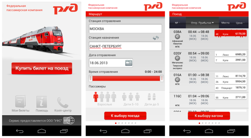
Step 2. After the user has specified all the parameters of the trip, he goes to the "Train" screen. It displays all the found train options, indicating the train number, departure and arrival times, ticket prices and the number of available seats. You can sort selected trains by train number, departure time and price. But sorting by price only works within one train, which is inconvenient for the user, because he has to carefully review the entire list of trains to find a ticket that is suitable for the price.
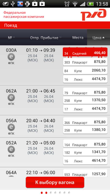
In addition, on this screen you can see some more interface errors. Firstly, the step indicator in the lower bar does not change. Secondly, when looking at this screen, it seems to the user that the entire list of trains is presented, but this is not so. One of the indicators of page continuation, except for the side scroll bar, are images, text and any content that goes beyond the screen border and tells the user about the page continuation. And on this screen we see that the clipping of information goes clearly along the lower border of the text block, and it seems that the list ends here.
Step 3 After the user has selected the appropriate train and type of car, he will be taken to the page with the choice of car number. The disadvantage is that, together with the choice of a car, the user expects to choose a place at the same time. However, when you click on the image of the car, the application takes the user to the next screen. This, firstly, does not meet the user's expectations, and, secondly, contradicts the Android gesture pattern - flipping should occur with a sliding gesture, and not just touching the screen. Such inconsistency of navigation confuses the user and interferes with his work with the application. In addition, other navigation problems are observed in the application - the swipe gesture that flips through the screens works differently on different screens - somewhere they can be flipped from the middle of the screen, and somewhere only in the lower corners of the screen.

Also on this screen the user sees the inscription in large print with the order amount, however, important information about the size of the service charge for buying a ticket through the application is indicated in a small gray font, and is invisible to the user. Full tariff information can be obtained only by clicking on this area with a gray font. This action is not at all obvious to the user. When you click on the legend over the image of the car, a pop-up window appears with a decryption that starts to tremble. It is impossible to read the information on it.
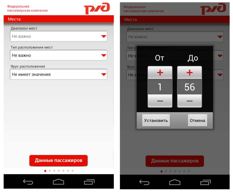
Step 4Finally, the user goes to the "Places" screen, where he can select the desired place in the train carriage. However, everything is not so simple. Unlike the Russian Railways website, where the user can immediately select the desired location on the diagram, here the user is prompted to do this in three steps - set the range of places, indicate the type of location (“in one compartment” or “not important”, and this option is offered, even if the user only buys one ticket) and tier location. The range of the place is set using the pick-up. You cannot enter values manually, and the user has to make about 50 clicks to select seats next to each other if he buys two tickets, or wants a place in a certain part of the car. Even if the user has chosen a compartment car or a suite, the range will remain unchanged from 1 to 56, although it is known
Step 5 . We pass to the indication of passenger data. On the screen there are fields for entering details, and fields for entering a series and document number do not contain any prompts or fill patterns. This is inconvenient because this data can be entered in several different ways (with a space, without a space), and if the user enters the data incorrectly, he will have to spend extra time correcting it.
Step 6. After entering all the data about the passengers and passing the electronic registration, the user goes to the "Payment method" window. In the application, you can pay for tickets in only one way - by credit card. Information on this is located in the Help section on the main screen. The problem is that not all users will carefully review this section, as it contains a large amount of complexly formulated text, which discourages users from reading it. This can lead to an unpleasant situation when a person who does not have a bank card has gone through all the steps of the purchase and at the end has discovered that there are no other payment methods.
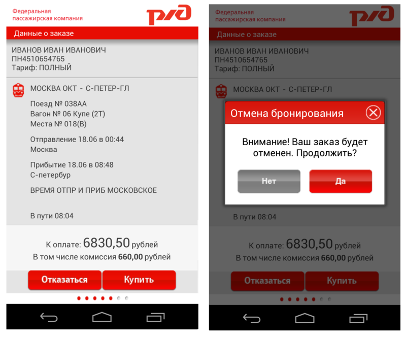
Step 7. On the "Order Information" screen, the user must once again carefully check all the details of the trip and proceed to payment. If he notices an error, then you cannot go back a step and correct it already - in this case, the system will offer to cancel the reservation and you will have to go through the purchase procedure again. Considering that when working with the touch keyboard, users make more mistakes and typos than when working with the desktop, we can assume that this behavior of the application will cause users some inconvenience.
The application is not adapted for tablet devices, and is a version stretched to a large screen for smartphones. This does not interfere with the performance of the user task, but it does not make a very good impression. By the way, both versions - both for smartphone and tablet, do not support landscape orientation. Error notifications appear at the bottom of the screen and are invisible to users, as The entire working area of the application is concentrated in the upper half of the screen.

The very idea of the application seems very correct. A smartphone or tablet are those things that are always at hand and access to them is easier than to desktop computers and laptops. Accordingly, the ability to buy tickets immediately through the application without having to go to the site is what should make life easier for the client, especially if he often has to travel by train. The pluses of the application can also be attributed to a bright, nice interface.
The application, not without problems, but still copes with the implementation of the main user task - buying a ticket. However, users are more frightened not by the inconvenience of working with the application, but by the policy of its creators. Most users acknowledge that this application is necessary, but the cost of the service is not adequate. User Grigory Bezhentsev writes:
Developers Relations Team, Google Russia
About app
The app “ Train tickets ” is still the first application on Google Play, with which you can buy train tickets. Through the application you can find a ticket, pay it with a credit card and immediately go through electronic registration.
Turning to reviews on Google Play, we see that users are not very happy with this application. Here is a review by Yuriy Turchin:
The average rating for an application is 2.4 out of 5.“It doesn’t work properly and there are still such high margins for the application. They called it service fees - requisitions for a raw product. ”
Next, we will talk about the key problems of the application and give recommendations on how to fix them.
Briefly about the main thing
One of the main problems of the application that repels users is not even an inconvenient interface, but a commission for buying tickets, which sometimes amounts to about 20% of the cost of the ticket itself. User Serg Q writes:
The fact that users are so outraged by high commissions is not surprising. At the moment, there is a common sales practice - users are encouraged to access sites and mobile applications in order to reduce the load on offline offices and get rid of queues. For example, the official website of Russian Railways offers discounts and bonuses for buying tickets online. In the case of this application, the situation is the opposite - due to the high commission, the whole point of buying a ticket through the application is lost, it is easier for the user to buy a ticket at the station, or access the site from a mobile phone, despite the fact that it is less convenient. But let's move on to interface problems.“I was waiting for the application, because I ride a train very often. Ticket cost 950 rub., Commission 350 rub. ?? Is that what? What kind of country do we have? Can’t Russian Railways afford a free application? ”
Application launch
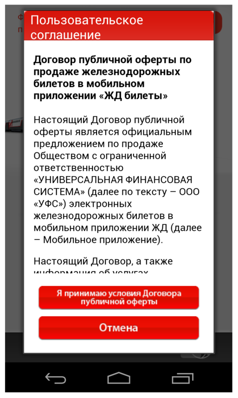
At the first launch of the application, the user sees a pop-up window with the user agreement, in order to start working with the application he needs to read and accept the terms of the offer (although we all know that users are usually not inclined to read such long texts). There is no scroll indicator on the pop-up window, which, firstly, does not allow to evaluate how long the text is contained in the window, and secondly, it does not correspond to the style guide for the Android platform.
Developer Information
Problem | Criticality | Recommendation |
| Lack of scrolling on pop-up with user agreement. |  | Add a scroll according to the Android style guide. |
Main screen
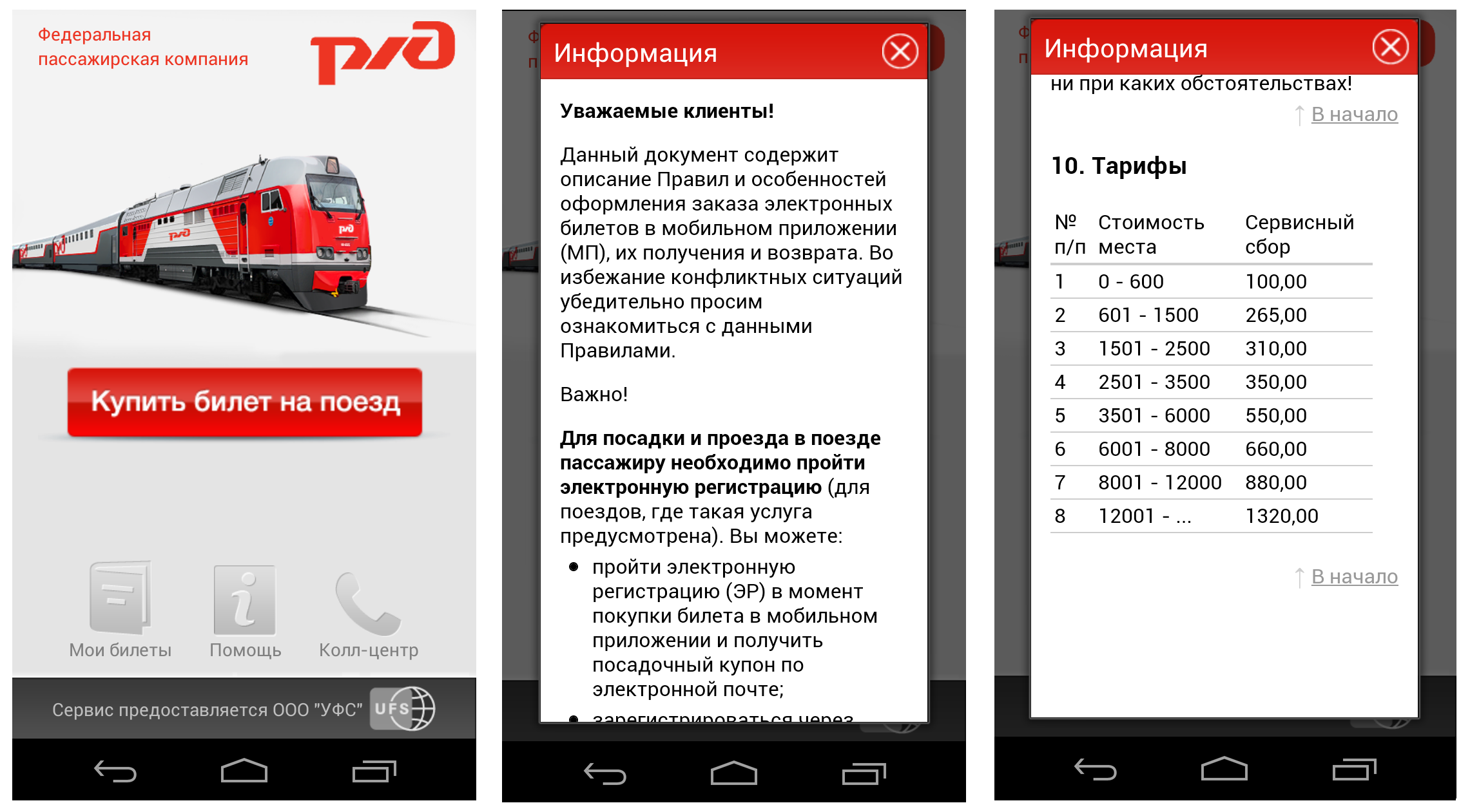
After the user has accepted the terms of the offer, he gets to the main screen of the application, containing a large bright button "Buy a train ticket" and the sections "My tickets", "Help", "Call center". The “My tickets” section contains a list of tickets purchased through the application, and clicking on the “Call Center” button opens a phone with a call center number already dialed. Interaction with these sections does not cause problems for users. If the user decides to learn more about the features of the application and goes to the "Help" section, then he will encounter a very long text containing the complete rules for issuing tickets through the mobile application. The text is written in the official language and is rather difficult to read, the pop-up window is again not equipped with a scroll indicator, and the most important, from the point of view of users, tariff information is at the very end of the document.
Developer Information
Problem | Criticality | Recommendation |
| The text with instructions for buying tickets through the application is difficult to formulate and difficult to understand. | | Formulate the rules for using the service in a language that the user understands. |
| The lack of scrolling on the pop-up window with information about the rules for buying tickets through the application. | | Add a scroll according to the Android style guide. |
Ticket purchase
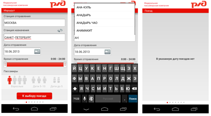
Step 1. By clicking on the “Buy train ticket” button, the user enters the “Route” screen. At this step, he needs to indicate the parameters of his trip - where and where he is going from, date and time of departure, number of passengers. The default route "Moscow - St. Petersburg" is set on the screen. If the user wants to change it, when entering the first letters of the station name, a list of prompts appears, which sometimes inaccurately opens on the screen, crawling beyond the upper border of the application and closing the input window.
Unfortunately, in the application you can buy tickets only for direct trains. When you try to set a route with transfers, the application either gives a technical error or the message “There are no trains on the specified date”. Such feedback is not informative for the user, because It doesn’t allow us to understand the reason for the failure - the user seems to be able to find a ticket by specifying a different date or time of departure.
Developer Information
Problem | Criticality | Recommendation |
| The message about the absence of search results does not contain information about the reasons for such a result and offers to change the search criteria. | | This message should contain information about why it is impossible to find trains along the selected route, and also contain suggestions for changing it to another (with transfers) if there are no direct trains. |
| The drop-down list of prompts is inaccurately opened on the screen, closing the keyboard. |  | Fix the appearance of the drop-down list. Rules for the design of drop-down lists are contained in the Android guidelines . |
Step 2. After the user has specified all the parameters of the trip, he goes to the "Train" screen. It displays all the found train options, indicating the train number, departure and arrival times, ticket prices and the number of available seats. You can sort selected trains by train number, departure time and price. But sorting by price only works within one train, which is inconvenient for the user, because he has to carefully review the entire list of trains to find a ticket that is suitable for the price.
In addition, on this screen you can see some more interface errors. Firstly, the step indicator in the lower bar does not change. Secondly, when looking at this screen, it seems to the user that the entire list of trains is presented, but this is not so. One of the indicators of page continuation, except for the side scroll bar, are images, text and any content that goes beyond the screen border and tells the user about the page continuation. And on this screen we see that the clipping of information goes clearly along the lower border of the text block, and it seems that the list ends here.
Developer Information
Problem | Criticality | Recommendation |
| Sorting by price occurs within one train and does not allow the user to immediately find a ticket in the desired price range. Instead, he has to browse through the entire train list. | | Change the principle of sorting by price. Sorting according to the price of a ticket should be carried out not within the limits of one train, but for all found trains. |
| The list of found trains is presented on the screen in such a way that does not give the user an idea of the continuation of this list beyond the boundaries of the screen. | | Change visually the list of trains so that the break of information goes in the middle of a line or graphic element. |
| The bottom panel (bar) with an indicator of the steps of buying a ticket does not work. | | To fix the work of the bottom panel with the indicator of steps - when moving to the next step, the position of the point should change, or the number of filled points should correspond to the number of steps taken. |
Step 3 After the user has selected the appropriate train and type of car, he will be taken to the page with the choice of car number. The disadvantage is that, together with the choice of a car, the user expects to choose a place at the same time. However, when you click on the image of the car, the application takes the user to the next screen. This, firstly, does not meet the user's expectations, and, secondly, contradicts the Android gesture pattern - flipping should occur with a sliding gesture, and not just touching the screen. Such inconsistency of navigation confuses the user and interferes with his work with the application. In addition, other navigation problems are observed in the application - the swipe gesture that flips through the screens works differently on different screens - somewhere they can be flipped from the middle of the screen, and somewhere only in the lower corners of the screen.
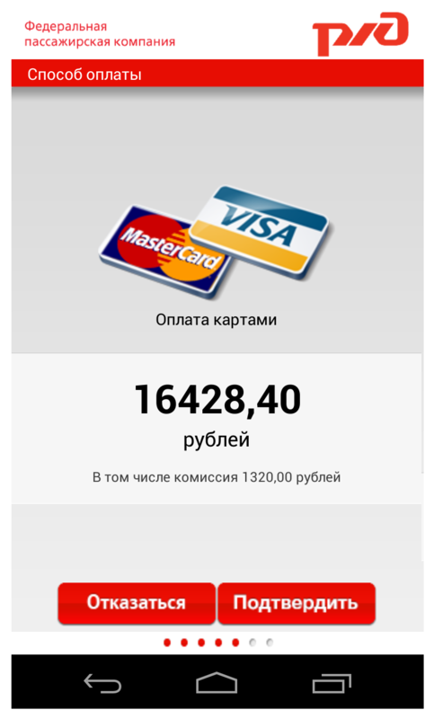
Also on this screen the user sees the inscription in large print with the order amount, however, important information about the size of the service charge for buying a ticket through the application is indicated in a small gray font, and is invisible to the user. Full tariff information can be obtained only by clicking on this area with a gray font. This action is not at all obvious to the user. When you click on the legend over the image of the car, a pop-up window appears with a decryption that starts to tremble. It is impossible to read the information on it.
Developer Information
Problem | Criticality | Recommendation |
| Important information about the commission for the purchase of tickets was not highlighted. | | Visually highlight information about the commission, indicate it under the main order price in large and bright font. |
| Inconsistency of navigation. The transition to the next screen occurs by touch, and not through the swipe gesture, familiar to Android users. Scrolling does not work the same way on all screens. | | Bring navigation in line with Android guidelines . |
| Technical problems viewing information about the car - a pop-up window starts to tremble. | | Fix this error. |
Step 4Finally, the user goes to the "Places" screen, where he can select the desired place in the train carriage. However, everything is not so simple. Unlike the Russian Railways website, where the user can immediately select the desired location on the diagram, here the user is prompted to do this in three steps - set the range of places, indicate the type of location (“in one compartment” or “not important”, and this option is offered, even if the user only buys one ticket) and tier location. The range of the place is set using the pick-up. You cannot enter values manually, and the user has to make about 50 clicks to select seats next to each other if he buys two tickets, or wants a place in a certain part of the car. Even if the user has chosen a compartment car or a suite, the range will remain unchanged from 1 to 56, although it is known
Developer Information
Problem | Criticality | Recommendation |
| The user does not have the opportunity to choose a specific place in the car. | | Implement seat selection using the wagon diagram, where the user can immediately select the desired seat, or indicate the range of seats within the same compartment / compartment in the reserved seat. |
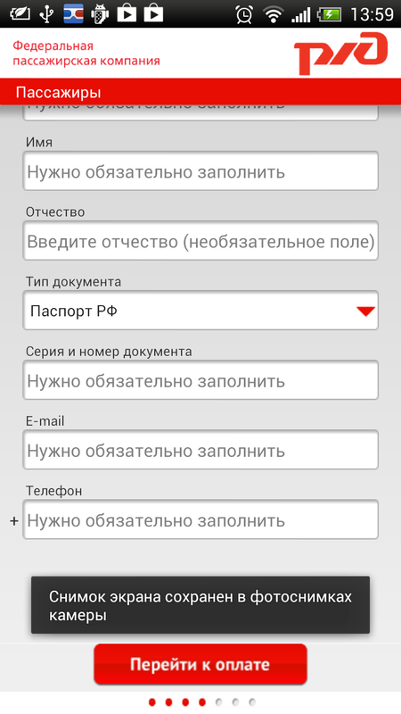
Step 5 . We pass to the indication of passenger data. On the screen there are fields for entering details, and fields for entering a series and document number do not contain any prompts or fill patterns. This is inconvenient because this data can be entered in several different ways (with a space, without a space), and if the user enters the data incorrectly, he will have to spend extra time correcting it.
Developer Information
Problem | Criticality | Recommendation |
| There are no hints or examples of filling in the “Series and document number” field. | | Add examples or tips with samples for filling this field. |
Step 6. After entering all the data about the passengers and passing the electronic registration, the user goes to the "Payment method" window. In the application, you can pay for tickets in only one way - by credit card. Information on this is located in the Help section on the main screen. The problem is that not all users will carefully review this section, as it contains a large amount of complexly formulated text, which discourages users from reading it. This can lead to an unpleasant situation when a person who does not have a bank card has gone through all the steps of the purchase and at the end has discovered that there are no other payment methods.
Developer Information
Problem | Criticality | Recommendation |
| Information important to users about possible payment methods can be found in the Help section, which contains a lot of text and does not cause the user to read it carefully. | | Duplicate information on payment methods immediately before starting a ticket purchase. |
Step 7. On the "Order Information" screen, the user must once again carefully check all the details of the trip and proceed to payment. If he notices an error, then you cannot go back a step and correct it already - in this case, the system will offer to cancel the reservation and you will have to go through the purchase procedure again. Considering that when working with the touch keyboard, users make more mistakes and typos than when working with the desktop, we can assume that this behavior of the application will cause users some inconvenience.
Developer Information
Problem | Criticality | Recommendation |
| From the screen for checking order data, it is impossible to go back and correct the details if an error was made. | | Implement the ability to go back from this screen. |
Work on tablet devices
The application is not adapted for tablet devices, and is a version stretched to a large screen for smartphones. This does not interfere with the performance of the user task, but it does not make a very good impression. By the way, both versions - both for smartphone and tablet, do not support landscape orientation. Error notifications appear at the bottom of the screen and are invisible to users, as The entire working area of the application is concentrated in the upper half of the screen.
A little about good
The very idea of the application seems very correct. A smartphone or tablet are those things that are always at hand and access to them is easier than to desktop computers and laptops. Accordingly, the ability to buy tickets immediately through the application without having to go to the site is what should make life easier for the client, especially if he often has to travel by train. The pluses of the application can also be attributed to a bright, nice interface.
Total
The application, not without problems, but still copes with the implementation of the main user task - buying a ticket. However, users are more frightened not by the inconvenience of working with the application, but by the policy of its creators. Most users acknowledge that this application is necessary, but the cost of the service is not adequate. User Grigory Bezhentsev writes:
«Слишком большой процент комиссионных, тем более если покупаешь на командировочные, если бы было 1-3% установил бы, а по хорошему можно брать его с РЖД. Не так уж сложно зайти на сайт РЖД со смартфона и купить без комиссий».
Резюме для разработчиков: что делать в первую очередь
Рекомендация | Критичность |
| Доработать сообщения об ошибках при поиске поездов. Сообщение должно содержать информацию о том, почему невозможно найти поезда по выбранному маршруту, а также содержать предложения по изменению данного маршрута на маршрут с пересадками. | |
| Изменить принцип сортировки по цене. Сортировка по цене билета должна производиться не в пределах одного поезда, а по всем найденным поездам. | |
| Реализовать выбор места с помощью схемы вагона, где пользователь может сразу выбрать нужное ему место, либо указать диапазон мест в пределах одного купе/отсека в плацкарте. | |
| Упорядочить навигацию по приложению. Перелистывание экранов должно происходить по одному и тому же жесту в соответствии с гайдлайнами Android. | |
| Реализовать возможность возврата назад с экрана проверки данных о заказе. | |
| Всплывающее окно с пользовательским соглашением должно быть снабжено индикатором прокрутки в соответствии с руководством по стилю для Android. | |
| Исправить оформление выпадающего списка подсказок со станциями. Правила оформления выпадающих списков содержатся в гайдлайнах Android. | |
| На экране с результатом поиска поездов необходимо изменить визуальное представление списка найденных поездов, таким образом, чтобы внизу экрана обрыв информации шел посередине строки или графического элемента, подсказывая пользователю о продолжении списка. | |
| To fix the work of the bottom panel with the indicator of steps - when moving to the next step, the position of the point should change, or the number of filled points should correspond to the number of steps taken. | |
| Fix a technical problem when viewing information about a car on a pop-up window (the pop-up window starts to tremble). | |
| Add examples or tips with examples of filling in the “Series and document number” field on the passenger data entry screen. | |
| Information on payment methods must be duplicated immediately before the start of the ticket purchase. | |