The main features of Chinese web design and their origins
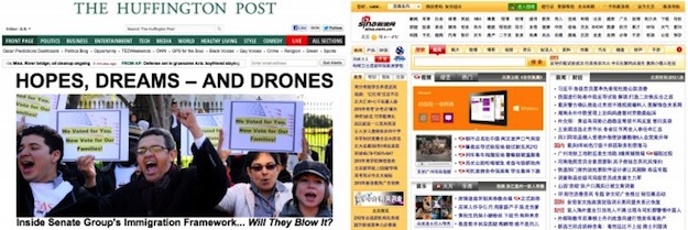
Compare: the popular news site in the West and in China
I have already written on Habré on the specifics of the Chinese Internet, so in the last article we touched on the purchase of a hosting in China , and today I propose to consider the features of Chinese web design and their origins.
I must say right away that in my understanding “web design” is something more than beautiful pictures and cool special effects. First of all, it is the correct presentation and presentation of information. Therefore, in this article I will discuss a lot about the Chinese mentality and differences in the perception of information.
What is Chinese web design for?
By the nature of my activity, foreign companies often turn to me for consultations, analytics and other help in the field of Chinese Internet. Often it comes to the localization of a site or application, then the question arises of a separate design for a Chinese audience. The question is correct, since the modern design approach is directly related to conversion, where minor changes in the interface can lead to an increase (or decrease) in profit (and other indicators) by tens of percent. (Ask webmasters who worked in the "adult": in the early 2000s, they did such advanced things with conversion, which some e-commerce sites reached only in 10 years.)The same thing on the Chinese Internet: some interfaces and "Western" solutions to the Chinese will simply be incomprehensible and will not work. Therefore, simply translating the site from one language into Chinese is not enough. It is necessary to take into account the specifics of Chinese thinking, the habits of the Chinese and the well-established practices of the Chinese Internet, so that the Internet project is successful in China. Here is one good example.
About new windows and a case study
A friend of mine a few years ago was engaged in the launch of an online store for Chinese housewives from second-order cities. Initially, they made a modern Western-style store, clean and bright, jQuery, AJAX and other bells and whistles. But despite aggressive marketing, sales were all bad. We looked at the statistics: people do not go beyond the main page or product page, the buy button is reluctant, the number of registrations is close to zero, and no one writes about problems in the feedback form. We decided to hold an action "tell us about the problems on the site and get a gift or 10 yuan to the account"and it began ... Reviews rained without ceasing. The first thing my colleagues did was to remove all Ajax from the site, make all the links open by default in a new window, leave only a cell phone or QQ for registration, fasten the BBS (forum) and ... after a couple of redesigns, the project started and sales went up .
Many users described the same “problem” like this: I click on registration or “buy” - the page does not respond (or does not change) . We started to study the case and it turned out - people simply ignored beautifully pop-up js-forms, or thought it was advertising or wiring.
And here is another common case: “I want to return to the previous page, press the cross - but I have a desktop or even a different site showing up. Everything works fine on other sites! ” This case (and there were many like that) clearly indicates the level of Internet literacy of the audience of this project. For the period of poor but accessible Internet (when all sites open links in new windows), the Chinese managed to gain a false understanding that the “close window” button is something that returns the user to the previous page. It's hard to believe, but ignorance of this "shocking" fact cost the company a lot of lost users.
Morality:Thoroughly analyze your potential audience for their readiness for your design experiments. The same interfaces may work well on the site for Shanghai hipsters and generally not work on the site for provincial housewives.
Stereotypes of Chinese web design
Now let's try to collect the most common signs (or stereotypes) of a typical Chinese site:
- Large and overloaded information web pages, the length of a sheet. It seems that Chinese webmasters are trying to fit all the site information on one page.
- A huge number of links, the practical absence of the usual (non-clickable) text.
- A huge amount of advertising, including gif / flash-animations and blocks flying around the screen.
- Several chat windows per page (with technical support): one chat window on the left, three on the right and one right in the middle of the screen.
- Incomprehensible and confusing navigation: a horizontal menu at the top, two vertical ones at the edges, one navigation with drop-down blocks, another one of 10 columns at the very bottom of the site.
- A page about everything and nothing specifically: the absence of any particular focus (task) for this page.
- Bright design, varied color scheme (at least 10 different colors).
- Block with scrolling text. Several such blocks are desirable.
Why is Chinese web design so bad?
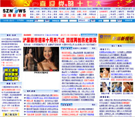
The peculiarity of Chinese web design No. 1: Overloaded with information pages The
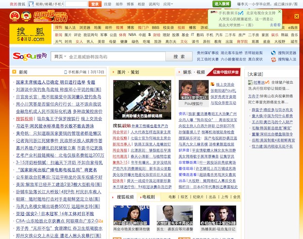
main page of the largest Chinese portal Sohu.com (adblock included)
Perhaps, everyone will agree with this item. Other differences can also be attributed to this, for example: “an unrealistic number of links”, “a bunch of graphics, animations and advertising”, “lack of focus on the page”, etc. All these points are associated with two reasons:
1.At the time of the “modem” and limited Internet, the creators of the first Chinese sites (usually of different thematic portals) tried to put as much information and links on the main page as possible so that the user could download this page once, [disconnect from the Internet], study it and open the pages he needed links. Naturally, all links opened in new windows by default, so that it would be convenient to return to the main page and travel further on the site. Over time, everyone got used to this state of affairs and a similar “design” became a reference. And still the main pages of the main media giants Sina , Sohu , Tencent QQ , as well as popular trading platformsdo not differ in minimalism. All these sites, which are in the TOP-10 or TOP-50 of the most visited Sinet sites, naturally affect young Chinese site builders.
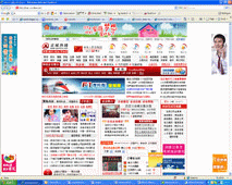
Clarification No. 1: It is worth noting that often the internal sections and special projects of the Chinese Internet giants listed above are more “human”, cleaner and aesthetically pleasing. And the interfaces of the largest Taobao C2C / B2C platform are honed to the nanometer, which shows the work of UX specialists in increasing the conversion.
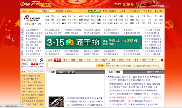
Homepage of Chinese Internet giant Sina. Adblock is disabled, popup banners are closed.
2. The second reason, with which I do not quite agree, but it is quite popular among Westerners, that the Chinese have a different way of perceiving information. It was described in more detail in his article “ Why Is Chinese Web Design So Bad? ” Nick Johnson, read the Russian translation of the article on Habr “ Why is Chinese web design so bad? ”. In particular, Nick describes his theory this way:
In the West, we expect something like enlightenment, understanding, even entertainment (regardless of the subject of the site). The inhabitants of the East are not so. At first they receive information, and only then they comprehend it. That is, the essence of my theory is that when visiting the site, the Chinese are in data collection mode. In it, they do not react, do not reflect, do not interact with the site. The brain is only absorbing information [...]
Another aspect of Chinese culture is their habit of walking around the bush. Unlike Westerners, the Chinese do not like to immediately approach the essence of the conversation. For them, this method of communication is the most acceptable. And it is not surprising that sites have adopted this habit.
Yes, the Chinese worldview may differ from the western one, especially if we try to measure it with our western ruler. But in practice and according to the results of numerous tests and surveys, the Chinese still choose the convenience and cleanliness of the interface, rather than clogged sites with incomprehensible navigation. Here is one of those polls where the Chinese rated two real estate sites: one with a “classic Chinese” design, the other made in a Western manner. 45 out of 50 people chose a clean, Western-style interface. From this survey, the arguments of those people who still chose the clogged design “in Chinese” are interesting:
- This site has a lot of information on the page, which gives the impression of its completeness and seriousness. Another site looks too simple and unattractive. And how to contact support is also unclear.
“The Western site seems too simple. From the main page, it seems that there is not much information. The company clearly lacks the built-in live chat so that they can be quickly contacted.
Two conclusions can be drawn from this:
- Many Chinese people tend to evaluate the "seriousness" of a site by the presence on the main page of a large amount of information. This is directly related to the credibility of this site.
- The Chinese are actively using the built-in chat windows to contact support. Moreover, as practice shows, trust in email is minimal. Online chats (livechat technologies) or support through the QQ messenger work much more efficiently .
There is only one advice: correctly evaluate the audience of your future site. I have already cited the example of “Shanghai hipsters” and “provincial housewives.” If you are building a site for an older audience, then you need to fit without going too far. On sites for young and advanced, you can not be afraid to experiment and use Western practices. One thing is for sure: if you have your own online business, make sure that users can contact you with one click and get an answer to their question within a few minutes. The Chinese use this more often than others.
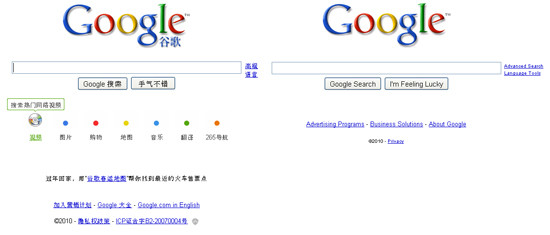
Compare: google.cn and google.com in 2010
Clarification number 2: The greed of some Chinese webmasters leads to the fact that the user is forced to click on the links as often as possible to get to the necessary information. For example: news that could be placed on one page is divided into three. Chinese patient users have long had to put up with this practice, but this does not mean that it suits them. They will be happy to change such a site to any better if they find out about it.
Chinese web design: from imitation to innovation, or Light at the end of the tunnel
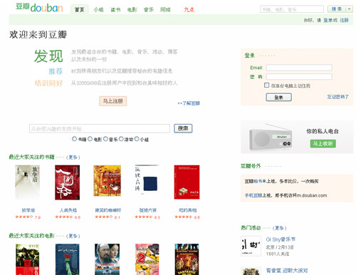
Douban Hipster Social Network Page
Is Everything So Bad With Chinese Web Design? Does a foreign company need to go to great lengths and make a Chinese website according to all the canons: with blocks flying across the page, a couple of pop-ups and music in the background?
There is no single answer to these questions. But I am inclined to the opinion that the “golden mean” exists and it is not necessary to completely become like bulky Chinese sites. On the contrary, you can go from the opposite and play unlike the gray majority. It’s also not worth it to turn up your nose and it’s silly to copy a foreign site into Chinese with a carbon copy. It is worth reading materials about Chinese aesthetics, their concept of beauty and trying to combine brightness, dynamism, liveliness (which the Chinese certainly love) with simplicity and accessibility. Here I can not help but give an example of my favorite Chinese sites Douban and Guokr (but do not forget that these sites are made for advanced youth).
Another argument in this favor, oddly enough: the Chinese love of copying. You probably know that clones of Western Internet startups appear very quickly in China (at Groupon in 2010-11, there were about 2000 clones in China). The first copies here usually appear within 1-2 months. Thanks to this rampant cloning, a huge number of Western interfaces appear in China, some of which take root or undergo local file processing. All this (a) educates Chinese web developers at a fast pace, (b) brings new practices and innovations to the Chinese Internet, (c) generally improves the quality of Chinese development and modern sites.
My humble conclusion: there is light at the end of the tunnel. The taste of Chinese Internet users is gradually improving, requests are growing, and developers are responding to this. Nevertheless, a large influx of Chinese Internet users are illiterate people, which is why the main Chinese portals and news sites will remain in the early 90s for a long time.
Extra reading
Below are links that will help you better understand the difference between the preferences of the Chinese Internet user and the Western one, as well as learn more about the features of Chinese web design. Do not miss the comments on these articles as well.
- Showcase Of Web Design In China: From Imitation To Innovation (A selection of Chinese web design: from imitation to innovation)
- Chinese vs. Western web design
- What is the major difference between Chinese netizens and US netizens? (the main differences between Chinese Internet users and American)
As usual, I am waiting for your comments, additions and questions about the Chinese Internet in general and Chinese web design in particular.
Thanks for the changes. Goblinoid