Phased progressive disclosure in mobile UX: how it works
On Habré, there are probably a lot of people who know what gradual disclosure is in the mobile UX. Nevertheless, much more than those who have not heard about this term. So, progressive disclosure is a strategy for managing the complexity of information in relation to a user of an application or service.

If the application user is given all the information at once, he is unlikely to quickly figure it out. The problem is that at each stage of interaction with the application, the user needs a strictly limited set of data. If there are more or less than necessary, the user experience will be negative.
First, this is a more efficient approach that does not frighten the user. All functions are in place, but the user sees only the priority. Well, if he wants more opportunities, 1-2 clicks - and they also become available.
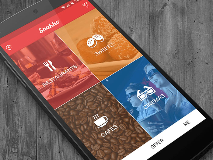
On the main of this application to search for bread and circuses just four main elements. There are secondary objects above and below. Clicking on any of them opens additional information
. Secondly, it means fewer errors when interacting with the application interface.
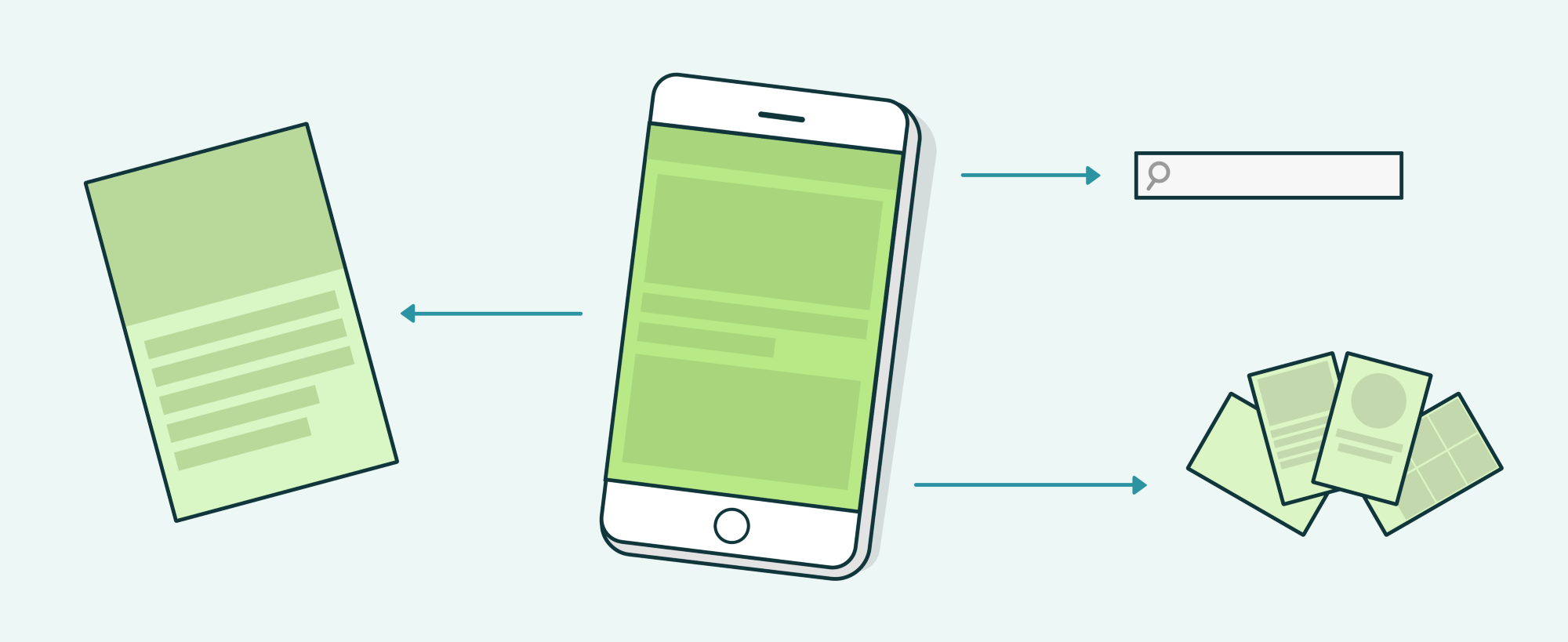
Main screen with search bar and links to secondary information screens
In order to provide relevant information to users, you need to be aware of the target audience of your application or service. Otherwise, you can begin to offer what is not needed. And such errors are expensive.
In no case can not be judged on their own, since the interests of the developer of the program and its target audience can (and necessarily will) be radically different. In some cases, it is possible to conduct a test launch of the application using specialized services. Such services direct specific traffic with customer-defined characteristics to a mobile application or web service. Next, the developer receives an analysis of user behavior and can correct certain elements.
In any case, in-depth analysis is the basis of all work.
The simplest example is the usual “read more” link, or “read more”, or something similar. But this is really the simplest example. We will talk about more complicated and at the same time effective things below.
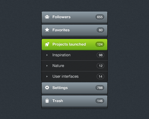
When you click on the main menu items appear additional items. If all this was shown from the very beginning, the interface would have been extremely cluttered.
One example is onboarding, and moreover interactive. At the first stage, it tells what is what, and then more information and more functions are revealed.
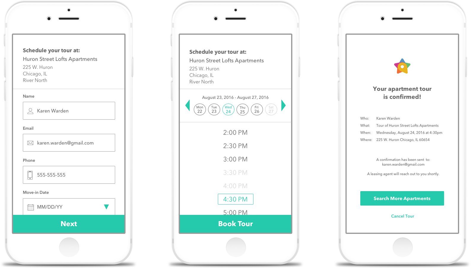
Mobile application for rental housing. On the first screen - the main details, if necessary, additional elements are shown
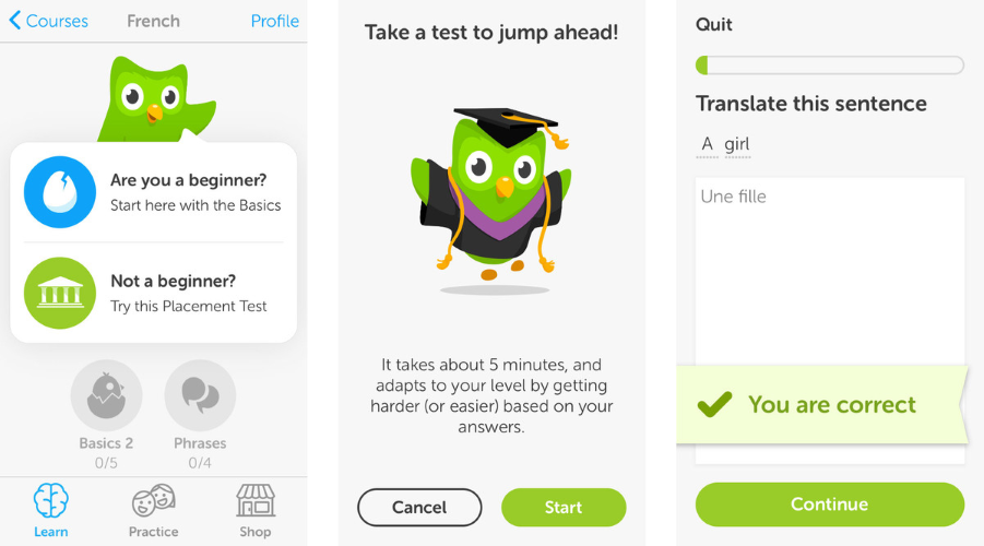
Another example is the Duolingo application, which also has an interactive, phased disclosure. The user passes the test after registration, and the application kills two birds with one stone at a time: and teaches the user how to work with the application, and sends data about his language level to the common base.
By the way, phased onboarding was introduced in the Windows interface for the PDA. Remember, at the very beginning it was necessary to copy and paste the text? Without this, it was impossible to start working with a handheld.
Another method of phased disclosure is the pop-up widget hint. Appears once; If you click "clear", the widget disappears. This method is used, in particular, by developers of applications for Android (at least take YouTube).

In different sections of the application, the user sees different prompts, but only once. After clicking on “got it,” the hint no longer appears.

Uber interface tooltip
This technique is used in both conventional applications and in mobile games. For example, Angry Birds trained the player with animation.

In games, there is also another method of gradual disclosure of information - training. During the test pass, the user is led through the entire process, showing the individual actions necessary for a successful pass.
Such training is in the game Plants vs. Zombies, which is how it looks in the second part:

Summarizing, let's say that there are three main ways of applying gradual disclosure of information:
Simplicity and practicality - this is really important. The principle of gradual disclosure of information is necessary when developing any interfaces, not only mobile applications. So it should be remembered and applied as needed.

If the application user is given all the information at once, he is unlikely to quickly figure it out. The problem is that at each stage of interaction with the application, the user needs a strictly limited set of data. If there are more or less than necessary, the user experience will be negative.
Skillbox recommends: practical course "Fullstack mobile developer" .Phased disclosure of data helps the user to play "dolls". First, he sees a little, then - a little more, then - even more, and so on. If he needs additional functions, the developer should provide the user with this opportunity.
We remind: for all readers of Habr - a discount of 10,000 rubles when writing to any Skillbox course on the promotional code "Habr".
What is good phased disclosure?
First, this is a more efficient approach that does not frighten the user. All functions are in place, but the user sees only the priority. Well, if he wants more opportunities, 1-2 clicks - and they also become available.

On the main of this application to search for bread and circuses just four main elements. There are secondary objects above and below. Clicking on any of them opens additional information
. Secondly, it means fewer errors when interacting with the application interface.

Main screen with search bar and links to secondary information screens
Need to know CA well
In order to provide relevant information to users, you need to be aware of the target audience of your application or service. Otherwise, you can begin to offer what is not needed. And such errors are expensive.
In no case can not be judged on their own, since the interests of the developer of the program and its target audience can (and necessarily will) be radically different. In some cases, it is possible to conduct a test launch of the application using specialized services. Such services direct specific traffic with customer-defined characteristics to a mobile application or web service. Next, the developer receives an analysis of user behavior and can correct certain elements.
In any case, in-depth analysis is the basis of all work.
What does a phased disclosure look like?
The simplest example is the usual “read more” link, or “read more”, or something similar. But this is really the simplest example. We will talk about more complicated and at the same time effective things below.

When you click on the main menu items appear additional items. If all this was shown from the very beginning, the interface would have been extremely cluttered.
One example is onboarding, and moreover interactive. At the first stage, it tells what is what, and then more information and more functions are revealed.

Mobile application for rental housing. On the first screen - the main details, if necessary, additional elements are shown
Another example is the Duolingo application, which also has an interactive, phased disclosure. The user passes the test after registration, and the application kills two birds with one stone at a time: and teaches the user how to work with the application, and sends data about his language level to the common base.

By the way, phased onboarding was introduced in the Windows interface for the PDA. Remember, at the very beginning it was necessary to copy and paste the text? Without this, it was impossible to start working with a handheld.
Need more information!
Another method of phased disclosure is the pop-up widget hint. Appears once; If you click "clear", the widget disappears. This method is used, in particular, by developers of applications for Android (at least take YouTube).

In different sections of the application, the user sees different prompts, but only once. After clicking on “got it,” the hint no longer appears.

Uber interface tooltip
Game Interface Tips
This technique is used in both conventional applications and in mobile games. For example, Angry Birds trained the player with animation.

In games, there is also another method of gradual disclosure of information - training. During the test pass, the user is led through the entire process, showing the individual actions necessary for a successful pass.
Such training is in the game Plants vs. Zombies, which is how it looks in the second part:

There is always a lot of information, but not enough space.
Summarizing, let's say that there are three main ways of applying gradual disclosure of information:
- Show text and graphic content is not immediately in full, but in part.
- To the forefront to bring the main controls, and secondary hide. But it is necessary to clearly understand the priority of individual elements and modules. Intuition is not enough here, you need a deep analysis of the target audience, including the construction of customer journey maps.
- All non-obvious functions (for example, innovative, with which the user is unlikely encountered in other interfaces) appear gradually - the developers embed in the application tooltips or entire tours of the interface.
Simplicity and practicality - this is really important. The principle of gradual disclosure of information is necessary when developing any interfaces, not only mobile applications. So it should be remembered and applied as needed.
Skillbox recommends:
- Practical course Mobile Application Design (feat. Redmadrobot!).
- Annual online course "Profession Web Developer" .
- Practical two-month course "UX-design" .
