 March 28, 2011 at 21:43
Mobile Web Design Principles
- Tutorial
I present to you the translation of the article " Mobile Form Design Strategies " by Chui Chui Tan . Transferred to UXDepot . Especially for users of Habrahabr with the approval of the publication UX Booth .
A web form that works well on a desktop PC will not necessarily be equally successful on a mobile device. Due to the nature of using desktop PCs, web forms are not productive. Due to the limitations inherent in mobile devices and the context of their use, when filling out a form on a mobile device, productivity is very important. This article will help you understand the principles of creating productive and error-resistant web forms for mobile devices.
The Internet on the screen of a mobile phone is influenced by several important factors:
- Environment - a person can use the gadget in a crowd, in time pressure mode or in bright light (accordingly, the image quality on the screen deteriorates)
- Networks - Connectivity can be slow and unreliable.
- Features of the device - for example, a small screen of a device
According to the international standard ISO 9241-11 , usability includes three important indicators: productivity, efficiency and productivity. However, web design does not quite correspond to the last factor - we are used to using the network on the big screen of a regular computer, without a time limit and having a powerful, reliable Internet connection. On the other hand, the use of the Internet on a mobile phone is taking place in a more tense environment. Productivity is becoming an important factor. The more time a user needs to fill out a form on a mobile phone, the greater the likelihood of various problems (such as an interruption in the Internet connection). Therefore, when working on a mobile device, it is very important how quickly the user can achieve their goals.
Web forms in a regular browser vs web forms in a mobile browser
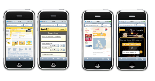
Hertz and Burger King Locator reservation forms (on the left is the desktop version, on the right is the
mobile version ) The mobile version of your site can be just a lightened and truncated version of a regular site, devoid of distracting elements and advertising ( like the version of the Hertz reservation form ). On the other hand, it can be a specially designed version, with a lighter and more convenient interface ( for example, the Burger King Locator mobile site ). There is another option - a small change in the markup. For example, changing the location of the headers to the fields, as on the M&S registration page.
In this article, we will take a closer look at these principles of the mobile design approach. All examples are considered for the mobile browser of iOS devices. Of course, for other mobile browsers the principles will be similar.
Mobile Form Design Principles
Vertical alignment of field headings The
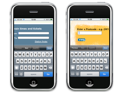
location of the input field name to the left of the field on the Trainline website and the location of the name above the field on the Burger King website
Each type of alignment has its pros and cons, however, in the mobile design, placing the field name and the field itself in one line should still be avoided . When the user clicks on the data entry field, this field increases in size, and the cursor focus is translated into it. If the field name is on the same line as the field itself, then the user will not be able to see them together. It’s also difficult to place a rather long field name on the small screen of a mobile phone - this is exactly what we can see on the mobile version of the booking page on Virgin Blue website.

A long name cannot be displayed completely due to the placement to the left of the field.
This problem can be quite simply solved by placing the name of the input field above the field itself.
Remove excess
Mobile design should be as simple and clean as possible - it is necessary with a light heart to get rid of unnecessary elements and help the user focus on the main tasks, minimizing distraction.
The obvious step is to get rid of all unnecessary fields and forms. Mobile design should contain only all the most important and necessary. All additional options, descriptions and buttons “What is this?” Should be safely removed - this helps to get rid of visual clutter and make life easier for the user. For example, Hertz performed this task perfectly and correctly created a car booking form on its mobile site, it looks clean and convenient without any additional unnecessary information.
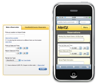
Hertz simplified the order form by removing secondary elements such as tips and help
If you are going to decide what to leave and what not, use a simple principle - if, for example, the value of the field does not affect the search result, but only affects how this result will be displayed on the screen, then safely remove this option. Leave only the most important!
Combine
Another way to simplify mobile design is to combine common forms into one single form.
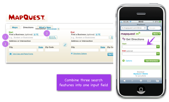
Mapquest simplified its form by combining several input fields into one “smart” field.
When choosing a direction on the desktop version of Mapquest, you see three options that determine your starting and ending points: find a company (where you can choose a company name), choose an address (where you need to enter the full address of the company), or you can choose it from the last entered previously locations. These three fields are very convenient in the browser for the PC, but there are too many of them for the user of the browser of the mobile device (in the end, when we give the user so many options, he can easily get confused in them).
That is why the designers of the mobile version of Mapquest website decided to combine these three options in one field. The user can easily enter the address of the company and its name - the “smart” field itself will figure it out.

Smart fields of the starting and ending points of direction on the Mapquest website.
However, using this rule, make sure that by reducing the number of elements, we leave the site with enough functionality and convenience.
Improvise
Modern devices have a lot of technical capabilities (for example, the ability to determine the location using GPS or the built-in compass). Make sure that the mobile version of your site uses these features in order to make life easier for the user.
On the car reservation page of the desktop version of the Eurocar website, the user is invited to choose the country from a huge drop-down list consisting of 139 items.
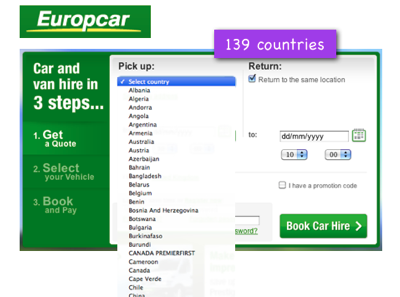
In the drop-down list of countries on the Eurocar website, 139 positions
In the mobile version of the site, they slightly eased the task for the user - only 40 positions remained in the list of countries (the most popular countries).
However, they did not stop there and decided to take the opportunity of a mobile phone to determine their location themselves. This simplified the filling out of the form and greatly facilitated the rental of a car using the mobile version of the site.

The mobile version of the Eurocar website prompts the user to automatically determine his location
In a few steps
Usually we recommend using the minimum number of pages in the mobile version of the site. However, sometimes this rule may be violated to simplify filling out forms.
In the regular version of its AirAsia.com website, the “From” drop-down list, consisting of 80 cities, is divided into subcategories by the number of countries (25 subcategories in total). In the regular version of the site, this works really cool, helping to quickly find the desired departure point. However, in the mobile version of the site such a huge list is clearly not needed.
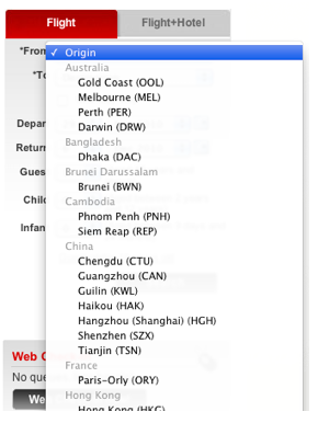
The AirAsia website lists the Departure City list by country
That is why in the mobile version of the AirAsia website, the list was presented in the form of several separate screens. On the first screen at the top, the default country name is displayed - Malaysia (since AirAsia is a Mailayskaya airline). Under the name of the country - all the cities of this country in which you can fly. Below this list is a list of other countries. If the user clicks on the name of another country, a new screen opens with a list of cities in that country.
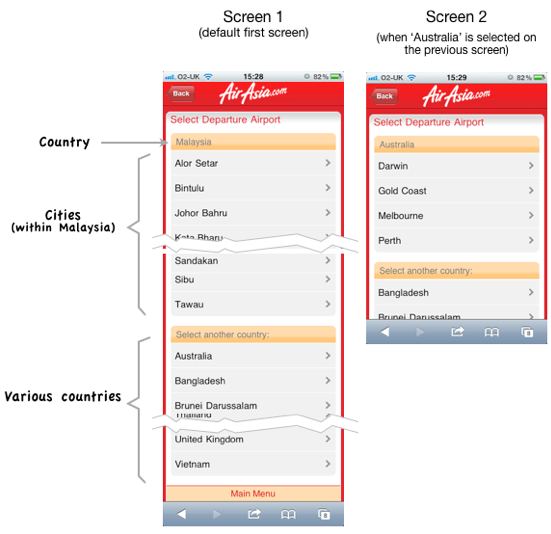
In the mobile version of the site, the “Departure City” list is presented in several steps on several screens.
Despite the fact that this approach will require more page reloads, it will help the user to focus on each specific step instead of seeing a huge complex shape in front of him.
When dividing the selection process into a few simple steps, do not overdo it. The user should not think that he is involved in an endless process of choosing something. And yet - try to minimize the number of extra elements on each page, making it easier for their size and download speed. The process of loading each new page should be very fast.
Using the right controls
Try replacing the controls with ones that could simplify the form, and, accordingly, user interaction with it.
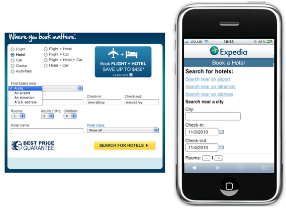
Booking Form in Expedia - the drop-down list has been replaced by several links
When users of the Expedia website choose a hotel, they usually search for it by city name, airport name, nearby attractions and address. In the regular version of the site, all these options are represented by a drop-down list. Depending on which option the user chooses, he sees before himself various further search forms. In the mobile version of the Expedia site, three search options became separate links (searching by city name remained the default option). This helped to simplify the search and minimize the number of clicks on the site.
With this approach, you also need to be more careful - a long list of links at the top of the screen can move the form down from the screen. The first screen should show at least the first two or three form fields.
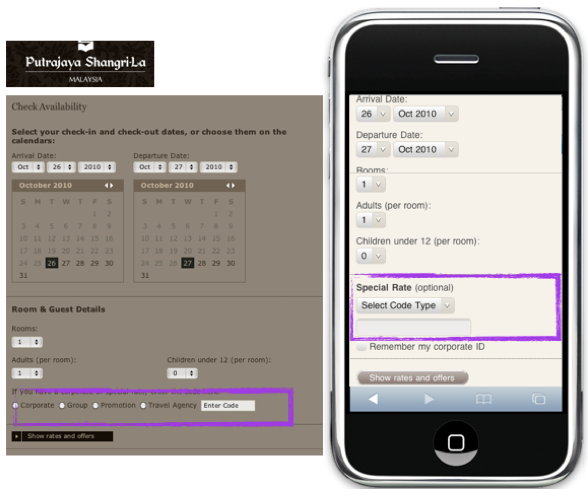
Booking form on the Shangri-La website - replacing a number of radio buttons with a drop-down list
When booking a hotel room using the desktop version of the Shangri-La website, the user selects special booking options using a number of radio buttons. In the mobile version of the site, this series of radio buttons has been replaced by a drop-down list, and here's why:
- Radio buttons do not look very nice on the screen of a mobile device (although there are only four) - they bring chaos into shape
- Special options selected by radio buttons are not very important for ordinary users (they are chosen by travel agents and other promos), so they can be completely removed from the eyes in the drop-down list
The user of the mobile version of the site should fill in several fields on the screen of his gadget (and he wants to do it faster), and here we show him all sorts of options that are important only for a small group of other people.
And better be merciless and completely remove these options in the mobile version (we already wrote about this in the section “ Remove unnecessary ”).
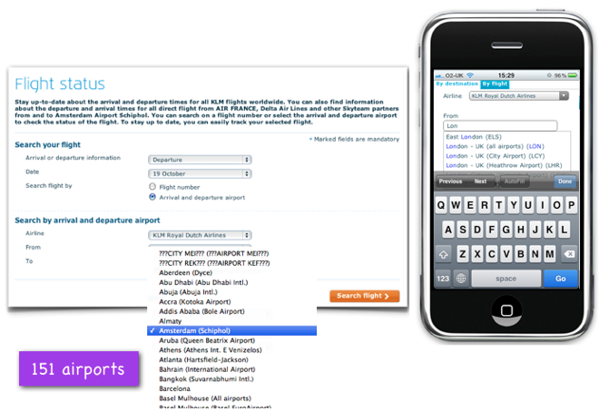
The drop-down list of destinations is replaced by an input field with automatic values
on the KLM airline websiteusers can check the flight status not only by entering the flight number, but simply by indicating the start and end points of the flight. The drop-down list of the regular version of the site contains 151 items. Knowing that such a long list cannot be displayed on the screen of a mobile device, the designers of the mobile version of the airline’s website replaced it with an input field with automatic substitution of results. This works very well - after all, the user knows the name of the endpoint of his arrival, so he just needs to enter a few characters in order to select it. Users are not overloaded with unnecessary information.
Choosing the right list
There are two main types of drop-down lists - a fixed list (offered in alphabetical or any other order) or a wildcard list . Both of these lists have their advantages and disadvantages. Choose the type of list you need in accordance with the type of information offered in the list (the number of list items, the length of each item or the location of items in the list).
Fixed List and Auto-Listing
When to use a fixed list:
- It is useful when users know exactly what they want to select from the list.
- Such a list is convenient when users search for the desired item in the list based on alphabetical or chronological orders (for example, country, number or date). In this case, the user knows how much approximately he needs to scroll through to select the desired item.
When a fixed list cannot be applied:
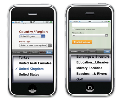
- A fixed list is inconvenient when the fields in the list are in random order or when the user most likely does not know which item to choose. Tripadvisor's Attractions Search Form is a good example of a case where you should not use fixed lists. 30 types of attractions are available on the list for selection. The problem is that, unlike the list of countries, in this case the user does not initially know what options he has and does not know what he is looking for. The user will have to scroll down the entire list and possibly go back up to select the option that works best.
- Also, this type of list should not be used when each item has a long name - it will inevitably be truncated with the use of "...", and the user will only have to guess what it means (read the full name of the item will not work).
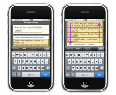
Right and wrong options for using a list with auto-substitution
When you can use a list with autosubstitution:
- An autosubstitution list is good to use when the items in the list have too long names. Unlike a fixed list, the items in the auto-replace list can have multiple lines each - this makes them clearer.
- If the user has many choices and a long list is not suitable in this case (or if the list is impossible or it makes no sense to sort by by any criterion), then it is better to use a list with automatic substitution.
- The user approximately knows what he wants to select from the list - he will only need to enter a couple of characters of the desired item in order to find it.
When you cannot use an autosubstitution list
- The auto-substitution list is inconvenient when, when you enter any character, the proposed auto-substitution list is too long for you to select the desired item from it - in this case, the user will have to go back to the input field and enter additional characters, reducing the number of proposed options.
Offer smart default options
The user of the mobile version of the site may be in a time-out mode, he wants to quickly fill out all the forms and select all the necessary items. If possible, offer smart defaults in various forms.
Each form has its own context of use. For example, if a user uses a mobile site to search for a train for a specific departure time, it is reasonable to assume that the user wants to know the schedule of trains leaving on the same day at any time after the request is entered. Therefore, it is reasonable to set the “Departure Day” by default to “today”, and “Time” - at the time of departure of the next train (or “evening” if the request was made after six hours).
Patrick Rhone described the benefits of using smart options by default:
“Smart options by default soften friction while using the product and simplify the life of all users without exception. The default options are the cornerstone of a practical and smart design. ”
Conclusion
When creating pages with forms for the mobile version of the site, remember the following:
- Imagine why and when users fill out these forms.
- Highlight the main thing - that the user must fill
- Rid the mobile version of the site from everything unnecessary, from what the user's eye clings to and which creates increased resistance
- Understand the mobile environment and create your site in accordance with this environment
Remember that the main thing for users of your mobile site is to easily and quickly achieve their goals (whatever they are).
PS from translators : I hope you enjoyed the article. We will be glad if you indicate to us errors in the translation, so that we can quickly correct them. Write to me in PM, please :)