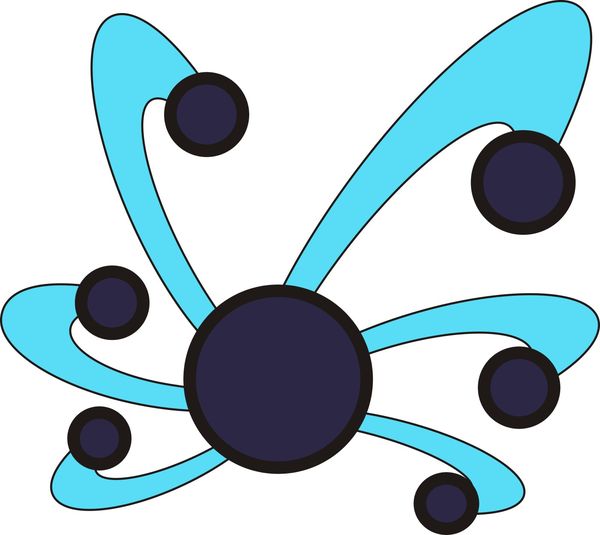
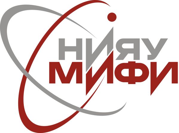
New logo of NRNU MEPhI

Dear Habrausers, at the moment, the official website of the National Research Nuclear University MEPhI is in full swing with the election of a new logo (Caution, traffic!).
A total of 117 options are provided . Honestly, for my simple taste, they are all mediocre. Especially when compared with the classic emblem of my own university, provided at the beginning of the topic. But I want to draw your attention to the leaders (at the moment, of course).
Nervous, Habracate is contraindicated unambiguously.
And so, in the first place:
No. 26 - 1,039 people voted

In the second:
No. 62 - 975

Well, the apotheosis is still in the third (although yesterday all day was in the first)
No. 16 - 925

Your opinion is interesting, dear habrausers.
UPD. Suddenly and unexpectedly, logo No. 53 got into the lead.

It is, although more or less neutral, it says that apparently in this competition they are using the markup ...
PS Many thanks to the people who added karma to publish this topic on the Design blog.
