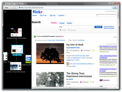
TreeBrowser (browser without tabs) + demo application
I decided to participate in the Mozilla Labs Design Challenge Summer 2009, because it’s a very tasty topic of the contest - “What can I offer to replace the tabs in the browser”. To get started - video:
Under the cut - a detailed description of the idea and screenshots.
Prerequisite
The idea of contra was born in Mozilla Labs, because tabs (tabs) do not work very well when there are a lot of them. They do not fit on the screen and do not give the user sufficient hints so that he can quickly remember whether he visited the page or not, whether it is open in one of the many tabs or if it needs to be opened in a new way.
It seems to me that the problem is not only in the tabs - in addition to them there is a history of visited pages, bookmarks (favorite sites), a stack of pages in the current tab (back / forward navigation buttons). All this is implemented in browsers as separate entities, and there are scaling problems everywhere.
For example - if you even have 7-10 tabs, can you remember with confidence that you switch to any of the tabs, which page will you go to by clicking the "Back" or "Forward" button? Can you say with certainty how you got to the page you are on?
Idea
Imagine that the browser does not have the usual separate concepts of “tab”, “history of visits”, “favorites”. Instead, there is a common space for the pages you visit. Each page is represented in this space by its own sketch, and the pages are connected to each other by links (links). You can move around the space, scale and move pages in it, grouping them by topic.

Such a space is very similar to “mind maps” (I don’t know if there is an established Russian-language term for this), i.e. graphs that people draw on their own in order to better understand the subject, to make some area of knowledge more visual. Below I gave a fun and cute example of such a hand-drawn map found on the Web. The idea is that the browser creates such maps automatically as you visit the sites (while giving you the opportunity to intervene in the process, of course). This would reduce the cognitive load and make the navigation process more visual and understandable even to people far from computers.

With this approach, the user does not have to think about whether to open the link in the current ondack or in the new one - there is no concept of tabs. Modern browsers and memory can well preserve the full state of the browser window with all the data and restore it, using a pool of several browser instances for faster switching between pages.
If you enter the address of a page you have already visited, then instead of opening a new page, the browser simply jumps you to an existing page on the map. Thus, on the map you will see the history of those pages that you opened from the current page (i.e. the history of visits is integrated together with the current session).
Demo app

I tried to translate this idea into a demo application, which you saw in the video and screenshots. It can be downloaded from this link:
http://ai-studio.com/treebrowser/TreeBrowserDemo.zip (350 Kb).
The application works under Windows XP / Windows Vista / Windows 7 and does not require installation - just unzip the archive to any folder. Try it, play with it. I wonder what you think about it.
Development
It is clear that the demo has a fairly limited functionality. A real browser should (or may) have the following features:
PS: There is also a description and a video in English (which, in fact, was sent to the contest).
Under the cut - a detailed description of the idea and screenshots.
Prerequisite
The idea of contra was born in Mozilla Labs, because tabs (tabs) do not work very well when there are a lot of them. They do not fit on the screen and do not give the user sufficient hints so that he can quickly remember whether he visited the page or not, whether it is open in one of the many tabs or if it needs to be opened in a new way.
It seems to me that the problem is not only in the tabs - in addition to them there is a history of visited pages, bookmarks (favorite sites), a stack of pages in the current tab (back / forward navigation buttons). All this is implemented in browsers as separate entities, and there are scaling problems everywhere.
For example - if you even have 7-10 tabs, can you remember with confidence that you switch to any of the tabs, which page will you go to by clicking the "Back" or "Forward" button? Can you say with certainty how you got to the page you are on?
Idea
Imagine that the browser does not have the usual separate concepts of “tab”, “history of visits”, “favorites”. Instead, there is a common space for the pages you visit. Each page is represented in this space by its own sketch, and the pages are connected to each other by links (links). You can move around the space, scale and move pages in it, grouping them by topic.

Such a space is very similar to “mind maps” (I don’t know if there is an established Russian-language term for this), i.e. graphs that people draw on their own in order to better understand the subject, to make some area of knowledge more visual. Below I gave a fun and cute example of such a hand-drawn map found on the Web. The idea is that the browser creates such maps automatically as you visit the sites (while giving you the opportunity to intervene in the process, of course). This would reduce the cognitive load and make the navigation process more visual and understandable even to people far from computers.

With this approach, the user does not have to think about whether to open the link in the current ondack or in the new one - there is no concept of tabs. Modern browsers and memory can well preserve the full state of the browser window with all the data and restore it, using a pool of several browser instances for faster switching between pages.
If you enter the address of a page you have already visited, then instead of opening a new page, the browser simply jumps you to an existing page on the map. Thus, on the map you will see the history of those pages that you opened from the current page (i.e. the history of visits is integrated together with the current session).
Demo app

I tried to translate this idea into a demo application, which you saw in the video and screenshots. It can be downloaded from this link:
http://ai-studio.com/treebrowser/TreeBrowserDemo.zip (350 Kb).
The application works under Windows XP / Windows Vista / Windows 7 and does not require installation - just unzip the archive to any folder. Try it, play with it. I wonder what you think about it.
Development
It is clear that the demo has a fairly limited functionality. A real browser should (or may) have the following features:
- support for different cards with the ability to save and load, so that you can share your sessions with friends or backup these sessions;
- the ability to create “starter maps” with the most useful sites grouped by topics (similar to favorites) so that you can start surfing the Web based on a specific set of sites;
- support for different representations of maps (for example, free form, as in a demo application or more structured, suitable for displaying a sequence of page visits for a certain period of time);
- support for the “time machine” mode, where you can see the map at a certain point in time in the past or even play back the page opening order and the “growth” of the map in animated form;
- the ability to search and highlight on the map pages that meet the search criteria specified in the address bar (which also works as a search field);
- full keyboard support and when working with the card.
PS: There is also a description and a video in English (which, in fact, was sent to the contest).
