Typesetting, typesetting and checking!
After Mr. layout dinamyte was kindly been drawn up by Mr curlybrace was the turn of a little test that turned out - to praise, criticize, and to work out a mechanism for testing the finished layout, for all those who need it.
Let's check the display of this page in various browsers and under different axes, for this we will use http://browsershots.org/ .
Archive with the result of the work of this service, namely 79 screenshots, on some jambs are visible.
There is nothing to talk about. Everything is valid as in the best houses of Paris. :)
To do this, just take a screenshot of the layout, put it on the layout and compare. As a starting point, as a rule, either the logo of the site or the header is chosen. In this case, I decided to take a header as a basis.
With the layout layer set the transparency to 30-50% and analyze the resulting image.
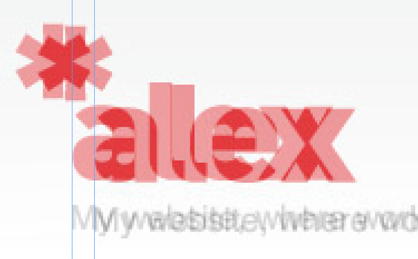
moved out
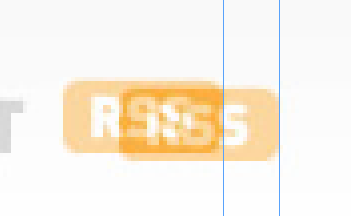
moved out
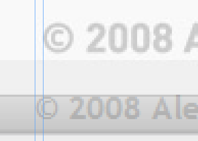
Aligned in different guides (on the design - relative to the pictures in the left block, in layout - relative to the left edge of the header)

Links in the header - have completely different vertical alignment relative to the green background on which they are located.
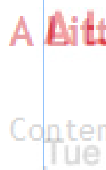
again see the departure from design

less than necessary
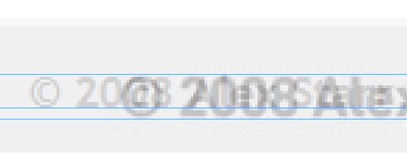
largest than necessary

on the design, the Home button is active.
A similar operation should be carried out for several browsers. I use the following:
Now it's time to check the typography. On almost all sites, the client (aka administrator) has the right to insert text. Let's check, and what will happen when we come across a rather complicated, but correctly formatted text?
For this purpose, we will insert a test with various elements and tags in the content area, as a basis I will take the text from http://loremipsum.banzalik.ru/ , it has the necessary structure to check the style of the layout text.
For comparison, a “reference" layout was attached to the screen of Verska.

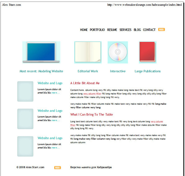
The first thing I want to note is the lack of any optimizations for printing.
So everything in order:
Our task:
- find errors
- Correct mistakes
- no longer make these mistakes
- make a certain algorithm for checking the quality of the layout of the site, and prevent problems that may arise already in the process of "pulling"
Cross-browser compatibility:
Let's check the display of this page in various browsers and under different axes, for this we will use http://browsershots.org/ .
Archive with the result of the work of this service, namely 79 screenshots, on some jambs are visible.
Validator:
There is nothing to talk about. Everything is valid as in the best houses of Paris. :)
Matching design and layout:
To do this, just take a screenshot of the layout, put it on the layout and compare. As a starting point, as a rule, either the logo of the site or the header is chosen. In this case, I decided to take a header as a basis.
Stage number 1
With the layout layer set the transparency to 30-50% and analyze the resulting image.
Logo

moved out
RSS feed

moved out
Copyright

Aligned in different guides (on the design - relative to the pictures in the left block, in layout - relative to the left edge of the header)
Links in the header

Links in the header - have completely different vertical alignment relative to the green background on which they are located.
Alignment in the right column

again see the departure from design
Line spacing

less than necessary
Basement font size

largest than necessary
Menu

on the design, the Home button is active.
A similar operation should be carried out for several browsers. I use the following:
- Internet Explorer 7 (this analysis was carried out on the basis of the image obtained from this browser)
- Internet Explorer 6
- Mozilla Firefox 3.x (latest version)
- Opera 9.6x (latest version)
- Safari 3.1.x (latest current version)
Technical points:
- In IE6-7 there is no way to increase the font size (gross error)
- For pictures, it is also desirable to write a title
- For links, it is advisable to write title
- There are no signatures in the header for icons – pictograms, although they are already defined by signatures under the pictures themselves.
- For the logo link, you should write title
- Links have a state of not only hover, but also visited, active, focus
- We check for comments on the code; in our example, they are
- It is not allowed to indicate the font size in pixels, use em or percentages
Typography:
Now it's time to check the typography. On almost all sites, the client (aka administrator) has the right to insert text. Let's check, and what will happen when we come across a rather complicated, but correctly formatted text?
For this purpose, we will insert a test with various elements and tags in the content area, as a basis I will take the text from http://loremipsum.banzalik.ru/ , it has the necessary structure to check the style of the layout text.
For comparison, a “reference" layout was attached to the screen of Verska.

What conclusion can be drawn from the last screenshot?
- The client is tormented when filling the site
- Elements such as tables, lists are completely not adapted for use on this project
- Layout designer will be pulled as the site fills
Print version.

The first thing I want to note is the lack of any optimizations for printing.
So everything in order:
- Large indentation from above
- Lack of company logo
- Graphic elements in the header - unnecessary for the print version, perhaps the whole header can be safely hidden
- Links, headings, texts - we do it in black and white, we live in the time of laser b & w printers, color texts on them look dull
- Rss icons on paper to nothing
- More links in the left column are superfluous
