With one click of the mouse, the guest turns ... the guest turns ...
How do you decide whether to register for a new service?
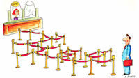 How many seconds and clicks are needed to evaluate the usefulness of a resource? Have the authors made sure that you with a minimal amount of body movements understand what its essence is and estimate your benefits from its use?
In order for as many doubting guests as possible to become full-fledged users, the authors could come up with a talking name or a capacious slogan: a story similar to MyWishList and FlashPhone (but very far from Habrahabr and Lepra ).
They could also post on their homepage a text description a la Lifehacker or Webby. Or they have allocated a separate section for this description, hidden behind the link "About the project" (the ubiquitous version that does not need examples, which does not always affect the increase in any conversion in general).
But the most caring and hardworking authors could provide their guests with a very pleasant opportunity: to launch a demonstration and, leaning back in their seats, to get all the necessary information about the service in a clear and understandable way.
This could be done in the form of a step-by-step tour, where each page vividly tells about one of the features of the site. Digg , Flickr and the domestic Startup from Pasha went this way .
And finally, the authors could make a flash presentation, like Gooroo orTeamWeaver , or a video in all colors telling about the delights of owning an account here.
Not too lazy to make Twitter video presentations :
Gmail :
Domestic Dubbee :
How many seconds and clicks are needed to evaluate the usefulness of a resource? Have the authors made sure that you with a minimal amount of body movements understand what its essence is and estimate your benefits from its use? In order for as many doubting guests as possible to become full-fledged users, the authors could come up with a talking name or a capacious slogan: a story similar to MyWishList and FlashPhone (but very far from Habrahabr and Lepra ).
They could also post on their homepage a text description a la Lifehacker or Webby. Or they have allocated a separate section for this description, hidden behind the link "About the project" (the ubiquitous version that does not need examples, which does not always affect the increase in any conversion in general).
But the most caring and hardworking authors could provide their guests with a very pleasant opportunity: to launch a demonstration and, leaning back in their seats, to get all the necessary information about the service in a clear and understandable way.
This could be done in the form of a step-by-step tour, where each page vividly tells about one of the features of the site. Digg , Flickr and the domestic Startup from Pasha went this way .
And finally, the authors could make a flash presentation, like Gooroo orTeamWeaver , or a video in all colors telling about the delights of owning an account here.
Not too lazy to make Twitter video presentations :
Gmail :
Domestic Dubbee :