Pixel Gallop - Part Five - Character Animation. Walking
- Tutorial
“Gallop of a pixel”, part I - basic concepts, stages of growing up, applied exercises ( link )
“Gallop of a pixel”, part II - perspective, color, anatomy and applied exercises ( link )
“Gallop of a pixel”, part III - Animation ( link )
“Gallop of a pixel”, part IV - Animation of light and shadow ( link )
“Gallop of a pixel”, part V - Animation of characters. Walking ( link )
Good day, Habr. We continue the Pixel Gallop cycle. Now, being at the start of 2019, we can confidently say that this is not only a series of articles, but also a multi-year saga. A wide narrative about pixels, their life, how to create them, techniques and tricks in working with them. We will not discuss the reasons for the initial "sprint", which then turned into a long-term marathon, because there is nothing more vital than life itself. Who needs reasons for absence or pauses, if you can simply return to what we did, what we cooked, and what God willing, we will continue to observe. In pixels, of course!
Today's publication will be the next, and possibly even a turning point in our story. Finally, we came to the creation of full-fledged character animation. In the two previous chapters, we covered the animation of light and shadow, as well as the animation of stationary characters (idle-animation) without pronounced actions. But today our characters will go, and in the next part they will even run, having won the fact that they have long been rightfully born. Another fertile region. And they will pass another point that will mark the end of the base cycle. Our pixels will finally become alive.
In view of the large size of this part, we will divide it into two stages. The fifth and sixth chapters of the "gallop". Everything will happen as usual, with the only difference being that you will not have to wait for the sixth chapter for another year or two. All she needs is to stand a little. She stands, we dig - for the shovels.

A few words about the tasks of secondary importance. Firstly, in the first article of the series, I promised to tell you about creating content for three types of games. Isometric (isometric games), platform games (platform games) and those that are clearly visible from a bird's eye view (top-down games). I also promised to tell you about the advanced animation of light and shadow, and about the types of transmission of halftones due to dithering. Each of these topics is not an island or even an archipelago. Tasks, by and large, are continental in nature. There is where to turn around, and there is something to dig.
As in previous articles, we will begin our next journey with simple exercises. As much as possible when it comes to the two most complex animations - step and run. We will do them with an eye on the work of Disney animators, already mentioned in previous articles. In this particular case, these will be four frame animations. Simpler than them are perhaps animations of two or three frames. For effective learning, we’ll touch them too. They will substantively show the importance of such entities as key frames, and how animation changes if intermediate frames appear between key frames. After all, we remember the main thesis of the “gallop”. It all starts with the simple, and the complex is nothing more than a system consisting of simple components. Knowing the cornerstones you can build any design.
I was tempted to use the CGA palette at the start, just like it was done earlier, in the first article to demonstrate the stages of animation growth. But I strangled this desire in the bud. To the modern reader, such colors seem rather strange, and often quite unpleasant. Also, repeating the narrative is a bad trait. However, we will curtsy in the direction of those times when there were few flowers. There is a reason for this. With a small number of colors, we better understand the shape, its movement and dynamics. Errors will be visible better, which is what we need.
As often happens, the beginning of our work will be the statement of the problem. Let's say that we make a game in the classic resolution for games of ancient eras, 320x200 pixels. And also suppose that we have two colors for the entire graphic, and two frames for any of the animations. The task is no longer pleasing, is not it? What can be done in two frames? And even if it is possible, then ... what can be done in two colors, if one of them is the background? Silhouette? Sounds like a mockery. Check if this is actually so.
To begin with, the fact that every person has a skeleton ... often even in a closet ... hell, sometimes they have whole tombs there. We create our animation by putting the bones in the correct position within each frame. But what if the skeleton is not clearly visible? What to do if the "weight" of the character is about 70 pixels? Equal to the normal weight of an ordinary person in the event that we, with the characteristic frivolity of us, convert pixels to kilograms? Let's get it right.
Chapter I - Binary Dances
- In fact, only one thing is important - what a person can and what he cannot.
Captain Jack Sparrow
The task we have set for us is not trivial. The degree of immersion in the subject is not just close to the silhouette drawings with which Gallop began, where our first pixels were compared with cave paintings of prehistoric people. Then we started with CGA mode and true wealth in the form of four colors. Now everything is much more interesting. We are at the very bottom, next to the low-level code. Zero and one. Lies and truths. Nothingness, or, conversely, being. I don’t know about you, but I feel a slight thrill. In almost every article, we, armed with shoulder blades, go to the sources of phenomena, trying to understand their very essence, and only having understood for ourselves certain bases we begin to move up.
For the sake of interest, we use white as the first color, and let it be the color of life and light, an ode to our being on this mortal planet. Well, the second color will be ... purple. Or what I consider purple. But not black at all. Today we will not be sad. In the interest of saving space, we will cut off the top and bottom of our canvas by 320x200 pixels, focusing solely on the character.
I think that after the previous course we can very well make such a little man. And even immediately equip it with two-frame animation. Where the first frame will be an ordinary man, and the second is exactly the same but with a shift of one single pixel up. He seems to be waiting for something. It is likely that we will stop fooling around and teach him to walk.

Chapter I. Fig. 1 - Where is he waiting
And let's draw it in a side view. Because while moving left or right, our character must be visible from the side. We must imagine how he looks from the outside. So ... let our expectant have a friend. Or even a whole group. True, we will expel her from our filming. So as not to interfere.

Chapter I. Fig. 2 - Where is he waiting with his friends
Even the “12 principles of animation” of the animators of the Disney studio, Ollie Johnston and Frank Thomas will help us in our task in only one single point. Use layouts. Reception, when key frames are created, and the rest are added between them. This would be appropriate for four, six, or eight frames of animation. But we have only two-frame pathetics on the horizon!
However, layouts will help us in our task. True, for this we will need to see another animation. The one to which we still have many miles. To draw key frames - you need to understand what it is. Let's look at the following example. The main thing is not to be scared, but ... without fear, do not immediately try to do something like this without mastering the basics.

Chapter I. Fig. 3 - 24 frame animation made for the unreleased project "Drake: The Golden Hind Story", as an illustration of the maximum load on frames, and as a result on the artist.
There are 24 frames in this animation, and I must say it was complete madness. You can make animations no worse, with half the number of frames. By the way, in a lot of modern games made in the style of pixel art, few people are waving at twenty-four frame animation. In the past years, I really wanted to make a cinematic plaftormer (from the English “cinematic platformer”) and I decided to go crazy. The game somehow did not work out, but the animations remained, and were waiting in the wings to appear here. At least in the form of applied material.
Drake (that's what his name is) we needed today not for bragging, but for training. Twenty-four frames, then for one phase we need only 12 frames. By phase we mean one step. And the frames of this step will look as follows.

Chapter I. Fig. 4 - Half 24 frame animation, as illustrative material for retroactive highlighting key frames. Usually everything happens the opposite. First come the key frames from the artist, then the drawing of intermediate ones.
Now back to the casual wording of the keyframes. Although a moment. Detailing on each frame in the form of a heap of colored pixels will hinder us. Therefore, we call the local vampire and turn them into silhouette images.
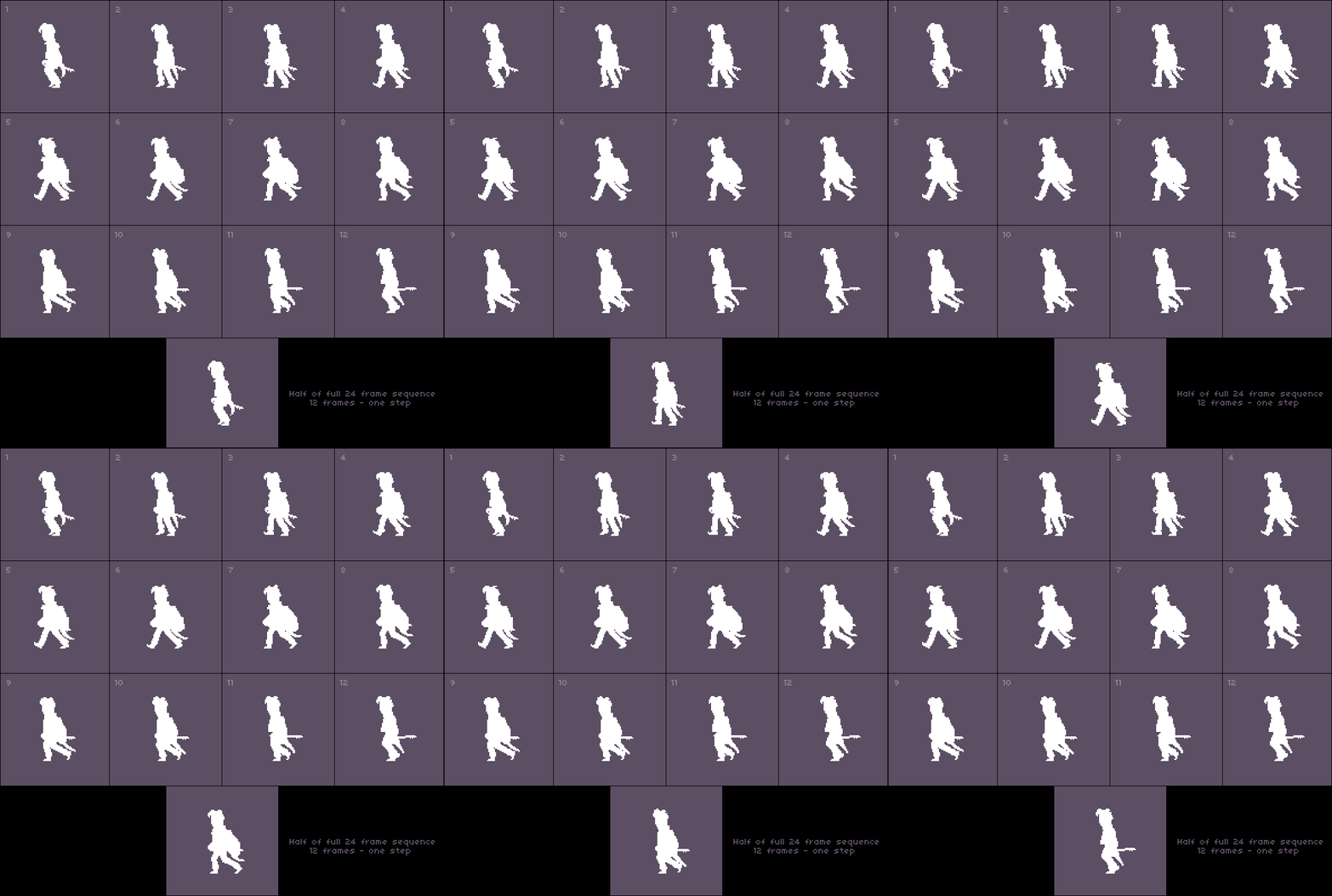
Chapter I. Fig. 5 - Half 24 frame animation translated into “white and black” as illustrative material for highlighting key frames according to the task posed in the chapter. Based on the selected key frames, the specified animation will be created.
Sadly, we still have to touch on a couple of definitions, but we will try to do it quickly, fun, and classically in our own way. To begin with, the concept of “key frames” came to us from animation (in English animation). The animator (please do not confuse it with naughty people from different hotels that entertain a bored audience) created sketches of the key frames of his characters, and then drew the necessary frames between them, which then turned into movement. The number of frames between these key frames was responsible for the smooth movement.
There are two techniques for creating animation (according to the "12 principles of animation") and this is either using layouts or direct phased movement. Layouts are what we are going to do, creating key frames and then drawing between them the additional movements we need (through intermediate frames). Direct phased movement is when the character is drawn as is. The first frame is drawn, and then additional frames are drawn to it as it moves (I would call it “animation according to circumstances”). This is suitable for a cartoon, but not very suitable for the production of graphics in games where the animation we created immediately goes into the game world as a character. The exception may be screensavers or videos.
The fact is that in the case of a direct phased movement, the character can go somewhere according to his own affairs, scratching his head thoughtfully, sometimes looking around and possibly even giggling at something, and each frame of the movement that he will do will be unique. This technique is perfect for gaming screensavers in the style of the unforgettable Another World or Flashback. But in case you need to create several frames of animation that, when repeated, will work in a loop (in the game industry, the English word is often used not the cycle word, but the word loop), and they will be a step or run - layout is the only solution. Thus, we get the first, and I hope the last, in today's publication definition.
Key frames- These are specific frames that the animator defines as key frames, between which intermediate ones are then added.
However, the wording is rather vague, isn't it? What kind of specific frames are these? What is their specificity? For myself, I deduced my own definition of a key frame.
Key frames are frames that best describe the animated movement at the individual key moments in time of this movement.
Now we need to define the keyframes in the animation above. In order to determine between which “keys” the remaining frames of the animation will be added, if they were not. Obviously, this is a frame of "maximum disclosure" when a person takes a full step, and a frame where a person lifts his leg, about to take a step or a frame close to him. Because it is precisely these character positions in space that describe the step as well as possible. This is the intention to take a step (foot leg) and actually the step itself in all its glory. Thus, if you select two frames from our silhouette list, the key frames will be the first and sixth frames, from the example above.
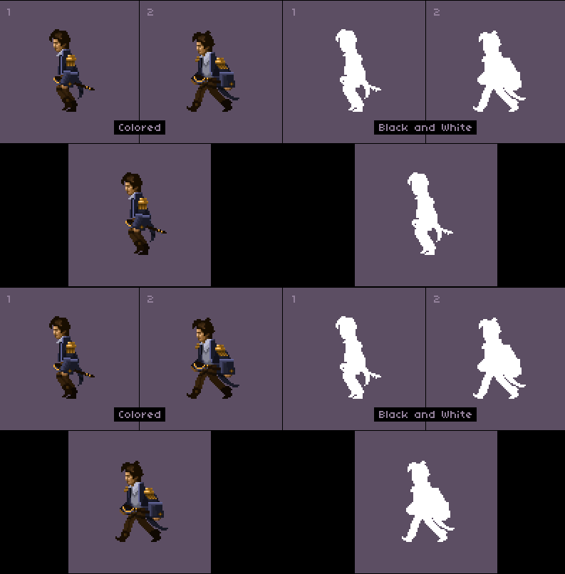
Chapter I. Fig. 6 - Two frames designated as key. On the left is in color. To the right in the "black and white" version. It is clearly seen in the image that the left option looks crumpled, while the right option, when reduced and properly cleaned, can solve the problem posed in the chapter.
In the first, a person begins to skid, in the second he is in the most open position that characterizes the full step well. And if the color version does not suit us at all, due to its inferiority, then we will meet the black and white warmly and in a friendly manner. Because it was she who solved our problem. Without colors, light and shadow, there is no way to evaluate an object in space. There are no left or right limbs, there are no objects closest to the viewer or distant ones - there is only a silhouette.
Now armed with at least a superficial knowledge of key personnel, we will return to our friends, and at the same time we will laugh at ourselves and our dilemma. Namely, the animation of two-color images into two frames. Since in our case both frames, by definition, will be key. At least because of the lack of other personnel!

Chapter I. Fig. 7 - Two-frame animation made with an eye on the frames from Fig. 6.
We coped with the task. We have two-frame animation in a range of two colors. However, it is worth noting that it became possible only because of the restriction of colors. Because any detail (color, light or shadow) on the character that goes beyond the silhouette would immediately put everything in its place, and it would become clear that the solution we created was nothing more than an illusion. For fun, I created seven replicas of the same man. Not only because with their help it can be shown that even “characters in two frames” can be different within about the same weight category. But probably because I wanted to say this way thanks to the band “Hanggai” under the composition of which “The Vast Grassland” I made up this part of Gallop for several hours, and which still keeps me afloat.
At the same time, this exercise was intended to tell the reader that you can get out of many, if not any situations. To do this, sit down and come up with a solution. Get creative. Understand what a person can do in a given situation, and what he cannot.

Chapter I. Fig. 8 - An emotional sketch demonstrating the difference between characters by changing the thickness of objects, changing groups of pixels, changing strength - to give the character a different character. Considered as a small tribute to the Hanggai band .
Chapter II - Tricolor
- Maybe three shillings are better? And the name ... damn it.
Captain Jack Sparrow
To begin with, we are not talking about patriotism. The title of the chapter briefly but succinctly defined our future task. Three frames for an animation of a step or any action, and ... three colors. Already richer, more interesting, but, like everywhere else, there are some nuances. It is always nice when the number of frames is multiple. He lifted his leg twice, took a full step twice, and so on. It would be logical to use four frames, right? But it’s much more interesting for us (to be more exact to me) to torture ourselves in order to get to the essence of phenomena. To understand what to do in certain cases.
In addition, I remembered one funny detail. It is such a restriction on the number of frames per animation used and still uses the RPG Maker engine (in a number of its versions). I do not understand the reasons for such decisions made by the developers (and there were not a few of them), due to some outlandish, alien logic. But this suits me as a kind of challenge, and the opportunity to illustrate another illusion that we will create with you. Right now.
So ... we have three colors. So, in addition to the background color, there are already two of them in our arsenal. As many as two colors that we can use when drawing a character. So, we can divide our image into lighter and darker. And this means that we will have volume in our silhouette, and that we will have limbs that will be closer to the observer, and further from him, which in theory will give us the result we need to solve the problem.
Let's start with keyframes. With a foot entered for a step, and frames of a full step, where our legs move apart to the maximum. Let the left foot be closer to the observer, and the right foot further away from him, and let the person go from right to left. Without noticing it, we issued TK for the upcoming task. Formed it in the form of text. This should always be done to at least roughly understand what you want to do. Let in addition to key frames in our first sketch there will also be poses and single sections of our hero in different versions for a better understanding of the shape and mood of the object.

Chapter II Fig. 1 - Different poses of the same character performed in order to understand his mood and form. They do not have to match what you do in the finale. There are no strict rules for following. But there is always a need to think before starting work, and sometimes just to feel something.
We decided on the poses, with an approximate view of key frames, too. But in the interests of the investigation, we will not start by simultaneously animating everything at once (all the handle-legs), but selectively. And let the legs go first.

Chapter II Fig. 2 - Illustration of progress
In the case of the previous “doublet”, we had no colors other than the background color and the color of the silhouette itself. Therefore, splitting into the foreground and the background within the same object could not be. Now we have a second color, with which we were able to shade the background, and the main push forward the foreground. It is here that we will finally understand that a step, just like running, or any other looping animation is born from repeating the same shape with a color shift. Using the same silhouette, in frame 1 and frame 3, we changed the colors of the legs, which gave birth to the illusion of movement of the right and left legs. In the second frame, we chose a neutral pose, which hides the leg as much as possible at the moment of its entry, so that it does not interfere with the general rhythm of movement.

Chapter II Fig. 3 - Illustration of progress
Having done the same technique with hands, we find out that our actions not only did not bring magic into the work, but also worsened the overall feeling of the animation being created. There are two reasons for this. The first is a limited number of frames. The second is the reach of the hands. They go beyond the body too far, and the frame between them is not enough to compensate for the intermediate movement. In the case of the leg, we cleverly twisted, because from the hip to the knee she repeats other frames, and what remains is bashfully hidden behind the foot closest to the observer, merging with the body. With hands, such a number did not work, they seemed to spread out like branches of a tree in different directions. Because of what an unpleasant flickering effect appeared. We can’t make an intermediate shot in such a way that it adequately compensates for the position of both hands, because they ... are brazenly waving.
What to do? To begin to become more modest. The energetic wave of arms in the case of three frames does not shine for us. Nevertheless, we are well aware that clever crooks live and work in most entertainment industries (although I prefer the term illusionists), who will always make the observer believe the reality of what is happening, or at least try to fool you with a clever illusion. When you buy another unnecessary utensil in your home, they will tell you about the exclusiveness of what you purchased, in addition they will give you a coupon with a discount on the next unnecessary thing, they will provide you with an “elegant” keyring as a gift, maybe they will even send you SMS messages with “rewards for loyalty” ... maybe , some of you will leave the store with awareness of your own importance. In the movie, you’ll be covered with effects, and if the actor suddenly gets fat, only his face will be removed, Well, in battle scenes they will be replaced by an understudy. And they will do everything so deftly that you will not even notice anything. All this is one big lie ... an illusion. Our path is no exception. Let's learn and enjoy the work that will give us far from illusory results.

Chapter II Fig. 4 - Illustration of progress.
Now our left hand looks pretty decent, and even looks like a real hand. Well, right? Yes to hell with her. And I'm not joking. In some cases, some elements of the image should be sacrificed for the sake of smoothness of movement. If you, as an inquisitive researcher, study the sprites of the protagonists of past games, you will be surprised to see that sometimes the hand farthest from the observer is either absent or present so implicitly that it seems that they simply forgot it. But only if you look at the frames individually. In statics. In motion, you don’t notice it, or notice because you have been pointed out to this.
We also added some shade to emphasize our hand. Still, a white hand on a white body looks quite inconspicuous. The second color, we gently shade it so that it becomes noticeable.

Chapter II Fig. 5 - Illustration of progress
We can still use the right hand. But personally, I prefer not to. In this particular case. Well, the next item in the program for us will be a change in the height of the character. With the "moonwalk" you can finish, as we have seen that the forms we have selected are sufficient to create our first animation. The fact is that the main movement is best done without secondary animations, so that they do not interfere with your work and allow you to focus directly on the step, or run, or any other animation that you want to do. Thus, first you will do the basic, basic animation. And then go on to the details, to animations that are secondary, but not necessary.

Chapter II Fig. 6 - Illustration of progress
By shifting one pixel vertically in the neutral zone, we get a wiggle effect, or ... bouncing. Choose for yourself what suits you best. In the case of a full step, a person is usually a little lower, in the case of a rack with a skidded leg ... higher. A shift of just one pixel makes our walk more real and more lively. I propose not to dwell on this. Remember, I mentioned "12 principles of animation"? One of these principles is to create an expressive trait in the character.

Chapter II Fig. 7 - Illustration of progress
In total, we added a couple of pixels to the character with additional dynamics that we need so much to make the character alive. In the case of the movement of the legs, we tried to make a synchronous movement. Here we will go the opposite way and add to the character elements of asynchronous motion, unique around the entire perimeter of the changeable zone, in each individual frame.

Chapter II Fig. 8 - Illustration of progress
Just like in the fourth image - let's shade the hairstyle of the character. We will not animate it. Just add shadows where she could be cast by her hair. In creating the shadow, we must be careful. Balance is important everywhere, and excessive shadow can ruin our results. There are no universal schemes for creating such small details. Improvisation is important. Ask yourself the question "what if?" and feel free to try something new. In the end, erasing a dozen failed pixels is not so difficult. And since we started asking ourselves questions ... what if we add a little more shadow to the character to emphasize the arm even better while moving?

Chapter II Fig. 9 - Illustration of progress
No sooner said than done. The only thing to take care of is that the shadow moves smoothly and without jerking. That is, its shift in relation to the previous and next frame should not exceed one pixel. If the animation has a sharp change in chiaroscuro - this is bad for the overall smoothness of movement. You can easily see for yourself by creating your own little man. What, I hope, this material will help you.

Chapter II Fig. 10 - Illustration of progress
We added another expressive detail, just as we previously animated the character's hair. Now this detail has become the collar of the jacket. We can say that we have achieved the set result. We made a character animation within three physical frames using three colors. The guy has found life and is ready to retire to the wasteland. To increase his chances of survival, we will give him a rifle, a backpack with supplies, and move on to the next chapter. True, with a small block of notes.

Chapter II Fig. 11 - Illustration of progress
Note:The backpack is just like hair, and the edge of the jacket moves asynchronously. In addition, they move in antiphase. If you look closely, you will notice that the top of the backpack with the strap does not move in the same way as the edge of the jacket does. With these elements having different dynamics of movement, you make the silhouette of the object unique. Special. All around its perimeter. And despite the fact that the principle of layouts is used to create animation, based on key frames and creating a cycle, some of the character's elements are knocked out of the general scheme, attracting the attention of the observer. Which is what we need.
It would be ugly for me not to pay a visit to an old acquaintance. The same principle that we used above was used for one post-apocalyptic game, which, unfortunately, never saw the light of day. Sprites were made specifically for RPG Maker, with this strange limitation of three frames within a sequence. The game did not become a reality, but we have educational material, which means that the work was no longer in vain.
Of course, the movement of the character is more than a step reminiscent of shuffling, and in some moments even the Russian dance, but, nevertheless, he moves, which also leads to another thought. When working in a limited or small number of frames, you should not be afraid of large characters in terms of pixel size. They also have the right to life.
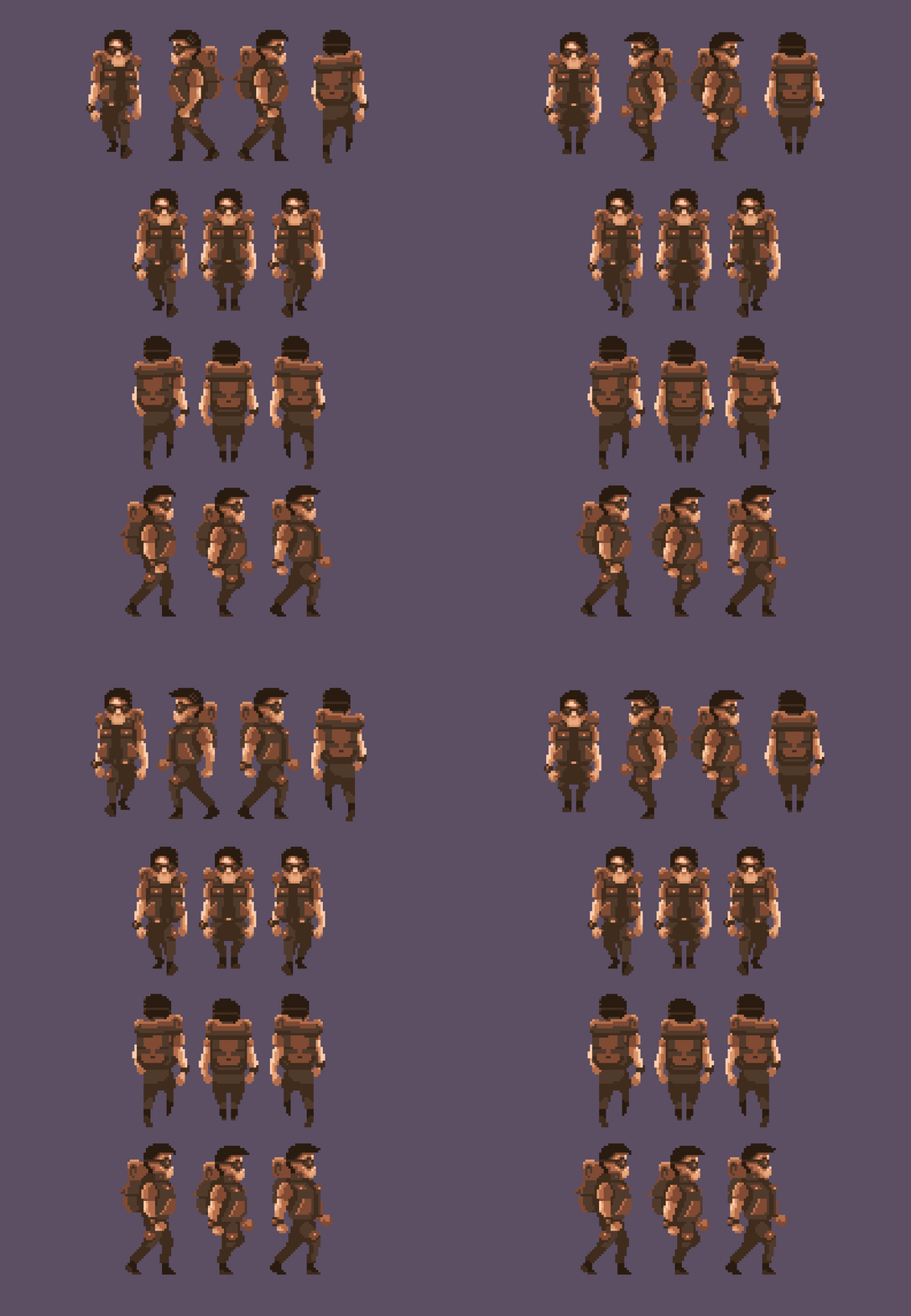
Chapter II Fig. 12 - A character made with parameters identical to the task of the chapter for the failed post-apocalyptic project “Finder”. Used in the demo version made on the RPG Maker engine.
Tas (oh god, and this one with a name) also uses three frames. Two broad steps, and an intermediate frame with a skidded foot. The wide step is redrawn twice with the shifting of light and shadow. The skidded foot is masked, and is done so as not to disrupt the general rhythm with its appearance, but to maintain it. Then characteristic details are applied to the image. For example, when walking to the left, gray strands are visible on his head, and there is a clock on one of his hands. A simple mirror image has already solved the problem of moving left and right.
But what about the details? These little things that will make your character special? Which will tell the observer how much love and attention to detail you put into the character? Do not neglect them, and he will be grateful to you for this. Twenty minutes of work on top of what has already been done will not burden you even if you need to make twenty of these characters, and acquiring in the form of audience sympathy ... is worth a lot.
Long forgotten story
The Finder project has an interesting fate. About what the history of a sunken ship might be. Development began a long time ago, back in those bright years, when my head was full of thoughts, and my heart of hopes, and even in my wallet, the hard-pressed florins tinkled. With these small savings, I expected to implement a demo version of the project. At that time, it was called Project Serenity. His echoes can be found on the site. www.serenitythegame.com
This is the last slice of the first demo version recorded in current resolutions. Unfortunately, I have no screenshots left, and to find this build you will have to spend a lot of time. Which is completely unacceptable in the context of an article whose support until the work is completed is 24 hours.
I managed to make a completely acceptable visual series. In creating this demo, I was guided by the best work of the developers of our bright past. And the swan song of isometric games for me was, is and will remain a series of “Commandos”. The attention to detail that the developers at Pyro Studios demonstrated always hit the eye and delighted the soul. But my own project was not destined to take off.
The end of savings meant one thing - the project will go to the shelf. And at that moment it did not seem crazy to me to realize at least some of the ideas in a third-party project, affecting the universe of the game that did not come out. Thus was born the concept of the game "Project Serenity: Finder". In it, an unlucky adventurer had to help other people search for certain objects and finds on the ruins of post-apocalyptic cities and villages. Since resources were limited, it was necessary to moderate appetites and choose some other graphical solution that would not be so voracious. I chose prerendered backs with a fair amount of post-abbot, rough brushes, in the style of pixel art, and characters made in the style of pixel art. The prototype was created on the basis of the RPG Maker engine, and one familiar face - you have already seen in this article. This is the main character named Tas.

The full version of the image is available at the link (size 2560x1920): habrastorage.org/webt/v4/vz/tv/v4vztvt6crc9cz-jl0tfhywcrek.jpeg The
first location was to be a small settlement of four game screens on which the action would unfold, affecting also a small a piece of wasteland on either side of it. But alas ... and this idea crashed. All that remains is the ruins of the first and second project, a small handful of screenshots, slices of the technological demo version, in terms of graphics, and the controller.
It was always interesting to dig out something old in the industry. Any old projects. Long forgotten, covered with moss, with details that are familiar to someone only according to legend. But I never thought that the fruits of my labors would turn out to be exactly the same stones. Now these mossy ruins make me bitterly smile. This is the price of indefatigable ambitions, and such is the hard way for the indie developer. Not all trails lead to success. My success is a series of articles that I write. And I am extremely glad that some of the developments came in handy in my next article, "Gallop Pixel."
By the way, Project Serenity has not disappeared without a trace. Many of the graphic developments migrated to the project "Encased" from "Dark Crystal Games". The attentive eye can notice some of them even now. Right on the latest developer screenshots. This is probably the best thing you could wish for in such circumstances. Using content in another project is much better than obscurity.
I am sure that any developer will have dozens of such stories. And this is why I love the gaming industry. Among other things. For its roots. The story. And archeology.
This is the last slice of the first demo version recorded in current resolutions. Unfortunately, I have no screenshots left, and to find this build you will have to spend a lot of time. Which is completely unacceptable in the context of an article whose support until the work is completed is 24 hours.
I managed to make a completely acceptable visual series. In creating this demo, I was guided by the best work of the developers of our bright past. And the swan song of isometric games for me was, is and will remain a series of “Commandos”. The attention to detail that the developers at Pyro Studios demonstrated always hit the eye and delighted the soul. But my own project was not destined to take off.
The end of savings meant one thing - the project will go to the shelf. And at that moment it did not seem crazy to me to realize at least some of the ideas in a third-party project, affecting the universe of the game that did not come out. Thus was born the concept of the game "Project Serenity: Finder". In it, an unlucky adventurer had to help other people search for certain objects and finds on the ruins of post-apocalyptic cities and villages. Since resources were limited, it was necessary to moderate appetites and choose some other graphical solution that would not be so voracious. I chose prerendered backs with a fair amount of post-abbot, rough brushes, in the style of pixel art, and characters made in the style of pixel art. The prototype was created on the basis of the RPG Maker engine, and one familiar face - you have already seen in this article. This is the main character named Tas.

The full version of the image is available at the link (size 2560x1920): habrastorage.org/webt/v4/vz/tv/v4vztvt6crc9cz-jl0tfhywcrek.jpeg The
first location was to be a small settlement of four game screens on which the action would unfold, affecting also a small a piece of wasteland on either side of it. But alas ... and this idea crashed. All that remains is the ruins of the first and second project, a small handful of screenshots, slices of the technological demo version, in terms of graphics, and the controller.
It was always interesting to dig out something old in the industry. Any old projects. Long forgotten, covered with moss, with details that are familiar to someone only according to legend. But I never thought that the fruits of my labors would turn out to be exactly the same stones. Now these mossy ruins make me bitterly smile. This is the price of indefatigable ambitions, and such is the hard way for the indie developer. Not all trails lead to success. My success is a series of articles that I write. And I am extremely glad that some of the developments came in handy in my next article, "Gallop Pixel."
By the way, Project Serenity has not disappeared without a trace. Many of the graphic developments migrated to the project "Encased" from "Dark Crystal Games". The attentive eye can notice some of them even now. Right on the latest developer screenshots. This is probably the best thing you could wish for in such circumstances. Using content in another project is much better than obscurity.
I am sure that any developer will have dozens of such stories. And this is why I love the gaming industry. Among other things. For its roots. The story. And archeology.
Chapter III - The Sign of Four
- You did not win, you cheated! In a fair fight, I would stab you!
- Well then, fighting honestly is clearly no reason.
Dialogue of Will Turner and Jack-Sparrow
We will also begin our third chapter with setting the task. Let the animation have four frames. We will continue to move towards the cadres gradually, incrementally. However, in terms of colors, we will not be so harsh. Fasting time is over. We already realized that hunger and abstinence are useful for understanding the essence of things and the lack of excess weight. But ... what about orgies? Let at least sixteen colors be put on the table, for we desire to feast! We also agree that if our gluttony goes too far, we will not cry, observing the dietary "thirty-two."
Before we fall into the ecstasy of gluttony, it is worth completing our terms of reference. So far, we have been doing animations exclusively in side view. Passing by Tas spoiled us all the raspberries, telling and showing that in a number of games the characters can walk not only left or right. Therefore, we wish that our character also went up and down. To revel, so to revel. Let our kit be no worse than in Stardew Valley.
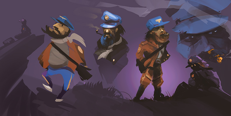
Chapter III. Fig. 1 - Emotional sketches, as part of the search for the image of the future character. They can be performed as you like, in any kind and style. Their task is not to sketch in pixel art style, but to grope those emotions, the image that you need.
Note:Regarding this image, I would like to give some explanations. Usually I do not post frankly raw work. But since this is my working sketch, hooliganism and search, then it is quite possible to attach it to the article. I believe that the task of the artist, or the one who is trying to be one, or the one who wants to be one, is to help oneself fulfill the task. Make good pixel art. And for this, all means are good. How exactly you will convey the desired mood to yourself, and how to catch the image is your personal task. And more than a draw. You can not publish your drawings if you are shy, and provide the observer or player with the final version of the pixel art in the form of a miniature, scene or game asset.
Why am I focusing on this moment. At all times, any artist was under pressure from society, educational institutions, or fashion (in a word, a snake ball surrounding you in the form of various sources of pressure) forcing him to do something in a certain generally accepted style, or in accordance with generally accepted image standards, or, in accordance with ethical standards, God knows what else. Unfortunately ... most often the opinion of others for the artist means a lot. And even if it doesn’t mean, it definitely hurts. Therefore, the most important thing in this matter is to ignore all types of opinions except your own. Of course, letting everything that falls on you through a special prism. Highlighting, among other things, adequate criticism that promotes your growth, if you need it, of course. If you don’t need it, just do it what you like and what the heart is for. If necessary, separate the grains from the chaff.
We started with simple poses, which, in essence, are future keyframes. They will have to undergo some cleaning. Because we need the essence of things and the starting point. In the interest of understanding processes, we must move from the simplest to the complex, but not vice versa.
Let's agree that the elements of our first frames will be divided into two-color arrays. Those same foregrounds and backgrounds, where the foreground of the object will be the arms and legs that are closer to the observer, and the background will be the arms and legs that are further from the observer. The close-up will be lighter, but the darker. And finally, it's time to cheat. Because we need - just one step. The second step will be a copy of the first one changed by changing colors. That is, we just repaint the arms and legs, without touching the silhouette. This will be true for both the side view and the front and rear views. In the case of the last mentioned, we simply make a mirror copy of the same step. Sounds like a pirate, so let's get started.

Chapter III. Fig. 2 - Illustration of progress.
Exactly, as agreed. A pair of flowers on the face, a pair on the jacket and a couple on the pants. The cap is not impressive yet, but not all at once. Sneakers are also divided into two colors in accordance with the concept of objects near and far from the observer. Therefore, without hesitation we run further. Let's start conjuring with shadows. We emphasize the cap with a darker color, make the hero’s jacket tidier (let’s, by the way, give him the same name as the previous guys), and add a hole behind the cap.
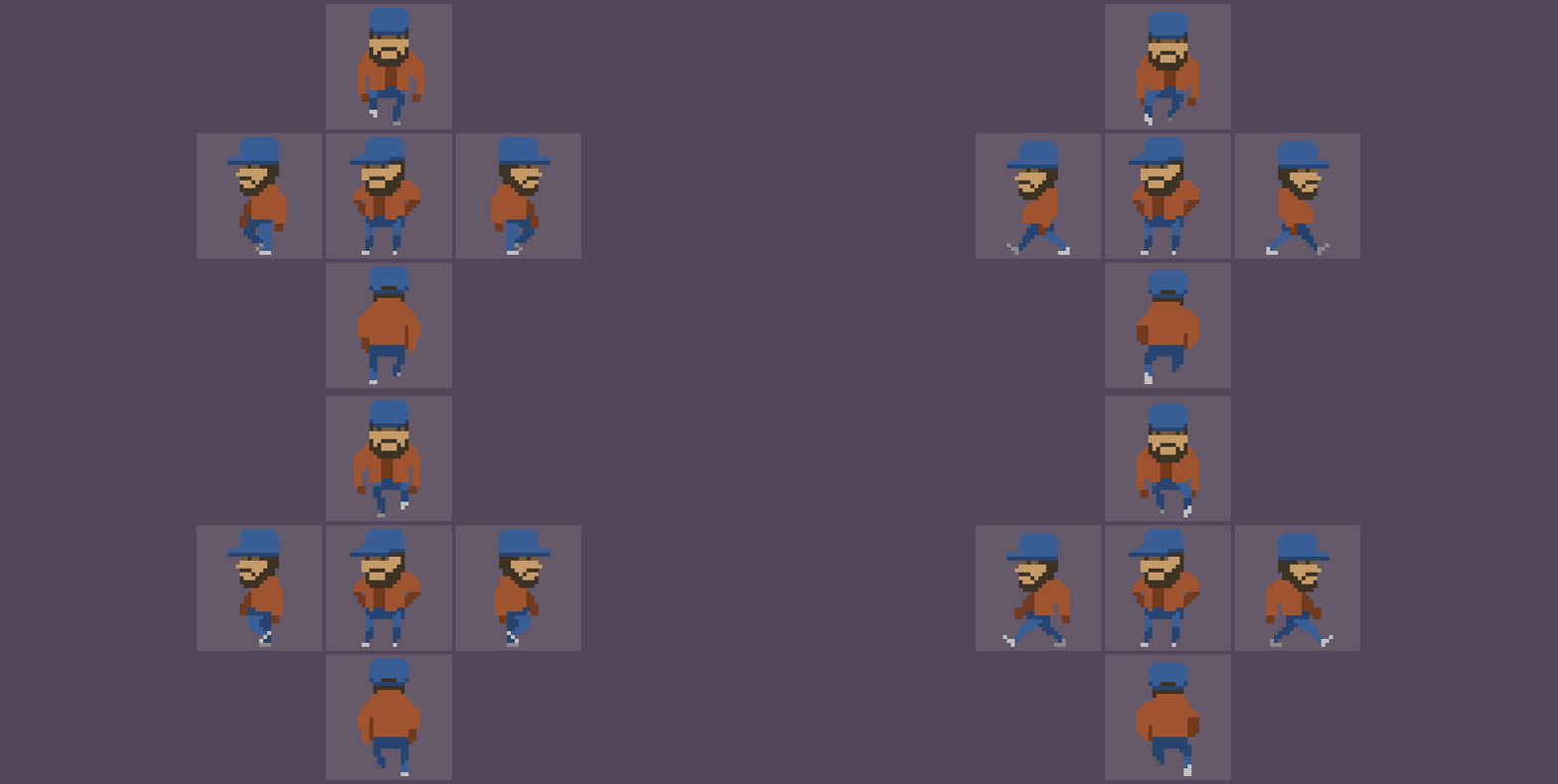
Chapter III. Fig. 3 - Illustration of progress.
Now let's provide Joshua's face with extra details. Divide the complexion and beard with an intermediate color. So it will become more attractive and voluminous. And at the same time, as at the very beginning of the article, we will make it wait. Not a face, but a character. Rather, his leg. Waiting leg. The impatiently tapping sneaker will clearly indicate this. Just one pixel and the central character ceases to be dead. May it entertain us, like the rest of the action.

Chapter III. Fig. 4 - Illustration of progress.
Suppose that the light falls from above, a little at an angle, and help the volume on the jacket, add shadows that cast the hands, and at the same time make the hands themselves. Rather courageously clenched fists.
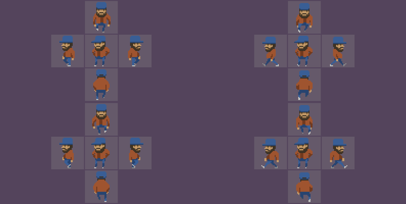
Chapter III. Fig. 5 - Illustration of progress.
The next change will be small, but quite significant. Let there be a T-shirt or shirt under the jacket. Just one color will break the gloomy realm of two colors, increasing Joshua's readability in the area.

Chapter III. Fig. 6 - Illustration of progress.
Our guy’s face is by far the most motionless part of the object. It sways up and down, but does not change its topology. So we can work it out in such a way that it is final. Right at the early sketch stage.
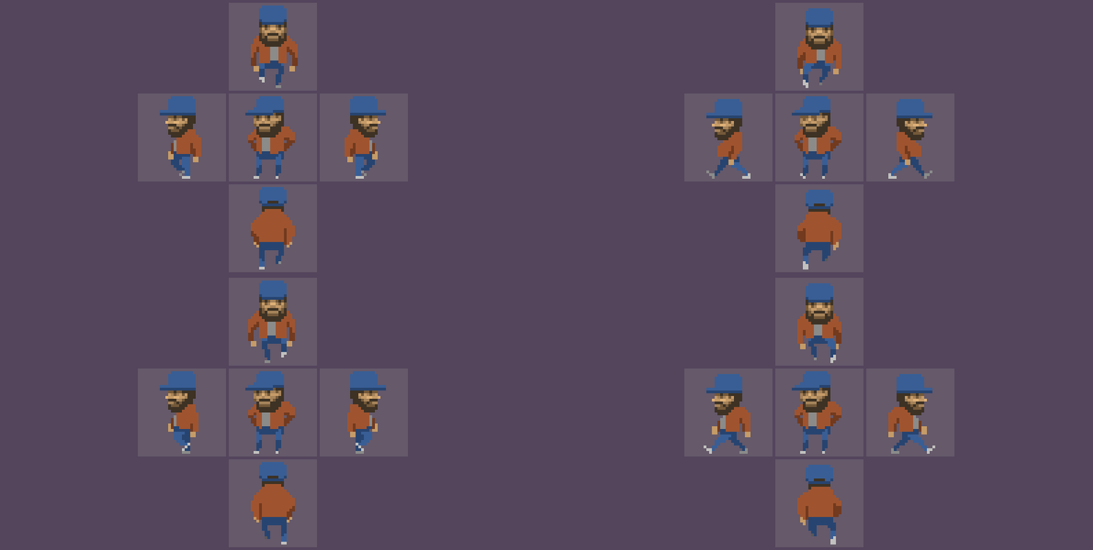
Chapter III. Fig. 7 - Illustration of progress.
Now let's do the magic. Without paying attention to specific details, it will be quite difficult to see the differences between the previous version and the subsequent one. But they definitely are. The same shape of the hands comes to life due to the shifting of colors. Without changing the shape of the object - we change its color. The closer the object is to the observer, the brighter it is, the farther, the darker. This is a turning point in our work. Now we have to crank out the same technique with the rest of the body. However, let's not get ahead of ourselves.
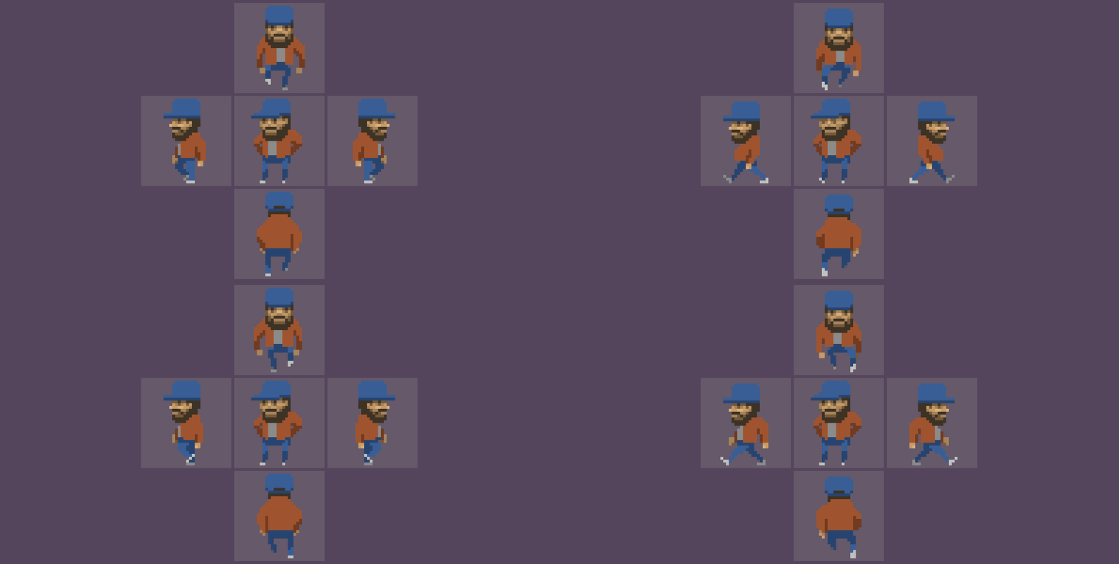
Chapter III. Fig. 8 - Illustration of progress.
Don't you think that the cap on the top character coming towards us looks somehow strange? Personally, it reminds me of one stereotypical cap for no less stereotypical characters who like to insert in cheap comedies in order to create a third-rate image of a Georgian who has long been out of touch with reality (and did it correspond at all)? Let's fix it. By adding light to it. And at the same time, since we began to work with Sveta, we add shadows on Joshua's legs. The farther the leg, the darker. Sharpen the colors in the shadow area so that the character becomes more voluminous from the perspectives, where he comes at us, and from us, in particular.
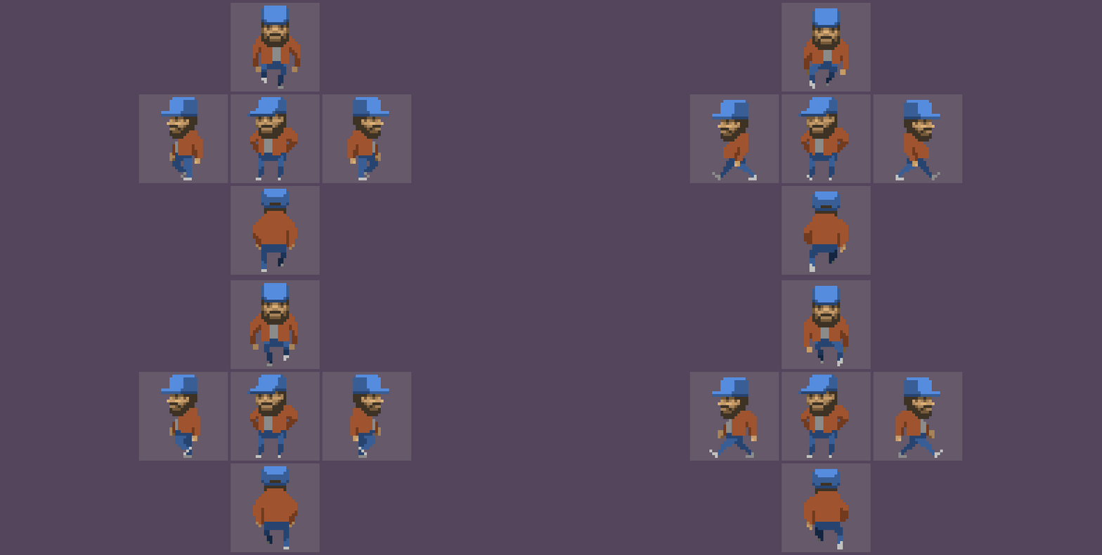
Chapter III. Fig. 9 - Illustration of progress.
If we already began to indulge with sister Shadow, let her open up in all its glory. Let the head, as it should be, cast a shadow on the body. And let the jacket below also have a shadow, and let the hands dangling sloppy around, also sin with it. We even emphasize the collar in the rear view. One small line is enough, and its shift within the frames of neighboring frames by only one pixel will create the illusion of a moving collar.
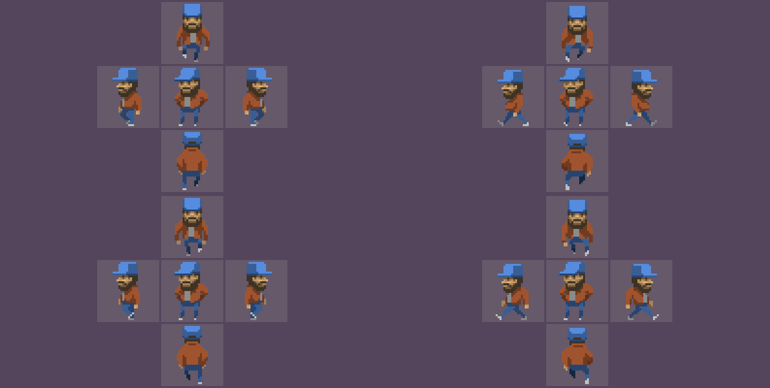
Chapter III. Fig. 10 - Illustration of progress.
Just as we already did this with our hands, let's take on the sneakers. In the view on the left and on the right, just add one pixel on the toe of the sneaker closest to the observer. Something like a glare. But in the rear view and front view - have to work.
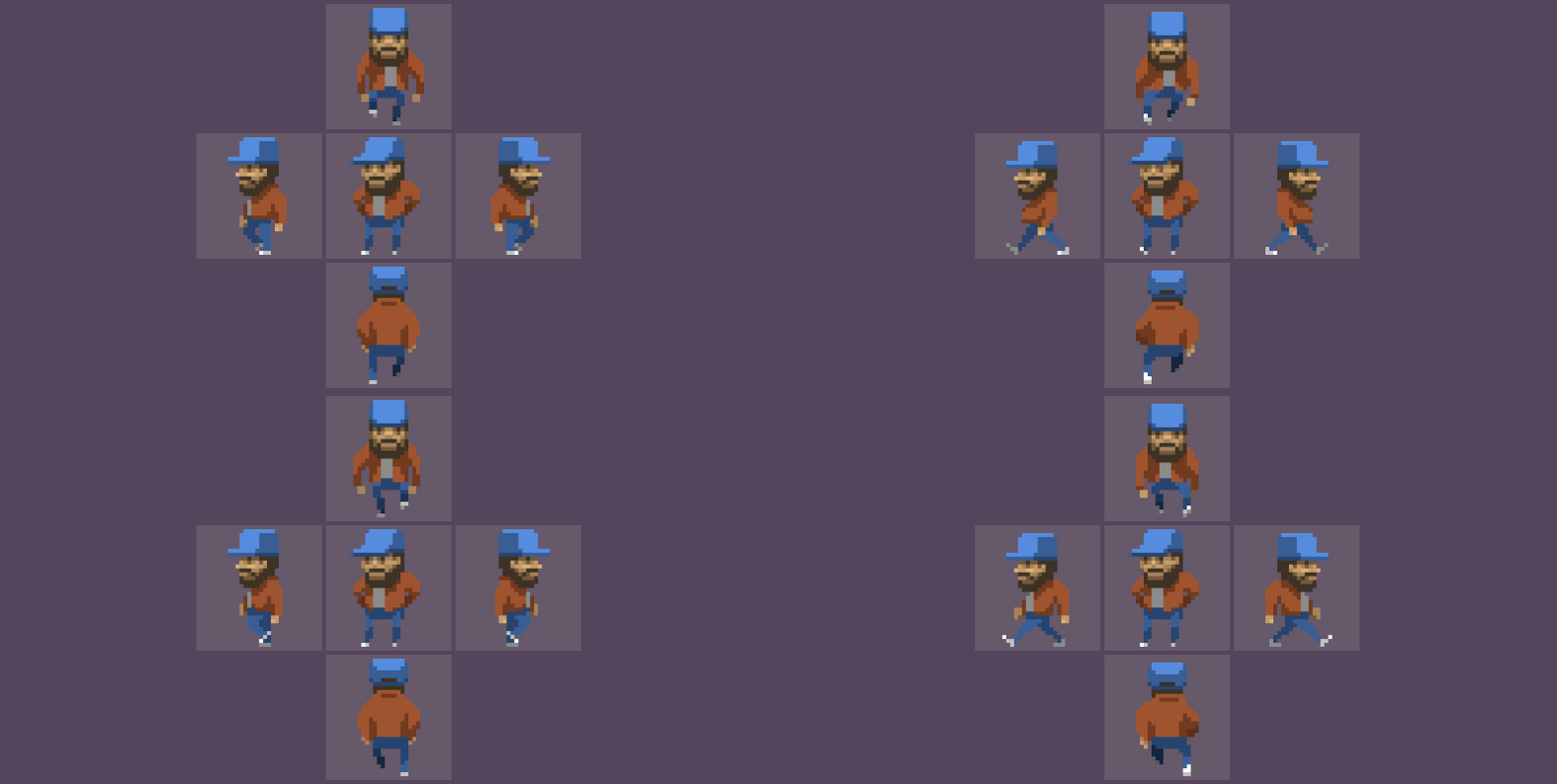
Chapter III. Fig. 11 - Illustration of progress.
Since the changes, even with an increase, are practically invisible, I made an enlarged section of this zone. On the left, what happened before we started adding light and shadow to the sneakers, and on the right, what we got as a result. It would seem an insignificant detail, a handful of pixels. But, believe me, it is from such trifles that the image is formed. From the little things around us, absolutely everything is formed. A handful of little things around you on the table can tell more about you than you yourself, well, and make a rare mess at the same time.

Chapter III. Fig. 12 - An enlarged example of animation by shifting colors. On the hands the shape of the object does not change, but only the color changes in order to convey the movement of the object in space. Sneakers use the same technique. It is clearly seen that even one correctly placed pixel makes the shoe seem to bend.
It's time to play with the forms. First, let's emphasize between the case the shadow that the jacket on the pants casts. We will do this in one line to clearly separate the jacket from the pants. And what’s much more interesting, we’ll make the jacket behave as it should. Prior to that, she “pleased” us with a log of grace, which revolves around its axis, not claiming more. If this is all that a leather jacket is capable of, then I'm not impressed.
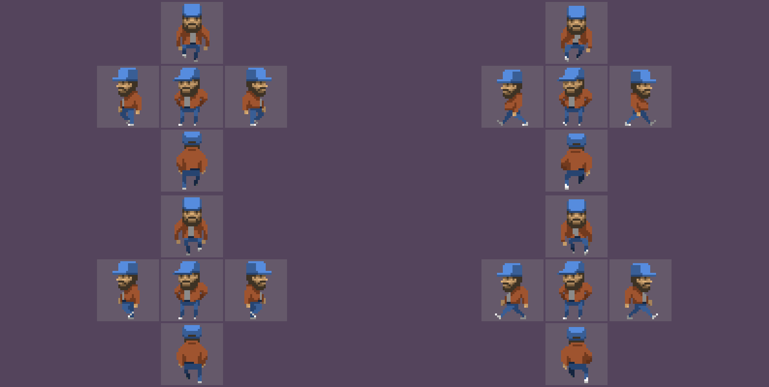
Chapter III. Fig. 13 - Illustration of progress.
Quite a different matter. Not as embarrassing as before. Nevertheless, our face flaunts light and shadow, transmitting information about the volume, and the jacket looks like a flat spot, albeit with a shadow. Why not add some light to your shoulders? If we assume that one color is the main color of the object, and the second color is the color of the shadow, then why is there no color responsible for the light? Let's fix this omission. Not forgetting about the cap. It’s already high time to break it by colors in order to separate the peak from the vertical part.

Chapter III. Fig. 14 - Illustration of progress.
Now we are starting to ride like a flea trying to “fix” our own omissions. But in fact, we just iteratively add more and more details to the image, continuing to work with light and shadow. And each new iteration tells us where we have voids, where it is better to add something, so that the character looks advantageous in comparison with the previous result. It's time to add a shadow to the t-shirt, and at the same time improve the pants by providing them with an additional shadow (that is, strengthen the current shadow by adding darker colors to some parts of the image), which will allow you to move your legs even further away from the observer, forcing Joshua to work with his hips.
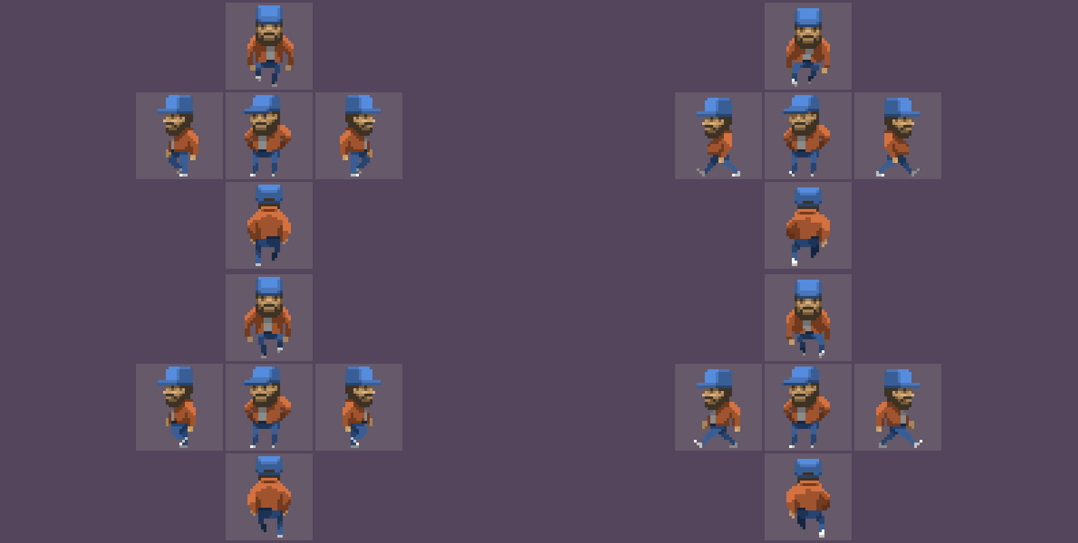
Chapter III. Fig. 15 - Illustration of progress.
As often happens, one pulls the other. After the appearance of light on the object, it becomes clear that some parts of the character look empty. Let's add the postman's cockade to his cap. With the same success, it could have been some other badge, but we will assume that this is exactly what postman regalia looks like in pixel art. I will not hide, almost everything that I do is somehow connected with the post-apocalyptic. We will call it yet another dedication to the “Postman” by Kevin Costner, to whom I have a certain weakness (how many of them I had, these postmen!).

Chapter III. Fig. 16 - Illustration of progress.
And the more new details appear, the more clearly the continuation of work with light and shadow is requested. It seems to me that a jacket in the back and front views should be especially helpful. As usual. Just a handful of pixels. And since we have taken up quite a trifle, assuming the close end of the path - let's add him a patch on the shoulder. Remember Tas? We will do the same trick. There is a patch on one hand, but not on the other. Case for two pixels!
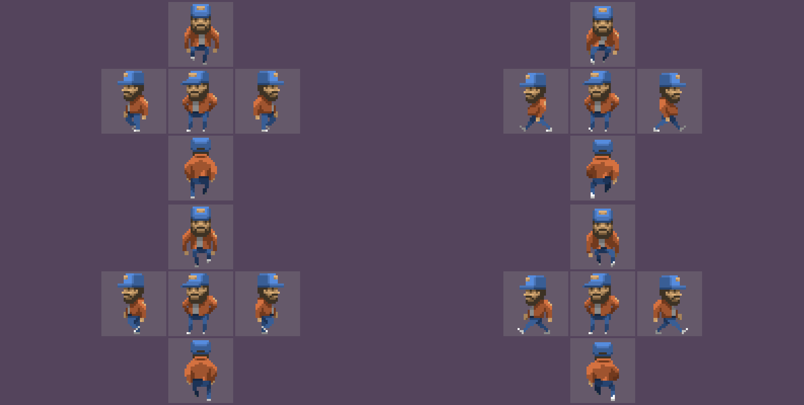
Chapter III. Fig. 17 - Illustration of progress.
Remembering the Disney animators add an expressive detail. And we, in this case, will not care about the eternal criticism that follows further that the visors of caps do not swing like that. We need an image. Alive. Mobile. Breathable life wherever possible.

Chapter III. Fig. 18 - Illustration of progress.
A dubious detail, to be honest. However, you can always fix it in your own way. For example, adding a postman bag to him, changing strange sweatpants to uniform trousers and stuffing a real cap on his head. There is no limit to fantasy. There are no obstacles in the process of your improvisation.

Chapter III. Fig. 19 - Frames individually
Four perspectives show well that the use of frames is minimal (four frames) for each sequence. Two frames are used for each step. The next two frames are mirrored copies of this first step with redrawn chiaroscuro and elements that help hide the reuse of the first two frames. I would say that this is the maximum possible savings, with the most effective visual range.
Such characters can become the bones of any project, making it easier for animators. It is much easier to do four-frame sequences than animations of six or eight frames. It’s much easier to make replaceable elements to hide the duplication of the first two frames than to draw truly unique clothes.
Of course, if the project has the means to make unique animations, and unique characters. But as practice shows, the developer always tries to save. After all, saving in one place means profit in another. And there is always not enough money.
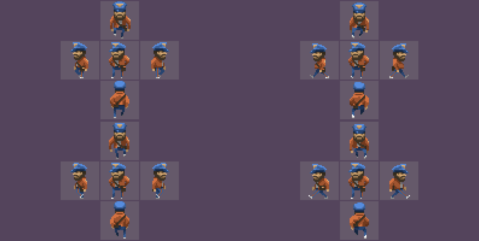
Chapter III. Fig. 20 - The final version of the Postman.
There is no point in unlocking and saying that the work of “Little Big” with the composition “Skibidi” had no effect on the latest animation. Like everyone else, I am constantly influenced by such powerful tools as sound and video. About fifteen years ago, I decided that I did not want to have anything to do with such things as television and television broadcasting. However, there is a network, and YouTube as well. From time to time, I am covered by a blast wave from popular musical works, movies or television series.
Chapter IV - Optional Synopsis
Time to take stock of today's race. Let us try to briefly describe what is hidden under a pile of pictures accompanying this article. One way or another, we met with the following concepts:
Layouts. The method of creating animation by means of key frames with additional rendering between them intermediate frames in the amount necessary for the author.
Direct phased movement. The method of creating animation from the first frame to the final, with the completion of each subsequent frame manually, in accordance with the author’s intention.
Key frames. Frames that best describe the animated movement in separate, key moments in time of this movement, between which intermediate frames are then drawn.
Animation by mirroring an object. Метод создания полноценной анимации на базе половинной анимации, где вторая половина создаётся за счёт зеркального отражения первой половины анимации и при возможном использовании перекладки цветов.
Анимация перекладкой цветов. Анимация, создаваемая за счёт изменения цветов объекта, а не его формы.
Глава V – Эпилог
The purpose of this publication was to create animations, starting from two and ending with four-frame sequences, in order to prepare for the final “Gallop Pixel” chord. Without a doubt, a phenomenon such as pixel art can be talked about endlessly, exactly, like any other artistic phenomenon. Every day there are new solutions, automation methods, and styles that claim to be new. It is impossible to keep up with everything, and it is impossible to describe everything that is happening around. Therefore, my task I see is focusing on the basic and public aspects that will help you prepare a very different pixel, both for the soul and for commercial use.
With these simple lessons and with some practice, you can create graphics that will look appropriate in games of the "Stardew Valley" or "Starbound" class. Of course, this course may not be enough if you are threatened with “Another World” or “Flashback”.
At the same time, these basic milestones will be enough to disperse the crew of their own inspiration, or to ignite the long smoldering gunpowder of future achievements. A little practice, and you can do similar things, for it really is ... simple. The main thing is to want, not to stop, and move towards your goal. Or, if there is no desire to do something, but if there is interest in the topic, at least be able to maintain a conversation in the kitchen, if such happens, about such a wonderful phenomenon as pixel art.
In the near future, it is planned to release the final article “Gallop Pixel”, which will mark the end of the base cycle and the transition to the so-called DLC. By DLC, I mean articles related to pixel art and revealing topics not included in the basic course. After so many years, I still want to put an end to the story. For at least one of my writing projects in recent years to be completed.
At the end of the Epilogue, I would like to express my gratitude to my Patrons from Patreon, my dear PP, who supported me for two years. I want to express my gratitude to them for their patience because the work at Dark Crystal Games that suddenly swallowed me and various health problems prevented me from doing this business with due diligence. And I’ll add that to describe in words those emotions that they give me with their support, and, therefore, emotions directly related to the release of the new chapter of “Gallop” - will not work. Therefore, I will say simply - Thank you for being!
Gronkh, Igor Gritsenko, Matei “Retronator” Ian, Kalam, Howie Day, Ben O'Neill. Pavel Bartchuk, Gleb Rukashnikov, Alexander “La Bestia” Andreev, Ross Williams, Paddle Poe, Stas Galyunas, X-Rust, Echo_Memoria, Nikolay Izoderov, Anton Reshetnikov, Oleg, Fernando Ezra (Fernando Esra) , Konstantin Epishev, Tanya Veksell, LilBrutha That's
it. See you on the other side of the moon (wink).

Herr Text Bunker
The first note , classically justified.
Если честно состояние сейчас… наверное так себя чувствует старая струна, которую натягивают, чтобы выдать правильный звук. Два года прошло с момента написания прошлой статьи. Для меня это скорее печальная новость, чем какая-либо ещё. С тех пор как я вступил в должность главного художника, по сути арт-директора пост-апокалиптической игры «Encased» от «Dark Crystal Games» моё свободное время куда-то улетучилось. Справедливости ради надо отметить, что физически — далеко не всё. Я бы даже сказал, что его было достаточно для написания статьи, для создания рисунков, и многих других вещей, которыми я обычно люблю заниматься. Но вот незадача исчезли силы. Совершенно. Этот проект как пиявка высосал из меня всё, что было, и каждый день я словно поднимаюсь на амбразуру дота, до которого ещё километров пятнадцать надо проковылять. И пока ковыляешь – вся жизнь проносится перед глазами. Что самое печальное пятнадцать километров понятие метафорическое. Физически я не покидаю стул квартиры, в которой «снимаю» комнатку.
Заметка вторая, кашевидная.
Самое тяжелое в статье это иллюстрации, их нарезка и верстка. Наверняка все знают, что оптимальное разрешение изображения на Хабре для того, чтобы оно корректно выглядело в статье – 793 пикселя. И это не очень напоминает кратный размер. Поэтому сначала делаются иллюстрации, затем делается кратное увеличение, подбирается нужный размер, в каждом случае разный, а затем создаётся «рамка», которая окружает это изображение. И ладно если это статическое изображение. А что если это анимация, да ещё разделенная изображений на сорок? Такие операции редко, когда можно повесить на скрипт, потому что даже создание срезов иллюстраций – процесс не автоматизированный. Ты должен внимательно отсмотреть материал, поправить огрехи, подумать и т.д. В результате работа растягивается на недели, потому что даже текущий набор изображений нахрапом не взять. Начинаешь лезть на стену. Сейчас, после двойной вычитки статьи я уже нахожусь на грани легкого помешательства. Я даже не уверен, что это статья, и что она вообще может кому-то в чём-либо помочь. Вероятно, такое ощущение создаётся по причине публикации после очередного рабочего дня. Вы уж простите ребята, но в голове у меня форменная каша. И мне известен только один способ проверить статью – доверить её публике.
Заметка третья, «стриммерская».
Я практически год ничего толком не стриммил, но сегодня я могу посидеть и послушать музыку. Хотя бы часок. Стрим в поддержку статьи непозволительная роскошь, надо беречь силы на завтрашний рабочий день. Однако мы всегда можем обменяться разного рода сообщениями. Так что – добро пожаловать. Завтра как обычно будет «рабочее радио», так я себя развлекаю в процессе работы. «Кручу» звуковые дорожки к играм и фильмам, пока махаю рубанком. Рубанок и стружка здесь — www.twitch.tv/weilard
Инфосфера
Термины, определения и дополнительные информационные ресурсы
Анимация — (от фр. animation — оживление, одушевление) — западное название мультипликации: вид киноискусства и его произведение (мультфильм), а также соответствующая технология. (вики-линк)
12 принципов анимации — набор основных принципов анимации, предложенных аниматорами студии Дисней Олли Джонстоном и Фрэнком Томасом в их совместной работе «Иллюзия жизни: анимация Диснея».
(вики-линк)
12 принципов анимации — набор основных принципов анимации, предложенных аниматорами студии Дисней Олли Джонстоном и Фрэнком Томасом в их совместной работе «Иллюзия жизни: анимация Диснея».
(вики-линк)
Дата последней правки в статье: 30.03.2018 Время: 10:46
- Правки орфографии
- Добавлены статичные кадры «Почтальона» в конце третьей главы, чтобы подчеркнуть минимум трудозатрат на создание подобного ассета, с соответствующими комментариями.
- Added a "Long Forgotten Story" about Project Serenity, and Project Serenity: Finder fragments of which were found in this part of the article. Location is the end of chapter II. In order not to break the general narrative, the story was introduced under cat.
- Spelling edits
- Updated links at the beginning of this and previous articles of the “Gallop” for easy navigation.
- Added safely forgotten epigrams. Fragmented text update.
- Another note added. Section "Herr Text Bunker"
- There is a trimming of trifles. Spelling editing.
- The info sphere is in question. Head after a working day absolutely does not cook.
