Rebranding: life hack how not to become a subject of ridicule
More recently, faced with an interesting interpretation of the logo of one brand, it became interesting, because among all the well-known world logos there are those that are not that unsuccessful ... they just went unusual.
Where developers, artists, designers looked ... Or is it just another marketing move, because a person perceives what is happening at a subconscious level, like that with a logo ... it caused emotions (no matter what is strong) and it’s hard to throw it out of some memory cell “ art ", the inscription. And so, it turned out, and there are a lot of such unique logos). This is what we will discuss in the body of this review article.
Over the past decade, brand-defining features are freedom. Social networks give freedom to discuss and criticize a product, be it advertising, performance, or just a smart philosophical saying. For better or worse, we will not judge, it is an integral part of today's everyday life.
Contradiction is the strongest emotion. When there is a rebranding of well-known products, this hourly causes a wave of indignation. But over time, considering the logo is not in complete isolation, but in the full context of the rebranding scheme ... hatred gives way tolove, good perception. The marvelous logo turns into recognizable, and the product occupies the top positions.

One thing is certain, the bold Wolff Olins brand for London 2012 attracted a lot of attention. Criticism ranged from “unreadability” to more outlandish claims that Lisa Simpson was portrayed during fellatio (you won’t throw words out of the song).
The criticism took on a political character after the Iranian Olympic team began to claim that the logo is the inscription “Zion”, and someone managed to make out the swastika as well. The trouble does not come alone - the bright, blinking colors in the promotional video to everything else have caused attacks of epilepsy in individuals.
What can be argued is the fact that among the sea of sporting logos for London 2012 this one remained in the memory of the majority for a long time. What lesson can be learned from this? If you do something bold with the brand, it will become noticeable, because sometimes it is better to be bold and distinctive - and hated by some - than to go into oblivion.

The next disastrous attempt to change the logo touched Gap. The desire to curtail and make a minimalist revolution in the beloved “sign” led only to a storm of emotions and criticism.
Instead of his cult blue square with letters made in the usual elongated serif, the American clothing giant depicted something completely indecisive and lethargic, which gave rise only to a whirlpool of ridicule in the vastness of the network.
Lesson in this case? Firstly, never throw away the legacy of your favorite brand in an attempt to accept a new trend, and secondly, if you make a mistake, admit defeat in time and correct it.

Wolff Olins came into contact with controversy again during another rebrand in 2012. USA Today is one of the most common newspapers in the States. Its name has been heard since its appearance in the 1980s, it is in no way inferior to older publications such as the Wall Street Journal and the New York Times.
The key point of rebranding is a simple visual system based on a large flat blue circle - an ultra-minimalist representation of the globe image - and the Futura font with all capital letters. Unfortunately, at first a wave of indignation and criticism arose, for some it seemed that such a change was too simple, and such a simplified version was simply not constructive and even offensive to the intellectual readers of the publication.
However, soon the story took a different course, rebranding was accepted and even recognized as attractive. Its simplicity and incredible versatility - the color of the circle carried its semantic load - worked very effectively.
Lesson? In the event that it is necessary to simplify the system of transmitting the semantic load of the context, it is sometimes useful to ignore the initial wave of criticism and continue to act with confidence.

Left to return. Like Gap, this is another case of a short reincarnation that has won extremely negative attention from fans of the Tropicana juice brand. His recognizable “straw in orange” was replaced with a regular glass of orange juice.
And complaints from indignant customers rained down ... As a result, the owner of the PepsiCo brand gave up and after a couple of months everything was back home.
The task of learning a lesson from this example is not easy: if your brand has something original and loved, then that gives an advantage in the market among competitors, do not fall for rebranding in pursuit of a “modern look”.
5. BP

Stirlitz has never been so close to Failure (s). This is the oldest example on this list since 2000, the forerunner of public noise around the high-profile rebrandings that will define this millennium. What can I say - a real PR disaster.
The rebranding was subsequently a ridiculed attempt by the oil giant British Petroleum to "wash" its reputation. The Landor company began to embody the design: the imperialistic yellow-green shield was replaced by a delicate geometric flower. The capital letters “BP” turned into lowercase, soaring above the flower, a new slogan was composed: “Beyond Petroleum” (going beyond Petroleum).
Considering that rebranding and its subsequent global implementation cost tens of millions of dollars, environmentalists did not say anything, because BP spent much more on its new logo than on investments in renewable energy sources. Provocative designers turned the logo into a meme, complementing it with stricken turtles and oil-filled seabirds.
The lesson that many companies have learned over the years: you can’t repair all the cracks with rebranding.
Rebranding for Airbnb made DesignStudio the center of attention back in 2014. The Airbnb logo actually depicts a hug, map, and heart. The audience did not compare the logo with these three symbols. Many discussions in social networks were devoted to the similarity of the logo with various parts of the human body (of course, mainly the genitals). Others insisted that it was Peter Griffin’s chin from Family Guy.
DesignStudio calmly endured a storm of fun and indignation, and now Bélo is positioned as a modern icon of “style”.
Lesson? If you and the client adhere to the idea of rebranding, do not let trolls from social networks get to you. Unlike Gap or Tropicana, this logo definitely brought success and recognition.

When you have a straightforward logo designed by a master like Massimo Vignelli, abandoning it will be a difficult decision. But American Airlines did just that, which caused the anger of many fans of this brand.
The bold, graphic cruciform symbol of the eagle, neatly depicted between the two twin letters A, had a pleasant visual symmetry, creating a timeless feeling and elegance of a sustained style. A softer blue color and the transformation of the majestic eagle into an abstract beak - well, how can one rejoice here.
Lesson? Do not correct what is so good. Especially considering that this is an eternal classic from Vignelli.

The American multinational restaurant chain specializing in all kinds of IHOP breakfasts has replaced the good old sign with something demonic - the smile of an gloating clown. Perhaps in an attempt to imitate the warm “smile” motif (which Turner Duckworth has so successfully achieved for Amazon), IHOP decided to make it look like a smiling face, thanks to a combination of the letters “o” and “p”. As a result, the warmth of the logo did not blow.
Lesson? If you want the logo to look friendly, first “test” it on real people and see if there is any frozen horror in their eyes.

The death of skymorphism and the appearance of a flat design, clearly tracked in the new Instagram logo (abandoning its retro camera in favor of the icon), simply infuriated the Internet. Rebranding has caused thousands of memes. It was too radical and looked something like something painted in Microsoft Paint in the early 90's.
Some complained that the essence of the Instagram application transmitted by the “retro camera” was lost, while others simply hated the ominous, vibrant color palette. But since flat design has become the defining appearance of iOS, the “native” feel of the app icon has become its advantage.
After all, Instagram is now one of the leading social networks, and not just an application with filters for processing photos.
Lesson: if unpopular design decisions are justified by a development strategy, they have a place to be.
In general, it is everyone’s business how to deal with their brand, what innovations and changes to make, and whether to make them. It is definitely useful, looking into history, to draw lessons from it at least sometimes.
Thank you for staying with us. Do you like our articles? Want to see more interesting materials? Support us by placing an order or recommending it to your friends, a 30% discount for Habr users on a unique analogue of entry-level servers that we invented for you: The whole truth about VPS (KVM) E5-2650 v4 (6 Cores) 10GB DDR4 240GB SSD 1Gbps from $ 20 or how to divide the server? (options are available with RAID1 and RAID10, up to 24 cores and up to 40GB DDR4).
VPS (KVM) E5-2650 v4 (6 Cores) 10GB DDR4 240GB SSD 1Gbps until spring free of charge when paying for a period of six months, you can order here .
Dell R730xd 2 times cheaper? Only we have 2 x Intel Dodeca-Core Xeon E5-2650v4 128GB DDR4 6x480GB SSD 1Gbps 100 TV from $ 249 in the Netherlands and the USA! Read about How to Build Infrastructure Bldg. class c using Dell R730xd E5-2650 v4 servers costing 9,000 euros for a penny?
Where developers, artists, designers looked ... Or is it just another marketing move, because a person perceives what is happening at a subconscious level, like that with a logo ... it caused emotions (no matter what is strong) and it’s hard to throw it out of some memory cell “ art ", the inscription. And so, it turned out, and there are a lot of such unique logos). This is what we will discuss in the body of this review article.
Over the past decade, brand-defining features are freedom. Social networks give freedom to discuss and criticize a product, be it advertising, performance, or just a smart philosophical saying. For better or worse, we will not judge, it is an integral part of today's everyday life.
Contradiction is the strongest emotion. When there is a rebranding of well-known products, this hourly causes a wave of indignation. But over time, considering the logo is not in complete isolation, but in the full context of the rebranding scheme ... hatred gives way to
Brand PR disasters or “marvelous” logos
1. London 2012
One thing is certain, the bold Wolff Olins brand for London 2012 attracted a lot of attention. Criticism ranged from “unreadability” to more outlandish claims that Lisa Simpson was portrayed during fellatio (you won’t throw words out of the song).
The criticism took on a political character after the Iranian Olympic team began to claim that the logo is the inscription “Zion”, and someone managed to make out the swastika as well. The trouble does not come alone - the bright, blinking colors in the promotional video to everything else have caused attacks of epilepsy in individuals.
What can be argued is the fact that among the sea of sporting logos for London 2012 this one remained in the memory of the majority for a long time. What lesson can be learned from this? If you do something bold with the brand, it will become noticeable, because sometimes it is better to be bold and distinctive - and hated by some - than to go into oblivion.
2. Gap (shortening)
The next disastrous attempt to change the logo touched Gap. The desire to curtail and make a minimalist revolution in the beloved “sign” led only to a storm of emotions and criticism.
Instead of his cult blue square with letters made in the usual elongated serif, the American clothing giant depicted something completely indecisive and lethargic, which gave rise only to a whirlpool of ridicule in the vastness of the network.
Lesson in this case? Firstly, never throw away the legacy of your favorite brand in an attempt to accept a new trend, and secondly, if you make a mistake, admit defeat in time and correct it.
3. USA Today
Wolff Olins came into contact with controversy again during another rebrand in 2012. USA Today is one of the most common newspapers in the States. Its name has been heard since its appearance in the 1980s, it is in no way inferior to older publications such as the Wall Street Journal and the New York Times.
The key point of rebranding is a simple visual system based on a large flat blue circle - an ultra-minimalist representation of the globe image - and the Futura font with all capital letters. Unfortunately, at first a wave of indignation and criticism arose, for some it seemed that such a change was too simple, and such a simplified version was simply not constructive and even offensive to the intellectual readers of the publication.
However, soon the story took a different course, rebranding was accepted and even recognized as attractive. Its simplicity and incredible versatility - the color of the circle carried its semantic load - worked very effectively.
Lesson? In the event that it is necessary to simplify the system of transmitting the semantic load of the context, it is sometimes useful to ignore the initial wave of criticism and continue to act with confidence.
4. Tropicana (abbreviated)
Left to return. Like Gap, this is another case of a short reincarnation that has won extremely negative attention from fans of the Tropicana juice brand. His recognizable “straw in orange” was replaced with a regular glass of orange juice.
And complaints from indignant customers rained down ... As a result, the owner of the PepsiCo brand gave up and after a couple of months everything was back home.
The task of learning a lesson from this example is not easy: if your brand has something original and loved, then that gives an advantage in the market among competitors, do not fall for rebranding in pursuit of a “modern look”.
5. BP
Stirlitz has never been so close to Failure (s). This is the oldest example on this list since 2000, the forerunner of public noise around the high-profile rebrandings that will define this millennium. What can I say - a real PR disaster.
The rebranding was subsequently a ridiculed attempt by the oil giant British Petroleum to "wash" its reputation. The Landor company began to embody the design: the imperialistic yellow-green shield was replaced by a delicate geometric flower. The capital letters “BP” turned into lowercase, soaring above the flower, a new slogan was composed: “Beyond Petroleum” (going beyond Petroleum).
Considering that rebranding and its subsequent global implementation cost tens of millions of dollars, environmentalists did not say anything, because BP spent much more on its new logo than on investments in renewable energy sources. Provocative designers turned the logo into a meme, complementing it with stricken turtles and oil-filled seabirds.
The lesson that many companies have learned over the years: you can’t repair all the cracks with rebranding.
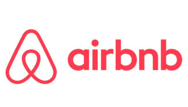
6. Airbnb
Rebranding for Airbnb made DesignStudio the center of attention back in 2014. The Airbnb logo actually depicts a hug, map, and heart. The audience did not compare the logo with these three symbols. Many discussions in social networks were devoted to the similarity of the logo with various parts of the human body (of course, mainly the genitals). Others insisted that it was Peter Griffin’s chin from Family Guy.
DesignStudio calmly endured a storm of fun and indignation, and now Bélo is positioned as a modern icon of “style”.
Lesson? If you and the client adhere to the idea of rebranding, do not let trolls from social networks get to you. Unlike Gap or Tropicana, this logo definitely brought success and recognition.
7. American Airlines
When you have a straightforward logo designed by a master like Massimo Vignelli, abandoning it will be a difficult decision. But American Airlines did just that, which caused the anger of many fans of this brand.
The bold, graphic cruciform symbol of the eagle, neatly depicted between the two twin letters A, had a pleasant visual symmetry, creating a timeless feeling and elegance of a sustained style. A softer blue color and the transformation of the majestic eagle into an abstract beak - well, how can one rejoice here.
Lesson? Do not correct what is so good. Especially considering that this is an eternal classic from Vignelli.
8. IHOP
The American multinational restaurant chain specializing in all kinds of IHOP breakfasts has replaced the good old sign with something demonic - the smile of an gloating clown. Perhaps in an attempt to imitate the warm “smile” motif (which Turner Duckworth has so successfully achieved for Amazon), IHOP decided to make it look like a smiling face, thanks to a combination of the letters “o” and “p”. As a result, the warmth of the logo did not blow.
Lesson? If you want the logo to look friendly, first “test” it on real people and see if there is any frozen horror in their eyes.
9. Instagram
The death of skymorphism and the appearance of a flat design, clearly tracked in the new Instagram logo (abandoning its retro camera in favor of the icon), simply infuriated the Internet. Rebranding has caused thousands of memes. It was too radical and looked something like something painted in Microsoft Paint in the early 90's.
Some complained that the essence of the Instagram application transmitted by the “retro camera” was lost, while others simply hated the ominous, vibrant color palette. But since flat design has become the defining appearance of iOS, the “native” feel of the app icon has become its advantage.
After all, Instagram is now one of the leading social networks, and not just an application with filters for processing photos.
Lesson: if unpopular design decisions are justified by a development strategy, they have a place to be.
In general, it is everyone’s business how to deal with their brand, what innovations and changes to make, and whether to make them. It is definitely useful, looking into history, to draw lessons from it at least sometimes.
Thank you for staying with us. Do you like our articles? Want to see more interesting materials? Support us by placing an order or recommending it to your friends, a 30% discount for Habr users on a unique analogue of entry-level servers that we invented for you: The whole truth about VPS (KVM) E5-2650 v4 (6 Cores) 10GB DDR4 240GB SSD 1Gbps from $ 20 or how to divide the server? (options are available with RAID1 and RAID10, up to 24 cores and up to 40GB DDR4).
VPS (KVM) E5-2650 v4 (6 Cores) 10GB DDR4 240GB SSD 1Gbps until spring free of charge when paying for a period of six months, you can order here .
Dell R730xd 2 times cheaper? Only we have 2 x Intel Dodeca-Core Xeon E5-2650v4 128GB DDR4 6x480GB SSD 1Gbps 100 TV from $ 249 in the Netherlands and the USA! Read about How to Build Infrastructure Bldg. class c using Dell R730xd E5-2650 v4 servers costing 9,000 euros for a penny?