About the ideal paragraph size
- Transfer

This is Magna Carta, Magna Carta , written in 1215. In the 11th century, parchment was very expensive, and therefore the document was written in small handwriting, with small letter and line spacing. But despite the scribe's efforts to give the text beauty, the Charter looks like incomprehensible gibberish, although it is written in medieval Latin. For us, accustomed to a completely different layout of the printed text, it is very difficult to catch hold of words at all, our eyes slip from the lines. The thing is the complete absence of any logical fragmentation of the text into blocks - paragraphs.
The division of the text into paragraphs is designed to solve three important tasks. Firstly, it is much easier for the author to build a narrative with their help, to organize thoughts and ideas that are conveyed to readers. Secondly, paragraphs make it possible to stop and ponder what is read, to be distracted, to relax. And thirdly, the presence of paragraphs serves for a kind of quick navigation through the “control” points, as micro-eyes. Today, this is especially important, since the absorption of a huge amount of information on the network has weaned us from thoughtful reading. We run through the text with our eyes, skip to different parts, trying to quickly grasp the essence.
Is there an ideal paragraph size?
The answers to this question can be very different, as you understand. A lot depends on what it is written about, what the text medium is - paper or electronic, - under what conditions the reading is supposed, what is the target audience, etc. However, the average paragraph size over the past 200 years has gradually become smaller.

This graph is based on an analysis of the structure of the inaugural messages of all US presidents since the late 18th century. The average value of the stated thoughts (in words) is plotted vertically. Of course, this is not the same as the size of a paragraph, but there is a certain connection between these concepts. As you can see, over the past two centuries, presidents have spoken about half as long.
We will not guess here about the reasons for this trend, we leave the conclusions and assumptions at your discretion. In this case, the only important thing is that for a long time, mankind has been moving along the path of reducing the size of logical units of text — paragraphs — and is trying to express itself more succinctly.
For example, the Bob Brooke's Writers' Corner page gives this advice:
Try to limit the paragraph size to five lines, not thoughts. If it turns out too long, then divide it into several paragraphs.
There is just one caveat: on the sites of the "five lines" vary greatly depending on the size of the display and its resolution. Here is a tip from Yahoo! Style Guide:
Make paragraphs short. Often enough to do with two or three thoughts.
Designers and UX / UI developers are trying to make the interfaces and text as readable as possible by selecting the size, line height, kerning, contrast and other parameters. And here the questions arise:
- Should these specialists also take care of choosing the ideal paragraph sizes? (most likely most will say no)
- Should the “perfect” paragraph depend on the size and resolution of the screen? What is comfortable to read on the screen of a reader or laptop will not necessarily be well perceived on a smartphone.
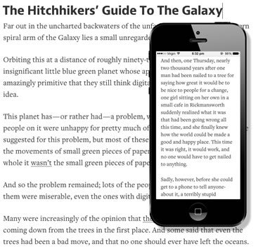
If only one or two paragraphs are placed on the smartphone screen, then all the advantages of text structuring come to naught. There is a peculiar effect of the Magna Card, when the text turns into one continuous “sheet”.
So what to do?
In an ideal world, perhaps it would make sense to change the structure of the text for the most optimal display on different devices, creating a kind of “adaptive content”. After all, we have different requirements and preferences when reading while standing in the subway and lying on the couch in the evening, right?
However, in the real world, changing the structure of the text for different displays requires a lot of time and effort, which in most cases puts an end to this idea. But you can try to use one small trick, which will help fit more paragraphs on the screens of mobile devices without strong compression of the text.
Today, in almost all digital texts - on websites, in electronic books - paragraphs are formatted the same way: the beginning is aligned to the left, and after the paragraph an interval is made of a width of a line or a little less. This is exactly the format for the paragraphs in this post.
But this is just one of the possible ways to format paragraphs. In typography, a different design is adopted: a paragraph begins with a small indent, and intervals between paragraphs are not made.

Perhaps it makes sense to use this approach to display texts on small screens, at least on smartphones. When displaying on large screens, let everything remain as it is, but on mobile devices, such formatting of paragraphs allows more optimal use of the available area. Of course, one cannot expect a radical improvement, after all, the gain will not be too big. But even this may already be enough for users to have a much more favorable perception. It is better to place three paragraphs on the screen than two.
It may make sense to conduct a detailed UX study on this topic. But still this idea looks quite interesting.
What do you think?