Automated correction of indentation in layout based on typographic styles and text metrics
The organization of indentation during layout and composition of elements on the page requires some skill to ensure the right combinations and the desired result.
And if in the design layout the requested indents are indicated without taking into account the line height and empty font rendering areas (shoulders, diacritics, descending height)? How to make layout as close as possible to the layout efficiently and without long manual recounts? Leading and vertical rhythm allow you to unify the distances between the elements, but do not solve the issue of distance compensation, taking into account the text metrics of the fonts used.
When developing applications for luxury customers, special attention is paid to the accuracy of the implementation of the interface, where every pixel is under control.
In this article, we will consider an approach designed to optimize the routine work around indents - automated indentation adjustment based on the line height of the target elements and text metrics of the fonts used at the stage of pre- or post-compilation of styles.
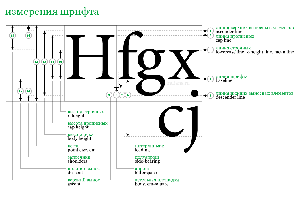
And so, the distance between the elements containing the text from the baseline of one element to the upper border of the capital letter (cap line) of the next element must be of a certain value (for example: 24px), excluding the area for drawing diacritics and shoulders.

When using this value in declarations such as padding or margin, an indentation area is formed between the elements, containing:
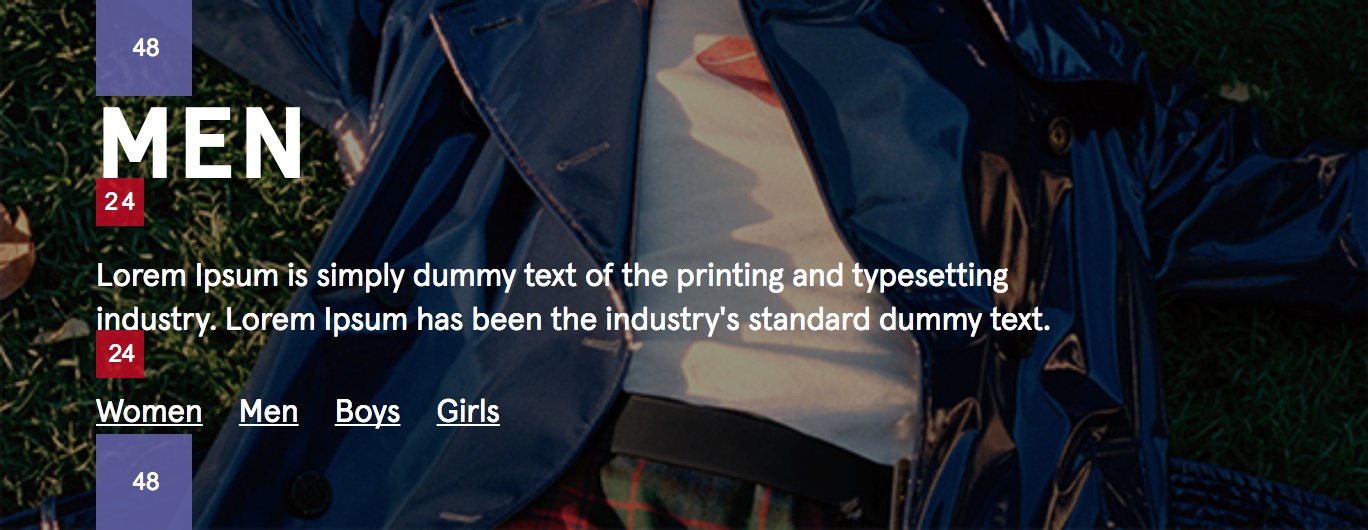
As an example, consider the implementation of a banner with text:
Typographic styles applied to a contingent project:
(The font size and line height are redefined for the heading class (.type-h2) and paragraph (.type-p1) depending on the breakpoint and locale.)
As well as styles directly for the banner:
(For clarity, the areas indicating the indentation are shifted to the visual boundaries of the elements)
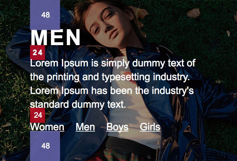
Result for the English locale:
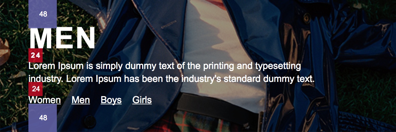
Result for the German locale (the title is changed compared to the English version to show the area of diacritics) :

As expected, the actual value of the indentation (24px ) was supplemented with empty areas of line height and bounding box of the font, a region for drawing diacritics, and also a region of downward font height.
To achieve the desired result, the following approaches were considered:
1. Reducing the line height of the text element.
Cons:
- Not suitable for multi-line text, as it affects its leading.
- When dropping to the actual value, the font height leaves empty areas of the font bounding box - shoulders.
2. Offset to “extra” height by using negative indentation values of the text element itself (or containing it) or, as an alternative, its pseudo-element.
Minuses:
3. Reducing the size of the font bounding box to the glyph rendering boundaries by modifying the font itself.
Minuses:
4. Decrease the value of the indentation used to visually match the desired value.
Minuses:
Of the listed methods for solving the presented problem, the most reliable and accurate, but at the same time the most time-consuming, is point 4.
For applications that support various breakpoints and several localizations, this means that it is necessary to accurately calculate the values applied to the declarations used, as well as create additional rules that take into account media queries, localization selectors, as well as text metrics of the fonts used. Doubt, to put it mildly, is doubtful. Moreover, the time spent on describing the exact styles and their subsequent verification increases the development time, adding routine work to both developers and testers.
postcss-text-indentation-adjustment - postcss plugin that allows you to adjust the indentation values used in styles taking into account typographic styles, as well as taking into account the text metrics of the fonts used.
The algorithm of work:
1. Extracting text metrics used in the font project.
2. Extracting data from used typographic styles.
3. Initialization of the plugin and its inclusion in the assembly process.
4. Description of the adjustment of the value of the declaration using special syntax with typographic selectors.
5. Assembling the project and obtaining the result of adjustments with all possible combinations of external rules for typographic styles (media queries, parent selectors and their combinations).
Benefits:
An example of the rules applied to the typographic style of the header with the .type-h2 class, describing the redefinition of the font family, as well as its size and line height for a certain screen width and German locale:
4. When using the css preprocessor (for example, sass, scss, less) - nesting of the processed rules is supported, as well as the use of variables.
The accuracy of the plug-in corrections depends on the text metrics of the fonts passed as an argument at the time of its initialization, so before integrating the postcss-text-indentation-adjustment plug-in into our example, we will consider how text metrics can be extracted.
Для извлечения текстовых метрик воспользуемся методом контекста холста measureText. Согласно документации TextMetrics единственное доступное значение объекта TextMetrics при отрисовке в браузере — ширина отрисованного текста (width).
Для решения нашей задачи необходимы более детальные параметры, такие как fontBoundingBoxAscent (расстояние от базовой линии до верхней границы ограничительной рамки шрифта), fontBoundingBoxDescent (расстояние между базовой линией и нижней границей ограничительной рамки шрифта), а также alphabeticBaseline (расстояние между выбранной для отрисовки базовой линиейand the alphabetic base line) and hangingBaseline (the distance between the base line selected for rendering and the upper border of the glyph rendering without taking into account the area of diacritics), available only in chrome when the ExperimentalCanvasFeatures: true flag is on.
The sum of the fontBoundingBoxAscent and fontBoundingBoxDescent values will give the actual height of the drawing area of the bounding box of the font, and the difference between the hangingBaseline and alphabeticBaseline values will be the actual height of the capital letter (cap height) without the diacritical marks, shoulders, and descending heights.
Since the values are presented in CSS pixels and will be calculated relative to the font-size used to render the text, you can use the ratio of the difference between the height of the font bounding box and the height of the capital letter to the height of the capital letter. This will allow you to calculate the relative height of excluded areas for the target font size used in our styles.
But first things first.
We need an html page with a canvas created on it, available for our script.
To manipulate the canvas in a browser with the ExperimentalCanvasFeatures flag enabled, use the Nightmare library :
As a result, we get the text metrics of the necessary fonts:
In this example, text metrics will be required only for the Arial, Karla Bold, and Karla Regular fonts, but in practice it can be any available system font, custom font, or delivered via cdn in the amount necessary to support all localizations of your project.
As a rule, the operation of obtaining text metrics is a one-time operation and should be restarted only when the fonts used in the project change. For most cases, it is enough to generate values once, save them to a file and use them during assembly.
Using the font-metrics package, the process of generating text metrics is greatly simplified:
Result:
The principle of operation of the postcss-text-indentation-adjustment plugin is based on the description of the adjustments to the initial value applied to the declaration (in this example, 24px) with the typographic classes regarding which this value needs to be adjusted. The description of the adjustment is performed in the form of a comment inside the value of the declaration and allows you to safely implement the plug-in in the project assembly.
Consider how adjustments can be described for our example:
We import the necessary libraries.
As a result, a file containing the following rules will be compiled (typographic styles and the results of @extend are excluded to emphasize the generated corrections) :
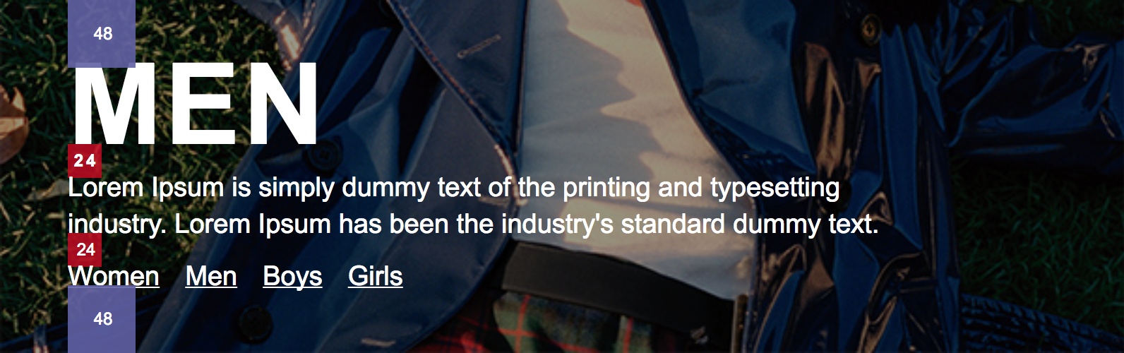
Result for the English locale:
Result for the German locale:


As you can see, the result of rendering the indentation has been substantially adjusted.
(Compiled values are additionally passed through the plugins for combining selectors and media queries - css-mqpacker, postcss-merge-rules)
1. Adjustments are made in the form of a comment and are located inside the declaration value .
2. Each value that needs to be adjusted is framed in braces (corrective group).
3. Typographic classes or tags for which corrections should be applied are indicated with a comma after the base value.
4. If you need to specify several values, each of them is placed in its own corrective group, which will be replaced by the calculated value.
5. The content of the commentary with the result of calculating all the corrective groups is set by the plugin in the final value of the declaration.
6. If there are parental selectors in the source file of typographic classes, an additional rule is created that includes a combination of the parent and target selector, as well as declarations with calculated values for all combinations of typographic selectors.
7. If there are media queries or media queries in combination with parent selectors, all possible combinations for typographic selectors involved in the adjustment are created.
8. You can check the parameters used to calculate the final values using the --debug flag
As a result, part of the data used to create the adjustment will be displayed in the console.
Thanks for attention. I will be glad to hear reasonable criticism, as well as suggestions for improvement and optimization.
And if in the design layout the requested indents are indicated without taking into account the line height and empty font rendering areas (shoulders, diacritics, descending height)? How to make layout as close as possible to the layout efficiently and without long manual recounts? Leading and vertical rhythm allow you to unify the distances between the elements, but do not solve the issue of distance compensation, taking into account the text metrics of the fonts used.
When developing applications for luxury customers, special attention is paid to the accuracy of the implementation of the interface, where every pixel is under control.
In this article, we will consider an approach designed to optimize the routine work around indents - automated indentation adjustment based on the line height of the target elements and text metrics of the fonts used at the stage of pre- or post-compilation of styles.
Design specification requirement
And so, the distance between the elements containing the text from the baseline of one element to the upper border of the capital letter (cap line) of the next element must be of a certain value (for example: 24px), excluding the area for drawing diacritics and shoulders.
When using this value in declarations such as padding or margin, an indentation area is formed between the elements, containing:
- The directly specified indent value (24px) between the elements.
- (Above the indent) The distance between the baseline of the text (baseline) and the bottom border (bottom bearing line) of the font bounding box (font bounding box, b-box, bbox) is the height of the lower offset (descent height).
- (Above indentation) The distance between the lower border of the font bounding box and the lower border of the line height of the element (for example, 4px when specifying 16px / 1.5).
- (Indented) The distance between the top border of the line height and the top border of the font bounding box. For example, 4px when specifying 16px / 1.5).
- (Indented) The distance between the top bearing line of the font bounding box and the line through the upper border of the capital letter (cap line), which includes the diacritic and shoulders.
(Font measurements)
Example
As an example, consider the implementation of a banner with text:
Typographic styles applied to a contingent project:
/*
Typography styles
*/
.type-h2 {
  font-family: Arial;
  font-size: 35px;
  line-height: 40px;
  font-weight: bold;
  text-transform: uppercase;
  letter-spacing: 2px;
  html[lang^="de"] & {
    font-family: 'Karla Bold';
    font-size: 35px;
    line-height: 40px;
  }
}
.type-p1 {
  font-family: Arial;
  font-size: 16px;
  line-height: 22px;
  font-weight: normal;
  letter-spacing: 0;
  html[lang^="de"] & {
    font-family: 'Karla Regular';
    font-size: 16px;
    line-height: 22px;
  }
}
@media only screen and (min-width: 480px) and (max-width: 767px) {
  .type-h2 {
    font-family: Arial;
    font-size: 50px;
    line-height: 55px;
    html[lang^="de"] & {
      font-family: 'Karla Bold';
      font-size: 50px;
      line-height: 55px;
    }
  }
  .type-p1 {
    font-family: Arial;
    font-size: 16px;
    line-height: 22px;
    html[lang^="de"] & {
      font-family: 'Karla Regular';
      font-size: 16px;
      line-height: 22px;
    }
  }
}
@media only screen and (min-width: 768px) {
  .type-h2 {
    font-family: Arial;
    font-size: 80px;
    line-height: 90px;
    html[lang^="de"] & {
      font-family: 'Karla Bold';
      font-size: 80px;
      line-height: 90px;
    }
  }
  .type-p1 {
    font-family: Arial;
    font-size: 19px;
    line-height: 26px;
    html[lang^="de"] & {
      font-family: 'Karla Regular';
      font-size: 19px;
      line-height: 26px;
    }
  }
}
(The font size and line height are redefined for the heading class (.type-h2) and paragraph (.type-p1) depending on the breakpoint and locale.)
As well as styles directly for the banner:
/*
banner.scss
*/
@import 'path/to/typography.scss';
.banner {
  display: flex;
  flex-direction: column;
  justify-content: flex-end;
  background: url('path/to/banner-image.png') no-repeat center bottom;
  background-size: cover;
  &__content {
    color: #fff;
    padding: 48px 0 48px 48px;
    &-title {
      @extend .type-h2;
    }
    &-description {
      @extend .type-p1;
      max-width: 80%;
      margin-top: 24px;
    }
    &-links {
      @extend .type-p1;
      display: flex;
      flex-direction: row;
      margin-top: 24px;
      li {
        margin-left: 18px;
        &:first-child {
          margin-left: 0;
        }
        a {
          color: inherit;
        }
      }
    }
  }
}
(For clarity, the areas indicating the indentation are shifted to the visual boundaries of the elements)
Result for the English locale:
Result for the German locale (the title is changed compared to the English version to show the area of diacritics) :
As expected, the actual value of the indentation (24px ) was supplemented with empty areas of line height and bounding box of the font, a region for drawing diacritics, and also a region of downward font height.
To achieve the desired result, the following approaches were considered:
1. Reducing the line height of the text element.
Cons:
- Not suitable for multi-line text, as it affects its leading.
- When dropping to the actual value, the font height leaves empty areas of the font bounding box - shoulders.
2. Offset to “extra” height by using negative indentation values of the text element itself (or containing it) or, as an alternative, its pseudo-element.
  .selector {
    margin-top: -6px;
  }
  .selector-2:before {
    content: '';
    display: table;
    margin-top: -6px;
  }
Minuses:
- Affects styles of an element or pseudo-element that may already be used.
- It requires manual calculation and indication of different values when using dissimilar font families for different localizations, which implies the creation of additional rules.
- When changing the basic typographic styles of the application or changing the fonts, it requires recalculation of all values (due to the difference in the text metrics of the new font).
3. Reducing the size of the font bounding box to the glyph rendering boundaries by modifying the font itself.
Minuses:
- Not suitable for system fonts.
- Not suitable for licensed fonts, as it may violate the terms of their use and / or modification.
- Does not solve the issue of compensating for the area of diacritical signs (for example, for characters such as Й, Ё, È, Ñ, Ÿ) over the upper border of the capital letter (cap line) and the area of descending height (descending height) (for example, for characters like p , g, j).
4. Decrease the value of the indentation used to visually match the desired value.
Minuses:
- It requires a calculation of the value depending on the typographic styles of the target and / or neighboring element used, depending on the typographic styles and text metrics of the font used.
- Requires different values when using different font families for different localizations, which implies the manual creation of additional rules.
- Changing the basic typographic styles of the site and / or replacing the fonts implies a recount of the values used (due to the difference in the text metrics of the new font).
- The presence of additional rules for various localizations and / or media queries (media quieries) implies the manual creation and calculation of all possible combinations.
Of the listed methods for solving the presented problem, the most reliable and accurate, but at the same time the most time-consuming, is point 4.
For applications that support various breakpoints and several localizations, this means that it is necessary to accurately calculate the values applied to the declarations used, as well as create additional rules that take into account media queries, localization selectors, as well as text metrics of the fonts used. Doubt, to put it mildly, is doubtful. Moreover, the time spent on describing the exact styles and their subsequent verification increases the development time, adding routine work to both developers and testers.
To automate the process of recalculating indentation between text elements based on typographic rules and text metrics of used fonts, as well as automated support for all dependent combinations used in typographic styles, the postcss plugin postcss-text-indentation-adjustment was created
PostCSS plugin postcss-text-indentation-adjustment
postcss-text-indentation-adjustment - postcss plugin that allows you to adjust the indentation values used in styles taking into account typographic styles, as well as taking into account the text metrics of the fonts used.
The algorithm of work:
1. Extracting text metrics used in the font project.
2. Extracting data from used typographic styles.
3. Initialization of the plugin and its inclusion in the assembly process.
4. Description of the adjustment of the value of the declaration using special syntax with typographic selectors.
5. Assembling the project and obtaining the result of adjustments with all possible combinations of external rules for typographic styles (media queries, parent selectors and their combinations).
Benefits:
- The original indent value is used (for example, from a design layout or typographic style guide), which allows you to centrally store these values in variables and, when changing design requirements, easily change the initial values.
- The indentation value is adjusted in such a way as to subtract empty areas of line height, font bounding box, diacritical drawing area, and font descending height using typographic style values for text elements that you need to reduce the distance from.
- If there are several rules in typographic styles that depend on media queries (media-query) or specific parent selectors (for example, html [lang ^ = "de"], .parent-classname), the necessary additional rules are automatically created for the target declaration, whose value needs to be adjusted, taking into account media queries and / or parent selectors, as well as calculating the final values of the declaration, taking into account the used line heights and text metrics of the connected fonts.
An example of the rules applied to the typographic style of the header with the .type-h2 class, describing the redefinition of the font family, as well as its size and line height for a certain screen width and German locale:
.type-h2 {
  font-family: Arial;
  font-size: 35px;
  line-height: 40px;
  font-weight: bold;
  text-transform: uppercase;
  letter-spacing: 2px;
  html[lang^="de"] & {
    font-family: 'Karla Bold';
    font-size: 38px;
    line-height: 46px;
  }
}
@media only screen and (min-width: 768px) {
.type-h2 {
  font-family: Arial;
  font-size: 80px;
  line-height: 90px;
  html[lang^="de"] & {
    font-family: 'Karla Bold';
    font-size: 86px;
    line-height: 94px;
  }
}
4. When using the css preprocessor (for example, sass, scss, less) - nesting of the processed rules is supported, as well as the use of variables.
The accuracy of the plug-in corrections depends on the text metrics of the fonts passed as an argument at the time of its initialization, so before integrating the postcss-text-indentation-adjustment plug-in into our example, we will consider how text metrics can be extracted.
Retrieving Text Metrics
The method for extracting text metrics described below is framed in a separate font-metrics package and allows you to get text metrics from locally stored, system or remotely located fonts by using the CSS Font Loading API , rendering text on a canvas in the Chrome browser with the “experimentalCanvasFeatures: true” flag enabled followed by saving the values to a file.
Для извлечения текстовых метрик воспользуемся методом контекста холста measureText. Согласно документации TextMetrics единственное доступное значение объекта TextMetrics при отрисовке в браузере — ширина отрисованного текста (width).
Для решения нашей задачи необходимы более детальные параметры, такие как fontBoundingBoxAscent (расстояние от базовой линии до верхней границы ограничительной рамки шрифта), fontBoundingBoxDescent (расстояние между базовой линией и нижней границей ограничительной рамки шрифта), а также alphabeticBaseline (расстояние между выбранной для отрисовки базовой линиейand the alphabetic base line) and hangingBaseline (the distance between the base line selected for rendering and the upper border of the glyph rendering without taking into account the area of diacritics), available only in chrome when the ExperimentalCanvasFeatures: true flag is on.
The sum of the fontBoundingBoxAscent and fontBoundingBoxDescent values will give the actual height of the drawing area of the bounding box of the font, and the difference between the hangingBaseline and alphabeticBaseline values will be the actual height of the capital letter (cap height) without the diacritical marks, shoulders, and descending heights.
Since the values are presented in CSS pixels and will be calculated relative to the font-size used to render the text, you can use the ratio of the difference between the height of the font bounding box and the height of the capital letter to the height of the capital letter. This will allow you to calculate the relative height of excluded areas for the target font size used in our styles.
But first things first.
Launching chrome with the ExperimentalCanvasFeatures flag
We need an html page with a canvas created on it, available for our script.
To manipulate the canvas in a browser with the ExperimentalCanvasFeatures flag enabled, use the Nightmare library :
import Nightmare from 'nightmare';
import fse from 'fs-extra';
const browser = Nightmare({
  show: false,
  webPreferences: {
    experimentalCanvasFeatures: true
  }
});
const pageUrl = 'your/path/to/canvas/page';
// параметры шрифтов, относительно которых нужно снять текстовые метрики
const fontsData = {
    fonts: [{
    fontFamily: 'Arial'
  }, {
    fontFamily: 'Karla Regular',
    src: '//fonts.gstatic.com/s/karla/v6/S1bXQ0LrY7AzefpgNae9sYDGDUGfDkXyfkzVDelzfFk.woff2'
  }, {
    fontFamily: 'Karla Bold',
    src: '//fonts.gstatic.com/s/karla/v6/r3NqIkFHFaF3esZDc3WT5BkAz4rYn47Zy2rvigWQf6w.woff2'
  }],
  fontSize: 24
};
browser.gotTo(pageUrl)
  .evaluate(data => {
    // Так как часть шрифтов может быть расположена удаленно и потребовать время на загрузку - используем Promise
    return new window.Promise((rootResolve, rootReject) => {
      const {fonts, fontSize} = data;
      // При наличии не системных, а подключаемых извне или локально шрифтов, добавим их в очередь на загрузку, обернув в Promise
      const fontsToLoad = fonts.reduce((result, fontData) => {
        const {src, fontFamily} = fontData;
        // При остутствии параметра src будем считать, что используется системный шрифт
        if (typeof src === 'string') {
          return result;
        }
        const promise = new window.Promise((resolve, reject) => {
            // Для подключения нового шрифта воспользуемся конструктором FontFace
            const fontFace = new window.FontFace(fontFamily, `url(${encodeURI(src)})`);
            // и добавим новый font face, когда шрифт будет загружен
            fontFace.load().then(function () {
              document.fonts.add(fontFace);
              resolve();
            }).catch(function (err) {
              reject(err);
            });
          });
          return promise;
      }, []);
      const fontsMetrics = {};
      // Как только все шрифты загружены - последовательно отрисуем их на холсте и извлечем текстовые метрики
      window.Promise.all(fontsToLoad).then(() => {
        const canvas = document.getElementById('canvas');
        const ctx = canvas.getContext('2d');
        // В качестве базовой линии используем алфавитную базовую линию
        ctx.textBaseline = 'alphabetical';
        fonts.forEach(fontData => {
          // Применим шрифт к холсту и извлечем текстовые метрики
          ctx.font = `${fontSize}px ${fontData.fontFamily}`;
          const metrics = ctx.measureText('Example');
          fontsMetrics[fontData.fontFamily] = metrics;
        });
      });
      rootResolve(fontsMetrics);
    });
  }, fontsData)
  .end()
  .then(result => {
    // Сохраним текстовые метрики в файл для последующего использования
    const content = JSON.stringify(result, null, 4);
    fse.outputFile('desired/path/to/metrics.json', content, function (err) {
      if (err) {
        console.error(err);
      }
    });
  });
As a result, we get the text metrics of the necessary fonts:
{
  "Arial": {
    "actualBoundingBoxAscent": 0,
    "actualBoundingBoxDescent": 24,
    "actualBoundingBoxLeft": 0,
    "actualBoundingBoxRight": 93,
    "alphabeticBaseline": 0,
    "emHeightAscent": 0,
    "emHeightDescent": 0,
    "fontBoundingBoxAscent": 22,
    "fontBoundingBoxDescent": 5,
    "hangingBaseline": 17.600000381469727,
    "ideographicBaseline": -5,
    "width": 93.375
  },
  "Karla Bold": {
    "actualBoundingBoxAscent": 0,
    "actualBoundingBoxDescent": 24,
    "actualBoundingBoxLeft": 0,
    "actualBoundingBoxRight": 85,
    "alphabeticBaseline": 0,
    "emHeightAscent": 0,
    "emHeightDescent": 0,
    "fontBoundingBoxAscent": 22,
    "fontBoundingBoxDescent": 6,
    "hangingBaseline": 17.600000381469727,
    "ideographicBaseline": -6,
    "width": 85.30078125
  },
  "Karla Regular": {
    "actualBoundingBoxAscent": 0,
    "actualBoundingBoxDescent": 24,
    "actualBoundingBoxLeft": 0,
    "actualBoundingBoxRight": 85,
    "alphabeticBaseline": 0,
    "emHeightAscent": 0,
    "emHeightDescent": 0,
    "fontBoundingBoxAscent": 22,
    "fontBoundingBoxDescent": 6,
    "hangingBaseline": 17.600000381469727,
    "ideographicBaseline": -6,
    "width": 85.30078125
  }
}
In this example, text metrics will be required only for the Arial, Karla Bold, and Karla Regular fonts, but in practice it can be any available system font, custom font, or delivered via cdn in the amount necessary to support all localizations of your project.
As a rule, the operation of obtaining text metrics is a one-time operation and should be restarted only when the fonts used in the project change. For most cases, it is enough to generate values once, save them to a file and use them during assembly.
Using the font-metrics package, the process of generating text metrics is greatly simplified:
import fontMetrics from 'font-metrics';
const fontParser = fontMetrics({
  fonts: [{
    fontFamily: 'Arial'
  }, {
    fontFamily: 'Karla Regular',
    src: '//fonts.gstatic.com/s/karla/v6/S1bXQ0LrY7AzefpgNae9sYDGDUGfDkXyfkzVDelzfFk.woff2'
  }, {
    fontFamily: 'Karla Bold',
    src: '//fonts.gstatic.com/s/karla/v6/r3NqIkFHFaF3esZDc3WT5BkAz4rYn47Zy2rvigWQf6w.woff2'
  }],
  output: './font-metrics',
  filename: 'font-metrics.json'
});
fontParser.parse();
Result:
{
  "metrics": {
    "Arial": {
      "_fontSize": 24,
      "_textBaseline": "alphabetic",
      "actualBoundingBoxAscent": 0,
      "actualBoundingBoxDescent": 24,
      "actualBoundingBoxLeft": 0,
      "actualBoundingBoxRight": 93,
      "alphabeticBaseline": 0,
      "emHeightAscent": 0,
      "emHeightDescent": 0,
      "fontBoundingBoxAscent": 22,
      "fontBoundingBoxDescent": 5,
      "hangingBaseline": 17.600000381469727,
      "ideographicBaseline": -5,
      "width": 93.375
    },
    "Karla Bold": {
      "_fontSize": 24,
      "_textBaseline": "alphabetic",
      "actualBoundingBoxAscent": 0,
      "actualBoundingBoxDescent": 24,
      "actualBoundingBoxLeft": 0,
      "actualBoundingBoxRight": 85,
      "alphabeticBaseline": 0,
      "emHeightAscent": 0,
      "emHeightDescent": 0,
      "fontBoundingBoxAscent": 22,
      "fontBoundingBoxDescent": 6,
      "hangingBaseline": 17.600000381469727,
      "ideographicBaseline": -6,
      "width": 85.30078125
    },
    "Karla Regular": {
      "_fontSize": 24,
      "_textBaseline": "alphabetic",
      "actualBoundingBoxAscent": 0,
      "actualBoundingBoxDescent": 24,
      "actualBoundingBoxLeft": 0,
      "actualBoundingBoxRight": 85,
      "alphabeticBaseline": 0,
      "emHeightAscent": 0,
      "emHeightDescent": 0,
      "fontBoundingBoxAscent": 22,
      "fontBoundingBoxDescent": 6,
      "hangingBaseline": 17.600000381469727,
      "ideographicBaseline": -6,
      "width": 85.30078125
    }
  },
  "src": [
    {
      "fontFamily": "Arial"
    },
    {
      "fontFamily": "Karla Regular",
      "src": "//fonts.gstatic.com/s/karla/v6/S1bXQ0LrY7AzefpgNae9sYDGDUGfDkXyfkzVDelzfFk.woff2"
    },
    {
      "fontFamily": "Karla Bold",
      "src": "//fonts.gstatic.com/s/karla/v6/r3NqIkFHFaF3esZDc3WT5BkAz4rYn47Zy2rvigWQf6w.woff2"
    }
  ]
}
Postcss-text-indentation-adjustment plugin integration
The principle of operation of the postcss-text-indentation-adjustment plugin is based on the description of the adjustments to the initial value applied to the declaration (in this example, 24px) with the typographic classes regarding which this value needs to be adjusted. The description of the adjustment is performed in the form of a comment inside the value of the declaration and allows you to safely implement the plug-in in the project assembly.
Consider how adjustments can be described for our example:
/*
banner.scss
*/
@import 'path/to/typography.scss';
.banner {
  display: flex;
  flex-direction: column;
  justify-content: flex-end;
  background: url('path/to/banner-image.png') no-repeat center bottom;
  background-size: cover;
  &__content {
    color: #fff;
    padding: 48px 0 48px 48px /* {48px, .type-h2} 0 {48px, .type-p1} 48px */;
    &-title {
      @extend .type-h2;
    }
    &-description {
      @extend .type-p1;
      max-width: 80%;
      margin-top: 24px /* {24px, .type-h2, .type-p1} */;
    }
    &-links {
      @extend .type-p1;
      display: flex;
      flex-direction: row;
      margin-top: 24px /* {24px, .type-p1, .type-p1} */;
      li {
        margin-left: 18px;
        &:first-child {
          margin-left: 0;
        }
        a {
          color: inherit;
        }
      }
    }
  }
}
Adjustment Processing
We import the necessary libraries.
// node-sass для компиляции исходного файла типографических стилей
import nodeSass from 'node-sass';
// postcss для манипуляции со стилями
import postcss from 'postcss';
// fse или fs для чтения исходного файла типографических стилей и сохранения результата
import fse from 'fs-extra';
// path для нормализации пути к файлу
import path from 'path';
// postcss-scss для использования postcss до компиляции scss файлов в css
import postcssSCSS from 'postcss-scss';
// postcss-text-indentation-adjustment для парсинга типографических стилей, создания корректировок и комбинаций зависимых правил
import textIndentationAdjustment, {parser} from 'postcss-text-indentation-adjustment';
// postcss-partial-import для инлайн ипорта scss файлов, использованных в основных стилях проекта
import postcssPartialImport from 'postcss-partial-import';
// css-mqpacker для группировки медиа-запросов (или любой другой инструмент)
import cssMqPacker from 'css-mqpacker';
// postcss-merge-rules для объединения css селекторов на основании идентичных деклараций (или любой другой инструмент)
import mergeRules from 'postcss-merge-rules';
// Текстовые метрики, извлеченные на одном из предыдущих шагов
import {metrics} from 'path/to/metrics.json';
// Скомпилируем типографические стили из scss в css для их последующего парсинга
const typography = nodeSass.renderSync({
  file: 'path/to/typography.scss'
}).css.toString();
// Инициализируем парсер, передав текстовые метрики, полученные на одном из предыдущих шагов
const typographyParser = parser({
  metrics: metrics
});
// Распарсим типографические стили для их последующего использования
const parsedTypography = typographyParser.parse(typography);
// Инициализируем postcss плагин, передав подоготовленные парсером данные типографических стилей
const typographyAdjustmentPlugin = textIndentationAdjustment({
  corrections: parsedTypography,
  plainCSS: false // при использовании плагина для корректировки значений на этапе препроцессинга стилей (например, при использовании scss)
});
// Используем postcss с синтаксисом scss
fse.readFile('path/to/banner.scss', (err, scss) => {
  postcss([postcssPartialImport(), postcssTypographyAdjustmentPlugin])
    .process(scss, {
      syntax: postcssSCSS,
      from: 'path/to/banner.scss',
      to: `path/to/banner.css`
    })
    .then(postcssResult => {
      return new Promise((resolve, reject) => {
        nodeSass.render({
          data: postcssResult.css,
          outputStyle: 'expanded'
        }, (err, result) => {
          resolve(result);
        });
      });
    })
    .then(result => {
      // Объединим медиа-запросы и правила с одинаковыми декларациями
      return postcss([mergeRules(), cssMqPacker()]).process(result.css);
    })
    .then(result => {
      fse.outputFile('path/to/banner.css', result.css);
    })
    .catch(e => {
      console.log(e);
    });
});
As a result, a file containing the following rules will be compiled (typographic styles and the results of @extend are excluded to emphasize the generated corrections) :
.banner {
  display: flex;
  flex-direction: column;
  justify-content: flex-end;
  background: url("path/to/banner-image.png") no-repeat center bottom;
  background-size: cover;
}
.banner__content {
  color: #fff;
  padding: 39.5px 0 43px 48px;
}
.banner__content-description {
  max-width: 80%;
  margin-top: 10.5px;
}
html[lang^="de"] .banner__content-description {
  margin-top: 10.5px;
}
.banner__content-links {
  display: flex;
  flex-direction: row;
  margin-top: 14px;
}
.banner__content-links li {
  margin-left: 18px;
}
.banner__content-links li:first-child {
  margin-left: 0;
}
.banner__content-links li a {
  color: inherit;
}
html[lang^="de"] .banner__content-links {
  margin-top: 14px;
}
html[lang^="de"] .banner__content {
  padding: 39.5px 0 43px 48px;
}
@media only screen and (min-width: 480px) and (max-width: 767px) {
  .banner__content-description {
    margin-top: 8.5px;
  }
  html[lang^="de"] .banner__content-description {
    margin-top: 7.5px;
  }
  .banner__content-links {
    margin-top: 14px;
  }
  html[lang^="de"] .banner__content-links {
    margin-top: 14px;
  }
  .banner__content {
    padding: 37.5px 0 43px 48px;
  }
  html[lang^="de"] .banner__content {
    padding: 36.5px 0 43px 48px;
  }
}
@media only screen and (min-width: 768px) {
  .banner__content-description {
    margin-top: -0.5px;
  }
  html[lang^="de"] .banner__content-description {
    margin-top: -1.5px;
  }
  .banner__content-links {
    margin-top: 11px;
  }
  html[lang^="de"] .banner__content-links {
    margin-top: 11px;
  }
  .banner__content {
    padding: 30px 0 41.5px 48px;
  }
  html[lang^="de"] .banner__content {
    padding: 29px 0 41.5px 48px;
  }
}
Result for the English locale:
Result for the German locale:
As you can see, the result of rendering the indentation has been substantially adjusted.
Adjustment Syntax
(Compiled values are additionally passed through the plugins for combining selectors and media queries - css-mqpacker, postcss-merge-rules)
1. Adjustments are made in the form of a comment and are located inside the declaration value .
.rule-selector {
  padding-top: 24px /*  */;
}
2. Each value that needs to be adjusted is framed in braces (corrective group).
.rule-selector {
  padding-top: 24px /* {24px} */;
}
3. Typographic classes or tags for which corrections should be applied are indicated with a comma after the base value.
.rule-selector {
  padding-top: 24px /* {24px, h3, .type-h2} */;
}
4. If you need to specify several values, each of them is placed in its own corrective group, which will be replaced by the calculated value.
.rule-selector {
  padding-top: 24px 0 24px /* {24px, h3, .type-h2} 0 {24px, .type-h2, .copy-p1} */;
}
5. The content of the commentary with the result of calculating all the corrective groups is set by the plugin in the final value of the declaration.
.rule-selector {
  padding-top: 17px 0 19px;
}
6. If there are parental selectors in the source file of typographic classes, an additional rule is created that includes a combination of the parent and target selector, as well as declarations with calculated values for all combinations of typographic selectors.
/* typography */
.p1 {
  font-size: 16px;
  line-height: 24px;
  font-family: Arial;
  .parent-selector-1 & {
    font-size: 18px;
    line-height: 26px;
    font-family: Arial;
  }
}
.p2 {
  font-size: 18px;
  line-height: 22px;
  font-family: Arial;
  .parent-selector-2 & {
    font-size: 14px;
    line-height: 20px;
    font-family: Arial;
  }
}
/* input */
.rule-selector {
  padding-top: 24px /* {24px, .p1, .p2} */;
}
/* output */
.rule-selector {
  padding-top: 13px;
}
.parent-selector-1 .rule-selector {
  padding-top: 12px;
}
.parent-selector-2 .rule-selector {
  padding-top: 13px;
}
7. If there are media queries or media queries in combination with parent selectors, all possible combinations for typographic selectors involved in the adjustment are created.
/* typography */
.p1 {
  font-size: 16px;
  line-height: 24px;
  font-family: Arial;
  .parent-selector-1 & {
    font-size: 18px;
    line-height: 26px;
    font-family: Arial;
  }
  @media (min-width: 768px) {
    font-size: 22px;
    line-height: 28px;
    font-family: Arial;
    html[lang^="de"] .parent-selector-3 & {
      font-size: 28px;
      line-height: 40px;
      font-family: Arial;
    }
  }
}
.p2 {
  font-size: 18px;
  line-height: 22px;
  font-family: Arial;
  .parent-selector-2 & {
    font-size: 14px;
    line-height: 20px;
    font-family: Arial;
  }
  @media (min-width: 321px) {
    font-size: 22px;
    line-height: 28px;
    font-family: Arial;
    html[lang^="de"] .parent-selector-4 & {
      font-size: 28px;
      line-height: 40px;
      font-family: Arial;
    }
  }
}
/* input */
.rule-selector {
  padding-top: 24px /* {24px, .p1, .p2} */;
}
/* output */
.rule-selector {
  padding-top: 13px;
}
.parent-selector-1 .rule-selector {
  padding-top: 12px;
}
.parent-selector-2 .rule-selector {
  padding-top: 13px;
}
@media (min-width: 768px) {
  .rule-selector {
    padding-top: 13px;
  }
  html[lang^="de"] .parent-selector-3 .rule-selector {
    padding-top: 14px;
  }
}
@media (min-width: 321px) {
  .rule-selector {
    padding-top: 12px;
  }
  html[lang^="de"] .parent-selector-4 .rule-selector {
    padding-top: 14px;
  }
}
8. You can check the parameters used to calculate the final values using the --debug flag
/* input */
.rule-selector {
  padding-top: 24px /* {24px, .p1, .p2} --debug */;
}
As a result, part of the data used to create the adjustment will be displayed in the console.
Features of use relevant at the time of writing of the article version (1.0.9)
- All values used in the calculation must be indicated in pixels.
- Each rule in typographic styles must contain font parameters such as font-family, font-size and line-height, specified separately, or combined into a single font declaration.
- When used with preprocessors at the stage of precompilation of styles, it is necessary to set the plainCSS option to false.
const typographyAdjustmentPlugin = textIndentationAdjustment({
  corrections: parsedTypography,
  plainCSS: false
});
Finally
- It reduces the time at times of developing constantly developing applications that support various breakpoints and several localizations, where great importance is attached to the accuracy of layout and design.
- It is easily customizable for any font, it is enough to extract text metrics only once and use them in the process of compiling styles.
- Integrates into any type of assembly supported by postcss.
- Constantly refined to improve the quality of corrections
Thanks for attention. I will be glad to hear reasonable criticism, as well as suggestions for improvement and optimization.