Creating your own color palette
- Transfer
- Tutorial
Adapted from our future book , UI Refactoring.
Did you see these trendy color palette generators? When you choose a color, set up several parameters with musical words like “triad” or “fourth major” - and get five perfect colors for your website?
Such a computational and scientific approach to the choice of an ideal color scale is extremely seductive, but not very useful.
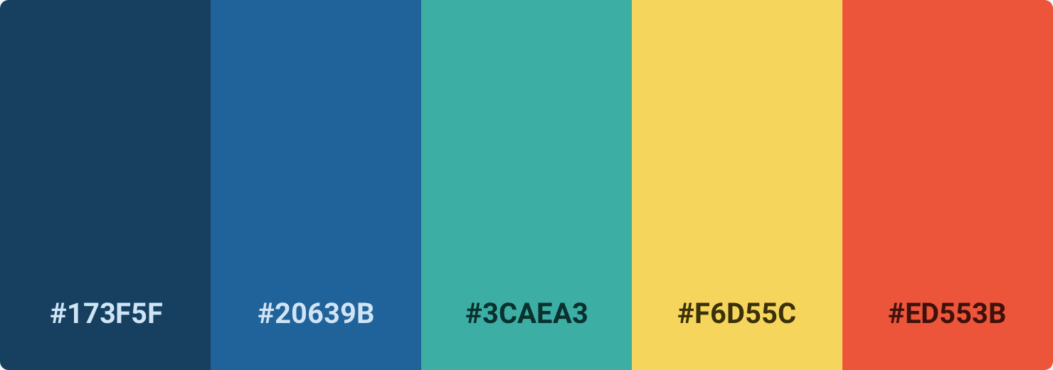
Well, if you do not want the site to look like this:

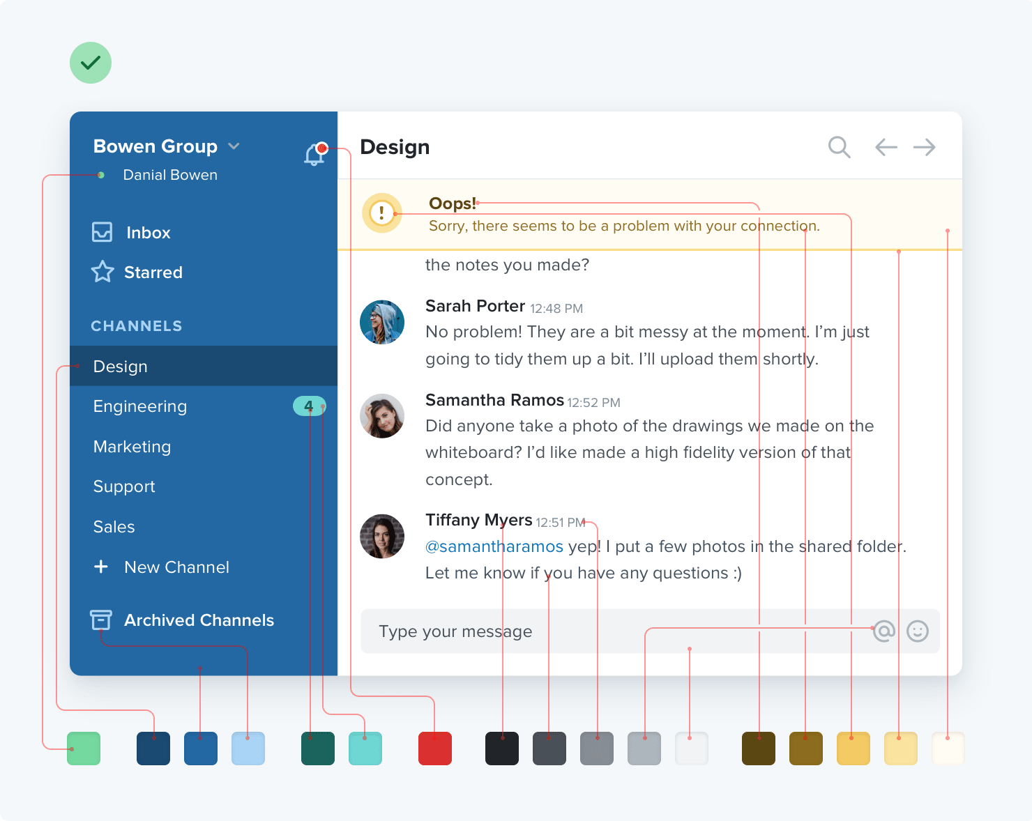
You do not do anything with five hexadecimal codes. To build something real requires a much more complete palette.
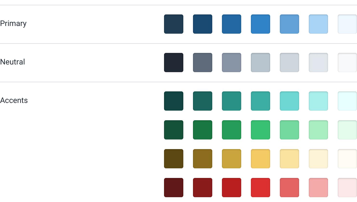
A good color palette can be divided into three categories.
Text, background, panels, form elements - almost all of this exists in the gray interface.
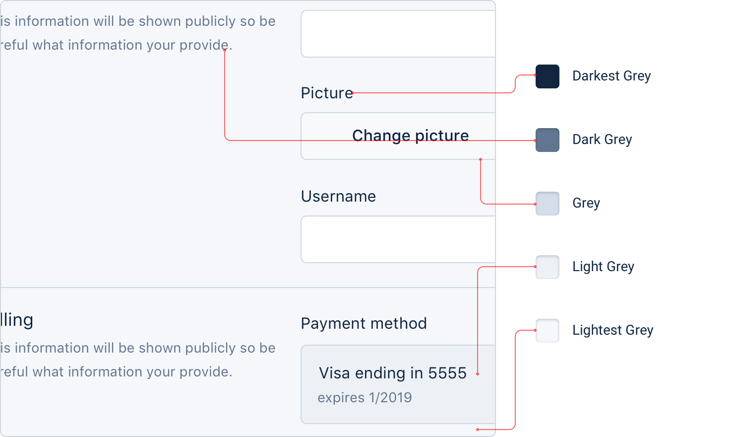
And you need more grays than you think. It seems that three or four shades are many, but very soon you will want something a little darker than shade number 2, but a little lighter than shade number 3.
In practice, it is advisable to choose 8-10 shades (more on this later) . It is not so much to look out for the difference between shades No. 77 and No. 78, but an ample amount.
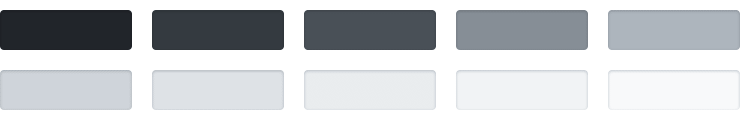
True black, as a rule, looks unnatural, so start with a very dark gray and gradually move to white.
Most sites need one or two colors for basic actions, navigation elements, etc. These colors define the overall look of the site: those that make you think of Facebook as “blue”, although in reality it’s mostly gray.
As with the gray palette, you need to choose a palette (5−10) lighter and darker shades.
The brightest shades can be useful as a tinted background for such things as alerts, and darker ones are great for text.
In addition to the main, each site needs several accent colors to communicate with the user.
So, to highlight a new feature, you can choose an attractive color, for example, yellow, pink or blue-green:
You may also need colors to emphasize different semantic states, for example, red to confirm destructive actions:
... yellow for warnings:

... or green to highlight a positive trend:

And a few shades of these colors, although they should be very economical to use in the UI.
If you create a design in which the color helps to distinguish or classify similar elements (for example, lines on charts, calendar events or tags in a project), then even more accent colors may be required.
In general, complex UI often requires up to ten different colors with 5–10 shades each.
When a slightly lighter or darker shade is required, you do not need to use CSS preprocessor functions like lighten or darken. So you will end up with 35 slightly different blue ones that all look the same.
Instead, define a fixed set of shades from which you will choose.
How to make such a palette?
Start with the base color on which the light and dark shades are based.
There is no real scientific way, but for primary and accent colors, a good rule of thumb is to choose a shade that works well for a button background.

It is important to note that there are no real rules here, such as “start with a brightness of 50%” or the like. Each color behaves a little differently, so you have to rely only on your taste.
Then select the darkest and lightest shades. This is also not a scientific approach, but it helps to imagine where the colors will be used and choose them according to this context.
The darkest shade is usually left for the text, and the lightest - for the background element. A simple alert is a good example of where these shades are combined.

Start with a color that matches the hue of the base color, and then change the saturation and brightness until you are satisfied.
If you have decided on the basic, dark and light shades, then it remains only to fill the gaps between them.
For most projects, you will need at least five shades per color, and preferably closer to ten, so as not to feel constrained.
Nine is a great number because it divides well, which makes filling gaps a little easier. Let's call the darkest shade 900 , the base 500 , and the lightest 100 .
Start by choosing the 700 and 300 shades , which are right in the middle of the two intervals: they will be the perfect compromise between the shades on both sides.

This creates four more slips on the scale ( 800 , 600 , 400 and 200 ), which are filled in the same way.

In the end, you get a fairly balanced set of colors, quite sufficient for the realization of your design ideas.
With gray shades, the base color is not so important, but otherwise the process is the same. Start from the edges and fill in the blanks until you get the desired palette.

The darkest shade is selected by the color of the darkest text in the project, and the lightest - the one that works well as a light, almost white background.
No matter how desirable, but when choosing the perfect color palette, you can not rely only on mathematics.
A systematic approach like the one described above is great for a start, but don't be afraid to change it if necessary.
As soon as you really begin to use your colors in the project, it is almost inevitable that you want to slightly change the saturation of a hue or make a couple of shades lighter or darker. Trust your eyes, not numbers.
Just try not to add too often new shades when it is not necessary. If you do not limit the palette, you can generally remain without a color system.
Did you see these trendy color palette generators? When you choose a color, set up several parameters with musical words like “triad” or “fourth major” - and get five perfect colors for your website?
Such a computational and scientific approach to the choice of an ideal color scale is extremely seductive, but not very useful.
Well, if you do not want the site to look like this:
What you really need
You do not do anything with five hexadecimal codes. To build something real requires a much more complete palette.
A good color palette can be divided into three categories.
Gray
Text, background, panels, form elements - almost all of this exists in the gray interface.
And you need more grays than you think. It seems that three or four shades are many, but very soon you will want something a little darker than shade number 2, but a little lighter than shade number 3.
In practice, it is advisable to choose 8-10 shades (more on this later) . It is not so much to look out for the difference between shades No. 77 and No. 78, but an ample amount.
True black, as a rule, looks unnatural, so start with a very dark gray and gradually move to white.
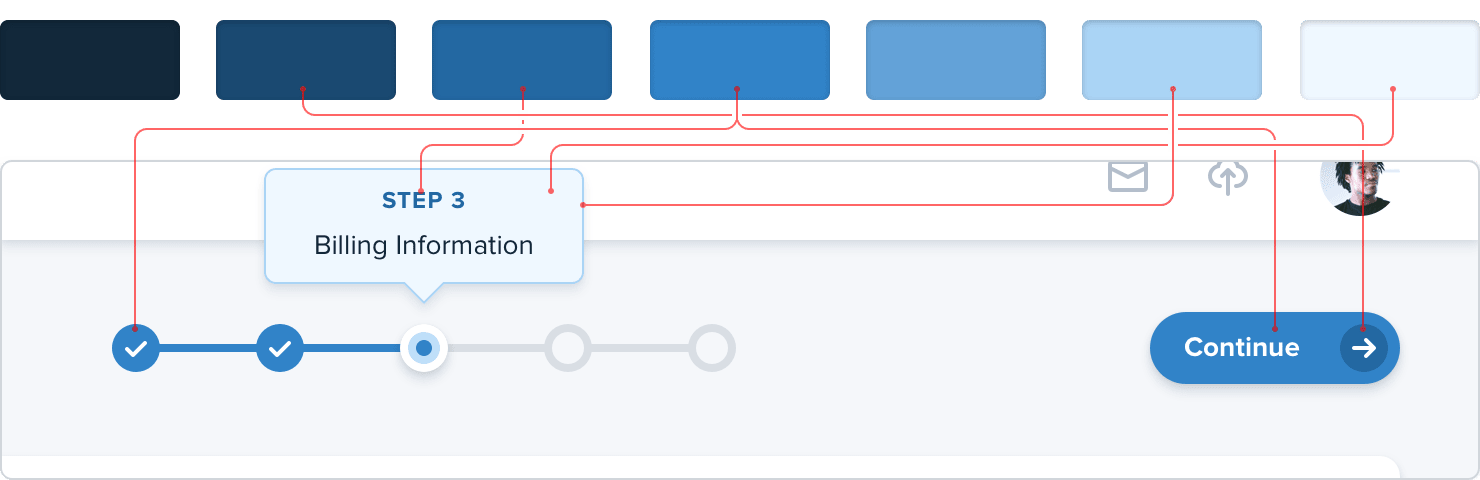
Primary colors
Most sites need one or two colors for basic actions, navigation elements, etc. These colors define the overall look of the site: those that make you think of Facebook as “blue”, although in reality it’s mostly gray.
As with the gray palette, you need to choose a palette (5−10) lighter and darker shades.
The brightest shades can be useful as a tinted background for such things as alerts, and darker ones are great for text.
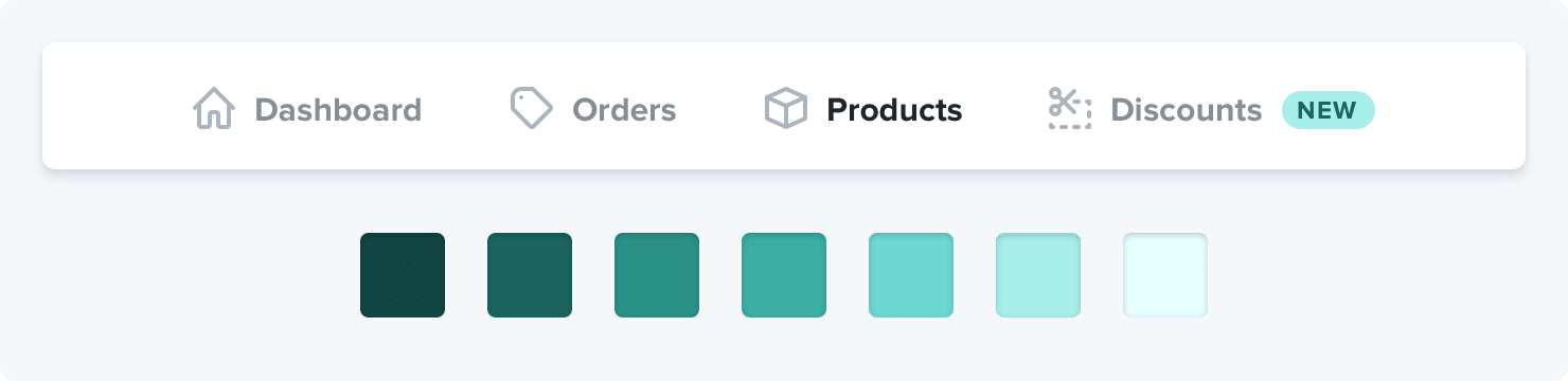
Accent colors
In addition to the main, each site needs several accent colors to communicate with the user.
So, to highlight a new feature, you can choose an attractive color, for example, yellow, pink or blue-green:
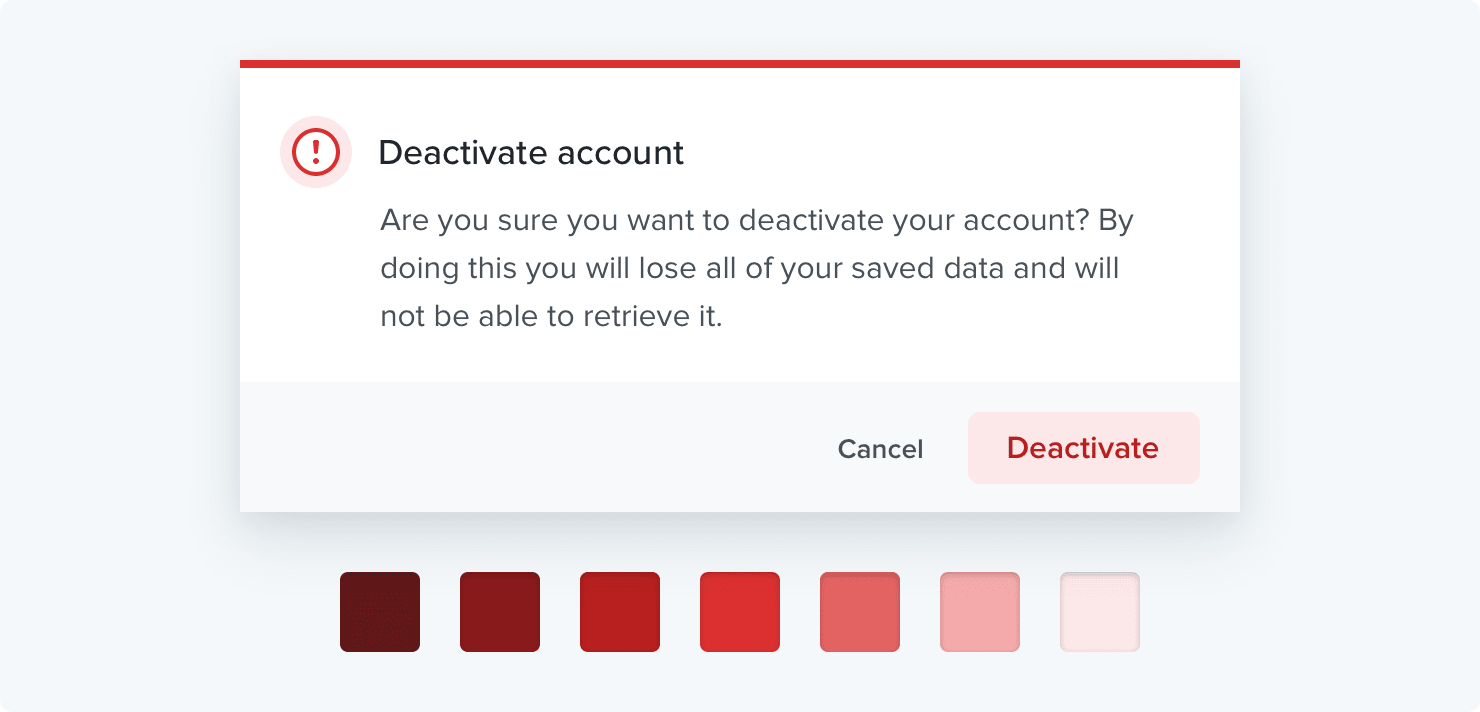
You may also need colors to emphasize different semantic states, for example, red to confirm destructive actions:
... yellow for warnings:
... or green to highlight a positive trend:
And a few shades of these colors, although they should be very economical to use in the UI.
If you create a design in which the color helps to distinguish or classify similar elements (for example, lines on charts, calendar events or tags in a project), then even more accent colors may be required.
In general, complex UI often requires up to ten different colors with 5–10 shades each.
Define the shades in advance
When a slightly lighter or darker shade is required, you do not need to use CSS preprocessor functions like lighten or darken. So you will end up with 35 slightly different blue ones that all look the same.
Instead, define a fixed set of shades from which you will choose.
How to make such a palette?
First select base color
Start with the base color on which the light and dark shades are based.
There is no real scientific way, but for primary and accent colors, a good rule of thumb is to choose a shade that works well for a button background.
It is important to note that there are no real rules here, such as “start with a brightness of 50%” or the like. Each color behaves a little differently, so you have to rely only on your taste.
Set boundaries
Then select the darkest and lightest shades. This is also not a scientific approach, but it helps to imagine where the colors will be used and choose them according to this context.
The darkest shade is usually left for the text, and the lightest - for the background element. A simple alert is a good example of where these shades are combined.
Start with a color that matches the hue of the base color, and then change the saturation and brightness until you are satisfied.
Fill in the blanks
If you have decided on the basic, dark and light shades, then it remains only to fill the gaps between them.
For most projects, you will need at least five shades per color, and preferably closer to ten, so as not to feel constrained.
Nine is a great number because it divides well, which makes filling gaps a little easier. Let's call the darkest shade 900 , the base 500 , and the lightest 100 .
Start by choosing the 700 and 300 shades , which are right in the middle of the two intervals: they will be the perfect compromise between the shades on both sides.
This creates four more slips on the scale ( 800 , 600 , 400 and 200 ), which are filled in the same way.
In the end, you get a fairly balanced set of colors, quite sufficient for the realization of your design ideas.
What about grays?
With gray shades, the base color is not so important, but otherwise the process is the same. Start from the edges and fill in the blanks until you get the desired palette.
The darkest shade is selected by the color of the darkest text in the project, and the lightest - the one that works well as a light, almost white background.
This is not science
No matter how desirable, but when choosing the perfect color palette, you can not rely only on mathematics.
A systematic approach like the one described above is great for a start, but don't be afraid to change it if necessary.
As soon as you really begin to use your colors in the project, it is almost inevitable that you want to slightly change the saturation of a hue or make a couple of shades lighter or darker. Trust your eyes, not numbers.
Just try not to add too often new shades when it is not necessary. If you do not limit the palette, you can generally remain without a color system.