Startup Plotguru increased landing conversion from 9% to 52%. Are you weak?
Yes, yes, yes, a very loud title. To get your attention, of course. This is probably the best landing page conversion rate case I've ever seen.
So, everyone knows that the landing page is a key element of any site. It receives the most traffic. It is on this page that visitors complete the targeted action. And it is attracting traffic to the landing pages that “eats” most of your budget for Internet marketing. Is that familiar?
Not only this is familiar, I am sure. There is still a high bounce rate on this page. Commercials 70-80%, if not more. Low conversion. Incomprehensible actions of visitors. All this relates to landing pages ... Incorrect landing pages .
In this case, you will learn how guys from a small startup improved landing conversion from 9% to 52%. Step by step. With a detailed description of the problems and changes they made on the page and what it led to. Incredibly cool case, which I advise everyone to read.
By the way, the conversion of 9% is a very good result for the landing. A conversion of 52% is an exceptional case. One in a million.
So, this is the first landing page option they made for their startup.

Before reading further, think for yourself what problems are on this page? Then check with the author. Minute boost your conversion boosting skills.
Related article - They will help you find all the "killers" of the conversion - 10 reports in Google Analytics
Ethan, co-founder and designer of Plotguru, noted for himself the following disadvantages of this option:
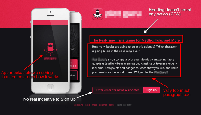
1. The image of the smartphone and application does not carry any information and value to the potential user. There is only a logo and nothing more. It is not clear how the application works, what awaits the user after downloading and registering.
One of the tips when promoting the application through the landing pages is to show screenshots from the application itself. Pictures are better than a thousand words. They attract attention. But the picture in the picture is different. In our case, it is equal to zero words.
By the way, did you know that most people are visuals, i.e. they perceive images and videos better than texts. In addition, people remember about 80% of visual information and only 20% of textual information. Why not use images, videos?
Each item on the landing page is worth its weight in gold.
2. The title (A simple online game for Netflix, Hulu) has absolutely no call to action. It has very little information. He is vague, quite ordinary. It’s hard to understand what this application is and how it works.
I think you know that the title on the landing page is a key element. If not the most important. 80% of visitors read headlines. And only 20% read the rest of the texts on the page. This is why headlines get so much attention when working on increasing conversions. This is one of the first points of contact with a potential customer.
3. Next comes the “wall of text” with a description of the application (approximately 20% of visitors will reach this text). But far fewer people will read it to the end. It is too big and monotonous for the first screen. Ideally, the visitor should understand the meaning of the text in 2 seconds. In this case, this certainly will not happen
4. The registration form is terrible. It is at the bottom of the page. It does not stand out among other elements in either its location or color: the input field is black and inconspicuous, and the color of the button merges with the page header and logo on the image. Most real ignoring all the rules for increasing conversion!
Related article - Which color has a better effect on conversion rate?
In addition to these problems, there is no incentive for a potential user to leave an e-mail address. Where are some free buns? Where are the special conditions for the first users? Where is the benefit? She is not.
By the way, do you know that when making a decision, users always compare the costs and benefits that they receive from a certain action? So here are the costs - this e-mail address left is not clear to anyone and why. And the benefit is not traced at all. More information about such cases can be found in the article - 5 signs of a site with high conversion - Analysis of benefits and costs
5. 75% of the entire black page. I do not mean by this to say that it is impossible to use black color on landing pages. But in this particular case, he looks completely unattractive and repulsive. And this is not a corporate color. So using it is completely optional.
After analyzing the above problems, Ethan made the necessary changes on the landing page. And so, what happened: The
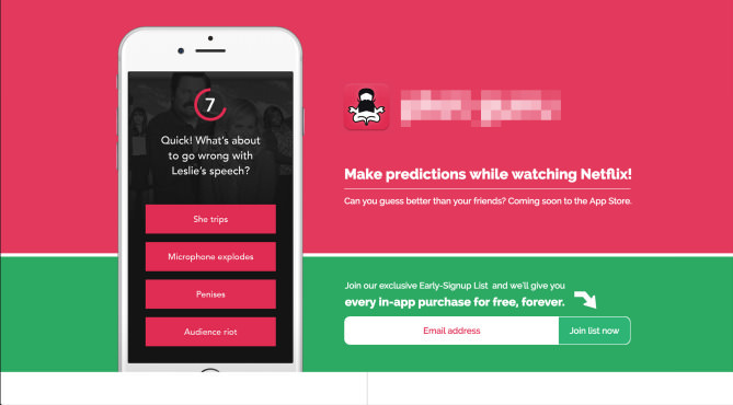
conversion on this page increased exactly 3 times - from 9% to 27%. But this was not enough.
The search for problems continued:
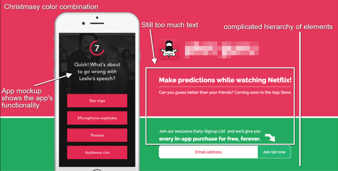
A detailed analysis of new problems:
1. Anyway, the page had a lot of text. This is not a few words that can be "grabbed" in 2-3 seconds. When compiling texts, ideally it is better to follow the rules of Twitter - a maximum of 140 characters. A great limitation that helps to create attractive and capacious headlines. Therefore, it was necessary to continue to work on text optimization.
2. The user's attention was still defocused. On the left is the image, on top is the logo, below are texts that most are not even going to read, but they are distracting anyway. And only below is a key element - a registration form. Of course, everything has become much simpler compared to the original version. But it could be made even simpler and more convenient.
3. Despite the change in draft color, the page has become similar to the packaging for Christmas presents. She became nicer, but did not fully match the corporate color. In general, when creating landing pages for applications, it is advised to use colors from the application interface. And no more than two.
4. The registration button now absolutely did not stand out against a green background. Green button on a green background. Tin. Try find and click. Just some kind of live quest. Only in the wrong place and at the wrong time.
But several positive changes should be noted:
Article in the topic - Change one word in the CTA-button and increase the conversion: myth or reality?
After analyzing new problems, Ethan again made changes to the landing page. And so, what happened this time:

WOW! The conversion on the new landing increased to 52%. Very powerful result.
And now let's analyze, due to which it was possible to achieve such a high rate:
Article in topic - 8 real-world examples of A / B testing of headings and texts
Everything is extremely simple. 2-3 seconds and the visitor understands what this application is about, whether it needs it and what benefits the registration brings right now.
By the way, analyzing this version of the page, a logical question may arise - “There is no screenshot of the application, and it may not be clear how it works.” But in this case, there is one reason for this decision. If there was a screenshot of the application, then it would violate the simplicity of the page and greatly attracted the attention of the user. But you need maximum focus: attention, title, benefit, form, registration. All. Perfect User flow, so to speak.
What is the most important conclusion to be drawn from this post?
I hope the article was useful and interesting for you!
Original article - From 9% to 52%: a Landing Page Conversion Optimization Case Study
Prepared by the Boosta.ru blog and the Changeagain.me project
Do you want your colleagues and friends to learn more about A / B testing and Conversion Increase? Just share the article. They will be grateful. Buttons for repost from below.
Read also our other popular articles:
1. They will help you find all the "killers" of the conversion - 10 reports in Google Analytics (5000+ views)
2. 100 ideas for A / B testing. Part One (2000+ views)
3. 100 ideas for A / B testing: Part Two(1000+ views)
4. How to find an idea for an A / B test: heatmaps and polls (1000+ views)
So, everyone knows that the landing page is a key element of any site. It receives the most traffic. It is on this page that visitors complete the targeted action. And it is attracting traffic to the landing pages that “eats” most of your budget for Internet marketing. Is that familiar?
Not only this is familiar, I am sure. There is still a high bounce rate on this page. Commercials 70-80%, if not more. Low conversion. Incomprehensible actions of visitors. All this relates to landing pages ... Incorrect landing pages .
In this case, you will learn how guys from a small startup improved landing conversion from 9% to 52%. Step by step. With a detailed description of the problems and changes they made on the page and what it led to. Incredibly cool case, which I advise everyone to read.
By the way, the conversion of 9% is a very good result for the landing. A conversion of 52% is an exceptional case. One in a million.
Original landing page version - 9% conversion
So, this is the first landing page option they made for their startup.
Before reading further, think for yourself what problems are on this page? Then check with the author. Minute boost your conversion boosting skills.
Related article - They will help you find all the "killers" of the conversion - 10 reports in Google Analytics
Ethan, co-founder and designer of Plotguru, noted for himself the following disadvantages of this option:
- The image of the smartphone with the Plotguru application does not say absolutely anything about the application itself.
- There is no incentive to action in the title
- The page has too much monotonous text
- In the texts and next to the form there is no incentive to leave your address / register
- The black color of the page is unattractive and unfriendly
Detailed analysis of each problem:
1. The image of the smartphone and application does not carry any information and value to the potential user. There is only a logo and nothing more. It is not clear how the application works, what awaits the user after downloading and registering.
One of the tips when promoting the application through the landing pages is to show screenshots from the application itself. Pictures are better than a thousand words. They attract attention. But the picture in the picture is different. In our case, it is equal to zero words.
By the way, did you know that most people are visuals, i.e. they perceive images and videos better than texts. In addition, people remember about 80% of visual information and only 20% of textual information. Why not use images, videos?
Each item on the landing page is worth its weight in gold.
2. The title (A simple online game for Netflix, Hulu) has absolutely no call to action. It has very little information. He is vague, quite ordinary. It’s hard to understand what this application is and how it works.
I think you know that the title on the landing page is a key element. If not the most important. 80% of visitors read headlines. And only 20% read the rest of the texts on the page. This is why headlines get so much attention when working on increasing conversions. This is one of the first points of contact with a potential customer.
3. Next comes the “wall of text” with a description of the application (approximately 20% of visitors will reach this text). But far fewer people will read it to the end. It is too big and monotonous for the first screen. Ideally, the visitor should understand the meaning of the text in 2 seconds. In this case, this certainly will not happen
4. The registration form is terrible. It is at the bottom of the page. It does not stand out among other elements in either its location or color: the input field is black and inconspicuous, and the color of the button merges with the page header and logo on the image. Most real ignoring all the rules for increasing conversion!
Related article - Which color has a better effect on conversion rate?
In addition to these problems, there is no incentive for a potential user to leave an e-mail address. Where are some free buns? Where are the special conditions for the first users? Where is the benefit? She is not.
By the way, do you know that when making a decision, users always compare the costs and benefits that they receive from a certain action? So here are the costs - this e-mail address left is not clear to anyone and why. And the benefit is not traced at all. More information about such cases can be found in the article - 5 signs of a site with high conversion - Analysis of benefits and costs
5. 75% of the entire black page. I do not mean by this to say that it is impossible to use black color on landing pages. But in this particular case, he looks completely unattractive and repulsive. And this is not a corporate color. So using it is completely optional.
The second version of the landing page - increase conversion to 27%
After analyzing the above problems, Ethan made the necessary changes on the landing page. And so, what happened: The
conversion on this page increased exactly 3 times - from 9% to 27%. But this was not enough.
The search for problems continued:
- There is still a lot of text
- Complex hierarchy of elements
- Page looks like Christmas gift wrapping
- The page did not match the simplicity of the application itself
A detailed analysis of new problems:
1. Anyway, the page had a lot of text. This is not a few words that can be "grabbed" in 2-3 seconds. When compiling texts, ideally it is better to follow the rules of Twitter - a maximum of 140 characters. A great limitation that helps to create attractive and capacious headlines. Therefore, it was necessary to continue to work on text optimization.
2. The user's attention was still defocused. On the left is the image, on top is the logo, below are texts that most are not even going to read, but they are distracting anyway. And only below is a key element - a registration form. Of course, everything has become much simpler compared to the original version. But it could be made even simpler and more convenient.
3. Despite the change in draft color, the page has become similar to the packaging for Christmas presents. She became nicer, but did not fully match the corporate color. In general, when creating landing pages for applications, it is advised to use colors from the application interface. And no more than two.
4. The registration button now absolutely did not stand out against a green background. Green button on a green background. Tin. Try find and click. Just some kind of live quest. Only in the wrong place and at the wrong time.
But several positive changes should be noted:
- The screenshot of the application on the image of the smartphone now spoke for itself and fully characterized the essence of the application. In theory, at this point, the potential user should already understand what's what. Here, the picture fulfills its role and replaces a thousand words, compared with the original version.
- The headline has an incentive to action - "Make Assumptions When Viewing Netflix." This is a positive change. It also became clear that the application is associated with forecasts of various events in the series on Netflix.
- The field for entering email addresses has become more visible. An incentive was added to him to leave the address - “Join us and get access to all internal purchases in the application absolutely free and forever.” There has already appeared a benefit, which is worth it to leave an e-mail.
- An arrow has also been added, directing the visitor’s attention to the button. This is one of the minor but important triggers that stimulate action. The text of the CTA button has changed and it has become more specific. If earlier it was just “Register”, now “Join now”. This is a more efficient option.
Article in the topic - Change one word in the CTA-button and increase the conversion: myth or reality?
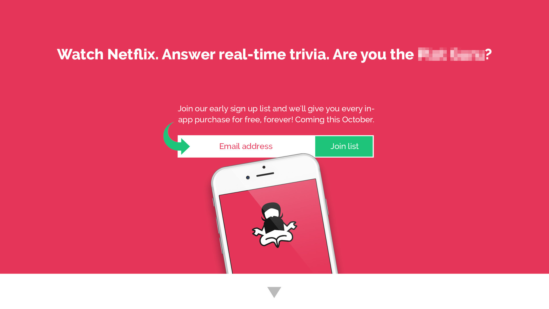
The third version of the landing page - increase conversion to 52%
After analyzing new problems, Ethan again made changes to the landing page. And so, what happened this time:
WOW! The conversion on the new landing increased to 52%. Very powerful result.
And now let's analyze, due to which it was possible to achieve such a high rate:
- The landing page has become very simple.
- It is very bright and made in pink, which is used in the application.
- A very clear hierarchy of elements: the title, the text stimulating to fill out the form, a visually distinguished form and a small screenshot of the application.
- The headline is attractive and stimulates to action. It defines the target audience (those who watch Netflix). It describes the essence of the application - assumptions about actions in the series in real time. It has a question that calls for action.
- There is an additional text that shows the benefits of registration right now - “Join us and get access to all internal purchases in the application absolutely free and forever. The application will be available in October »
- There is only 1 element on the page on which all attention is concentrated - this is the form. She is in the center. There is nothing to pay attention to except her. The STA button is highlighted against all other elements. Accordingly, the visitor is not distracted by anything and if he decides to click on something, then this will be the registration button.
Article in topic - 8 real-world examples of A / B testing of headings and texts
Everything is extremely simple. 2-3 seconds and the visitor understands what this application is about, whether it needs it and what benefits the registration brings right now.
By the way, analyzing this version of the page, a logical question may arise - “There is no screenshot of the application, and it may not be clear how it works.” But in this case, there is one reason for this decision. If there was a screenshot of the application, then it would violate the simplicity of the page and greatly attracted the attention of the user. But you need maximum focus: attention, title, benefit, form, registration. All. Perfect User flow, so to speak.
What is the most important conclusion to be drawn from this post?
Do not overload landing pages. They should be as simple as possible, focused on 1 target action.
I hope the article was useful and interesting for you!
Original article - From 9% to 52%: a Landing Page Conversion Optimization Case Study
Prepared by the Boosta.ru blog and the Changeagain.me project
Do you want your colleagues and friends to learn more about A / B testing and Conversion Increase? Just share the article. They will be grateful. Buttons for repost from below.
Read also our other popular articles:
1. They will help you find all the "killers" of the conversion - 10 reports in Google Analytics (5000+ views)
2. 100 ideas for A / B testing. Part One (2000+ views)
3. 100 ideas for A / B testing: Part Two(1000+ views)
4. How to find an idea for an A / B test: heatmaps and polls (1000+ views)