[Design Psychology] - The Psychology of Design
- Transfer
There are a number of debates about what additional skills designers should learn. Should designers be
But the problem is where to start? What principles from psychology are helpful? What are examples of these principles in the work? In this article we will look at the basics and discuss the ethical implications of using psychology in design.
Key principles
The intersection of psychology and design is vast. There is an endless list of principles that occupy this space, but there are several that I consider more universal than others. Let's look at what these principles are and where they are most effectively used by the products and experiences that we interact with daily.
HIKA Act
One of the main functions that we have as designers is the synthesis of information and its presentation in such a way that it does not overwhelm users. After all, good communication strives for clarity . This is directly related to our first key principle: Hick's law. Hick's law predicts that the time needed to make a decision increases with the number and complexity of the options available. It was formulated by psychologists William Edmund Hick and Ray Hyman in 1952 after examining the relationship between the number of stimuli present and the response time of a person to any given stimulus.
It turns out that there is an actual formula for representing this relationship: RT = a + b log2 (n). Fortunately, we do not need to understand the math of this formula in order to understand what it means. The concept is quite simple: the time required for users to respond directly correlates with the number and complexity of the options available. This means that complex interfaces lead to an increase in processing time for users, which is important because it is associated with a fundamental theory in psychology, known as cognitive load.
Cognitive load
Cognitive load refers to the mental computing power used by our working memory. Our brains are like computer processors, because we have limited computing power: when the amount of information entering it exceeds the available space, a cognitive load arises. Our productivity suffers, and the tasks are complicated, which leads to missing parts and even to disappointment.
Examples

Modified TV consoles that simplify the “interface” for grandparents
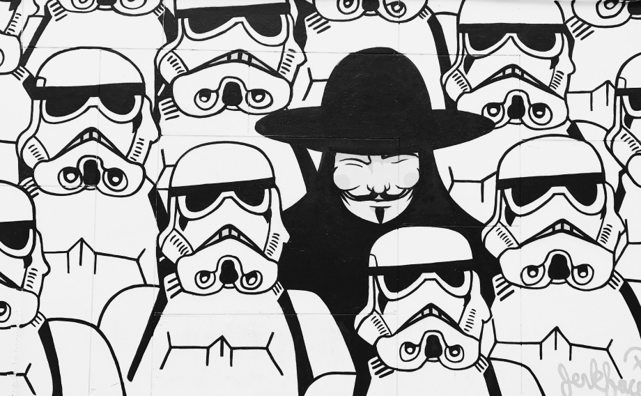
There are examples of Hick's Law all over the world, but we will start with a general: remote control. Over the past decades, many new functions have appeared on televisions, which could not but affect the control panels for them. In the end, the consoles turned out to be so complex that their use required either muscle memory from reuse or a significant amount of mental processing. This led to a phenomenon known as the “understandable console for grandparents”. By gluing everything except the main buttons, the grandchildren were able to improve the usability of the remotes for their loved ones, by sharing this invention online, they did us a big favor.
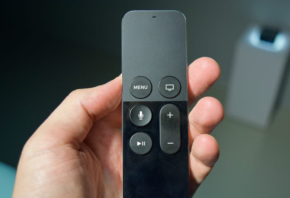
Apple TV remote, which simplifies the management of the most necessary functions.
For comparison, we have consoles for Smart TV: an optimized cousin of the previous example, which simplifies the management of the most necessary functions. The result is a console that does not require a significant amount of working memory and, therefore, carries a much lower cognitive load. By transmitting complexity to the TV interface itself, information can be effectively organized and gradually disclosed in the menu.
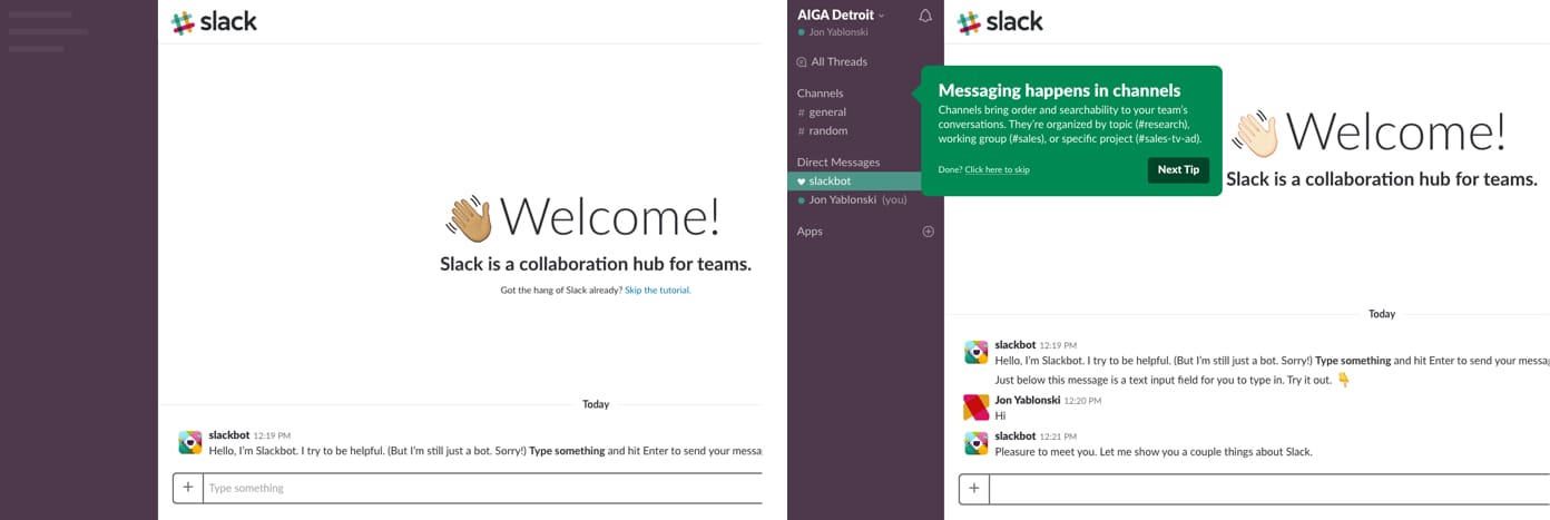
Screenshots from the progressive experience of introducing Slack
Let's look at another example of Hick's Law. Implementation is a crucial, but risky process for new users, and it will turn out the same way as with Slack. Instead of immersing users into a full-featured application after they have passed a few inline slides, they use a bot (Slackbot) to attract users and prompt them to study the messaging function more comfortably. In order to avoid that new users do not feel
This is a more effective way to introduce users, because it mimics how we actually learn: we count every subsequent step and add to what we already know. By opening functions at the right time, we allow our users to adapt to complex workflows and sets of functions without feeling overwhelmed.
Highlights
- A large number of options increases the cognitive load for users.
- Break long or complex processes into screens with fewer options.
- Use gradual deployment to minimize cognitive load for new users.
MILLER's Law
Another key principle is Miller's Law, which predicts that the average person can only store 7 (± 2) elements in his RAM. It stems from an article published in 1956 by cognitive psychologist George Miller, who discussed the limits of short-term memory and memory. Unfortunately, over the years there have been many misinterpretations regarding this heuristic, and this led to the fact that the “magic number seven” was used to justify unnecessary restrictions (for example, restricting the interface menu to no more than seven elements).
Fragmentation
Miller’s passion for short-term memory and memory was not focused on the number 7, but on the concept of “Fragmentation” and our ability to remember information. When applied to design, Fragmentation can be an incredibly valuable tool. It describes the action of visually grouping related information into small separate pieces of information. When we collect content in design, we effectively simplify processing and understanding. Users can scan content and quickly determine what they are interested in, which is consistent with our experience in the use of digital content.
Examples

An example of the fragmentation of elements such as phone numbers.
The simplest example of Fragmentation can be found when we format phone numbers. Without Fragmentation, the phone number will be a long string of characters, which increases the complexity of processing and memorization. Alternatively, a phone number that has been formatted (fragmented) becomes much easier to interpret and memorize. This is similar to how we perceive the “wall of text” compared to well-formatted content with the appropriate heading, line length and content length.

Fragmentation can organize content so that users can easily process, understand and remember. On the right, I described how Bloomberg grouped information.
Another example of the effective use of Fragmentation in design is the layout. We can use this method to help users understand basic relationships and hierarchy by combining content into various modules. In particular, in volume and content information, fragmentation can be effectively used to structure content. Moreover, the result is more visually pleasing and convenient when browsing.
Highlights
- Do not use the "magic number seven" to justify unnecessary design restrictions.
- Break content into small chunks to help users easily process, understand, and remember information.
JACOBE Act The
last principle we’ll review is Jacob’s Law (Jacob’s Internet User Experience Act), which states that users spend most of their time on other sites, and they prefer your site to work just like everyone else. other sites that they already know. In 2000, he was introduced by usability expert Jacob Nielsen , who described the user tendency to form expectations from design templates based on generalized experience from other websites. This principle encourages designers to follow common design patterns so as not to confuse users, which can lead to higher cognitive load.
Thinking patterns
I know what you're thinking: if all websites followed the same design patterns, it would create a rather boring web. The answer is yes, it probably is. User awareness is quite a powerful tool that brings us to another fundamental concept in psychology, which is also valuable for designers: models of thinking.
A thinking model is what we think we know about the system, especially how it works. Whether it is a website or a car, we form models of how the system works, and then we apply this model to new situations when the system is similar. In other words, we use the knowledge that we already have from past experience when interacting with something new.
The thinking model is valuable for designers because we can matchthinking model of our users to improve their experience . Consequently, users can easily transfer their knowledge from one product or experience to another, without spending time understanding how the new system works. A good user experience becomes possible when the designer’s thinking model coincides with the user's thinking model. One of the most important tasks is to close the gap between our thinking model and the thinking model of our users, and to achieve this goal we use various methods: user surveys, personalization, travel maps, empathy cards and more. The essence of all this is to gain a deeper understanding not only of the goals and objectives of our users, but also of their pre-existing patterns of thinking, and how this applies to the product or experience we are developing.
Examples
Have you ever wondered why controls look the way they look? This is due to the fact that the people who designed them had a ready-made model of how these elements look on the control panels in the physical world. Such form elements as switches, radio buttons, and even buttons arose from the construction of their tactile counterparts.
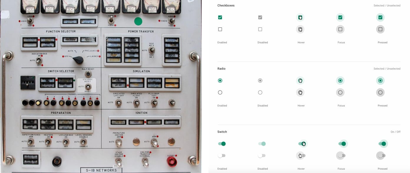
Comparison of control panel elements and typical form elements.
As designers, we need to close the gap that exists between our thinking patterns and the thinking patterns of our users. It is important to do this because there will be problems if the models are not consistent, which may affect how users perceive the products and experiences that have helped us. This inconsistency is called the discomfort of the thinking model.and this happens when a familiar product has suddenly changed.

Redesign Snapchat, before and after.
Take, for example, Snapchat, which rolled out a major redesign in early 2018. They launched a reformatted layout, which, in turn, embarrassed users, making it difficult to access the features they used daily. These unfortunate users immediately massively expressed their disapproval on Twitter. Even worse was the subsequent migration of users to a rival Snapchat, Instagram. Snapchat was unable to reconcile the thinking model of users with the modified version of their application, and the resulting discrepancy caused a serious reaction.
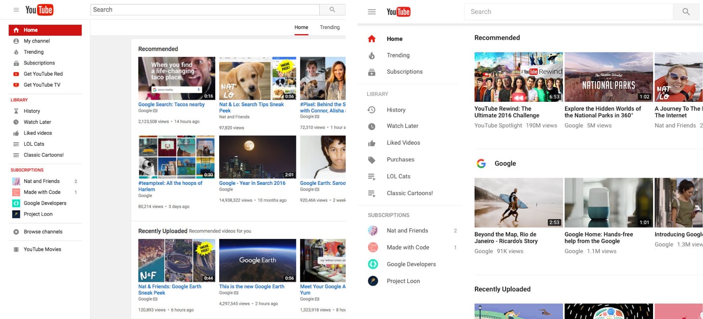
YouTube redesign in 2017 before and after comparison.
But major redesigns don't always have to lead to a negative reaction — like Google’s example. Google has a history that allows users to choose new versions of their products, such as Google Calendar, YouTube and Gmail. When they launched a new version of YouTube in 2017 after several years of essentially the same design, they allowed desktop users to simplify their work with the new Material Design interface without having to stay on the new version. Users could view the new design, get some information, send feedback and even return to the old version if they prefer it. As a result, the inevitable mismatch of the thinking model was eliminated by simply empowering users to switch when they were ready.
Highlights
- Users transfer the expectations formed around one familiar product to another similar one.
- Using existing thinking patterns, we can create a superior user experience in which the user can focus on his task, rather than learn new patterns.
- Minimize disagreement by allowing users to continue using the familiar version for a limited time.
Let's sum up:
Perhaps you are thinking: “What remarkable principles, how can I use them in my projects?” Although nothing replaces the study of user behavior and specific data related to our projects, we can use these psychological principles as a guide for design development more intuitive, people-oriented products and experiences. Accounting for these principles helps us create a design that takes into account the behavior of people as opposed to being forced to adapt to technology. Brief repetition:
- Hick's law can help us reduce the cognitive load for users by minimizing choices and breaking long or complex processes into screens with fewer options.
- Miller's Law teaches us to use fragmentation to organize content into smaller clusters to help users easily process, understand, and remember.
- Jacob's law reminds us that users transfer expectations that have formed around one familiar product to another similar product.
Therefore, we can use existing thinking patterns to create a superior user experience.
We looked at some key principles that are useful for creating more intuitive, people-oriented products and experiences. Now let's touch on their ethical implications and how easy it is to fall into the trap of exploiting user psychology.
Ethical moments
On the one hand, designers can use psychology to create more intuitive products and experiences; on the other hand, they can use it to find out how the mind works, for the sake of creating more exciting applications and websites. Let's first consider why this is a problem, and then consider possible solutions.
PROBLEM
No need to go far to understand why the welfare of users, being excluded from the priority in favor of profit, is a problem. When was the last time you were in the subway, on the sidewalk or in the car, and you saw someone not sticking to your smartphone? There are some who would claim that we are at the center of the epidemic , and that our attention is held captive by the mini-computers that are with us everywhere.
It would not be an exaggeration to say that the mobile platforms and social networks that connect us also put a lot of effort into sticking us to themselves, and every day they are getting better. The consequences of this dependence are well known to us: from the reduction of sleep and anxiety to the deterioration of social relations, it becomes obvious, these are unintended consequences in the race for our attention. These consequences become problematic when they begin to change how we form relationships and what we are.
DECISION
As developers, our responsibility is to create products and experiences that support and align with the goals and well-being of users. In other words, we must build technology to expand human experience, not replacing it with virtual interaction and rewards. The first step in making ethical design decisions is to recognize how the human mind can be used.
We must also ask ourselves what we should and should not design. We may be in quite capable teams that have the ability to design almost everything that you can imagine, but this does not always mean that we have to do it - especially if the goals of what we design do not correspond to the goals of our users.
Finally, we must consider metrics outside of product usage data. Data tells us a lot of things, but what they don’t tell us is why users behave in a certain way or how a product affects their lives. To understand why, we need to listen and be receptive to our users. It means getting out of the screen, talking to them, and then using this qualitative research to improve our design.
Examples
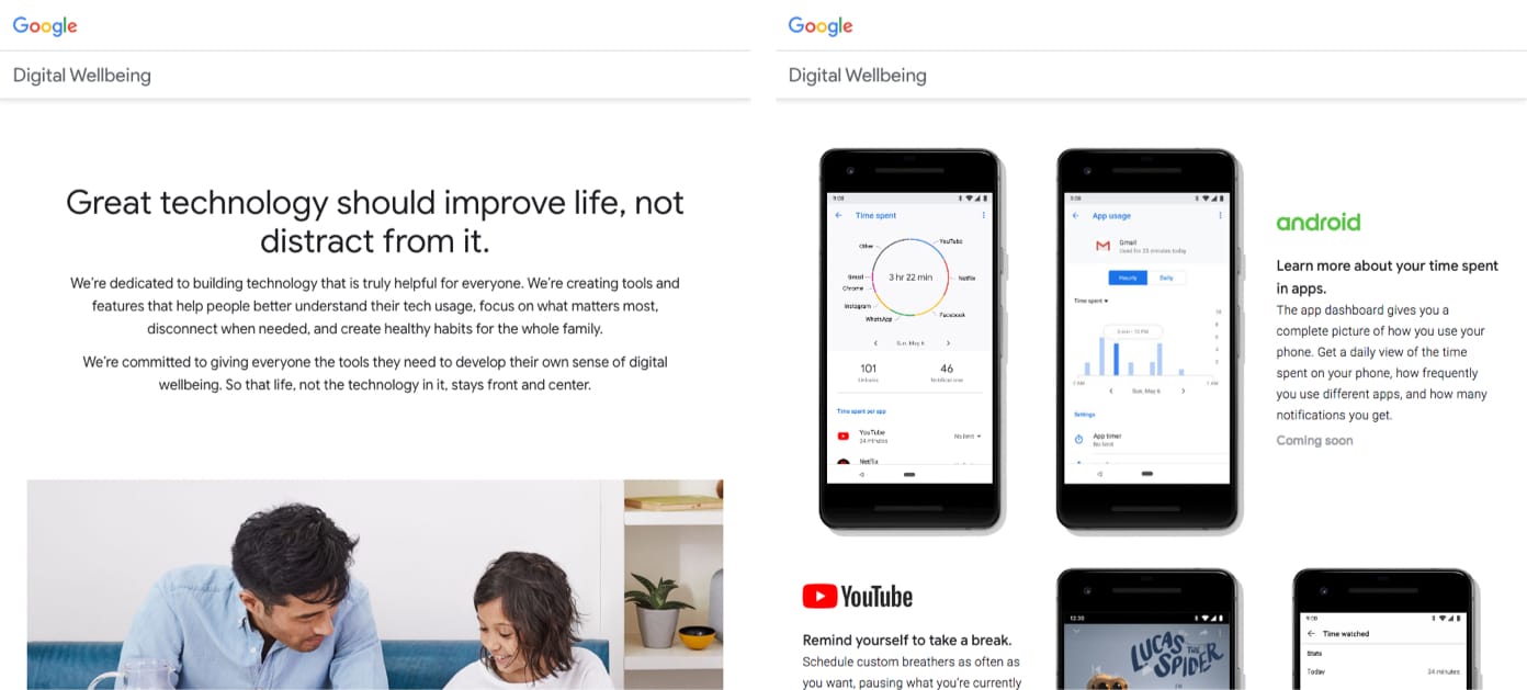
Google Digital Wellbeing initiative website
It was great to see that companies are taking the right steps when it comes to users' digital well-being. Take, for example, Google, which has just announced tools and functions in its latest I / O event, which focuses on helping people better understand their use of technology, focus on the most important, turn off when necessary, and create healthy digital habits. Features such as an application panel, which provides an overview of usage, additional control over warnings and notifications, and Parental Control to set basic digital rules for small ones, all designed to protect users.

Screenshot of the video in Facebook "FYI news feed: bringing people together."
Some companies even redefine their success rates. Instead of time spent by the user on the site, companies such as Facebook, determine success by meaningful interactions . It required them to restructure their news feed algorithm in order to prioritize content that is valuable to people over meaninglessly consumed information. Now content from friends and family takes precedence, even if the result means that users spend a little less time on their application.
These examples are just a look at the steps that many companies are taking, and I hope that more companies will join in the coming years. Technology, in which we play the role of designers, can significantly affect the lives of people, and it is essential to ensure a positive impact. We are responsible for creating products and experiences that support and are consistent with the goals and well-being of users. We can make ethical design decisions, taking into account how the human mind can be used, consider what we should and should not design, and talk to users in order to get quality feedback on how the products and experience we design affect on their lives.
Resources
There are many useful resources that we can use to make our projects more intuitive for users. Here are a few that I refer to quite often:
- Laws of UX : A website I created for designers to learn more about the psychological principles associated with UX / UI design.
- Cognitive UXD : This hand-picked publication by Norbi Gaal is an excellent resource for anyone interested in the intersection of psychology and UX.
- Center for Humane Technology : A team of former high-tech insiders and world-class executives who promote thoughtful solutions for changing culture, business incentives, design methods and organizational structures, and tell us how technology captures our brains.
- Design of everyday things: revised and expanded edition : an absolute classic that explores the relationship between an object and a user through design, how to optimize this connection, and ultimately, how psychology plays a certain role in designing for the real needs of people.
- Emotion Design : Look at the importance of emotion when you express your brand identity and how designers can go beyond functionality, reliability and usability for people, not machines.
- Hooked: How to create familiar products : a guide that gives an idea of the behavioral methods used by companies such as Twitter, Instagram and Pinterest.